A few notes on cluster analysis

12 Slides593.95 KB
A few notes on cluster analysis
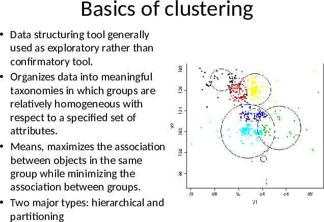
Basics of clustering Data structuring tool generally used as exploratory rather than confirmatory tool. Organizes data into meaningful taxonomies in which groups are relatively homogeneous with respect to a specified set of attributes. Means, maximizes the association between objects in the same group while minimizing the association between groups. Two major types: hierarchical and partitioning
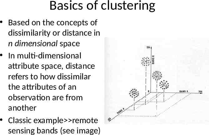
Basics of clustering Based on the concepts of dissimilarity or distance in n dimensional space In multi-dimensional attribute space, distance refers to how dissimilar the attributes of an observation are from another Classic example remote sensing bands (see image)
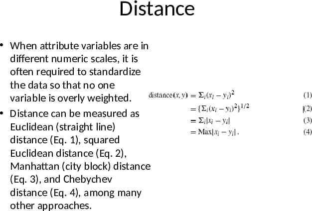
Distance When attribute variables are in different numeric scales, it is often required to standardize the data so that no one variable is overly weighted. Distance can be measured as Euclidean (straight line) distance (Eq. 1), squared Euclidean distance (Eq. 2), Manhattan (city block) distance (Eq. 3), and Chebychev distance (Eq. 4), among many other approaches.
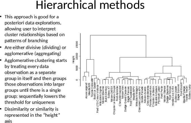
Acura Legend Mazda 929 Toyota Cressida Buick Le Sabre Ford LTD Crown Victoria Mitsubishi Sigma Nissan Maxima Buick Century Subaru XT Nissan 240SX Chrysler Le Baron Coupe Ford Aerostar Chevrolet Caprice Nissan Van Dodge Grand Caravan Eagle Premier Ford Thunderbird Mazda MPV Mitsubishi Wagon Chevrolet Lumina APV Honda Prelude Nissan Axxess Chevrolet Beretta Pontiac Grand Am Chrysler Le Baron Mitsubishi Galant Plymouth Laser Ford Probe Nissan Stanza Dodge Daytona Ford Tempo Honda Civic CRX Subaru Loyale Eagle Summit Ford Escort Mazda Protege Toyota Tercel Subaru Justy 0 15000 This approach is good for a posteriori data explorations, allowing user to interpret cluster relationships based on patterns of branching Are either divisive (dividing) or agglomerative (aggregating) Agglomerative clustering starts by treating every data observation as a separate group in itself and then groups those observations into larger groups until there is a single group; sequentially lowers the threshold for uniqueness Dissimilarity or similarity is represented in the “height” axis Height 5000 10000 Hierarchical methods
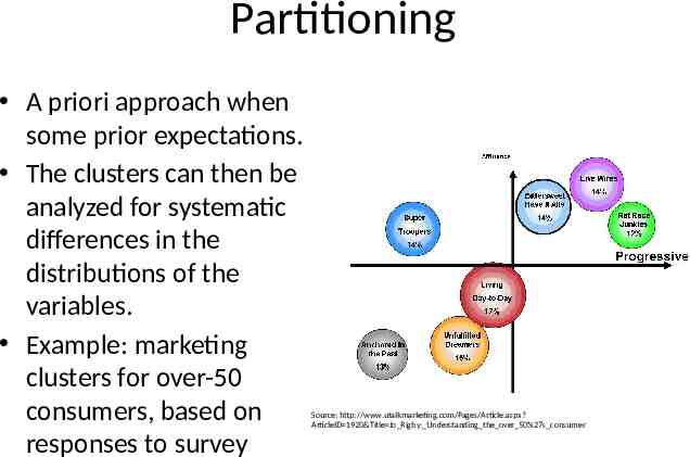
Partitioning A priori approach when some prior expectations. The clusters can then be analyzed for systematic differences in the distributions of the variables. Example: marketing clusters for over-50 consumers, based on responses to survey Source: http://www.utalkmarketing.com/Pages/Article.aspx? ArticleID 1920&Title Jo Rigby: Understanding the over 50%27s consumer
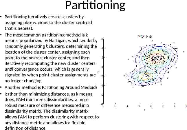
Partitioning Partitioning iteratively creates clusters by assigning observations to the cluster centroid that is nearest. The most common partitioning method is k means, popularized by Hartigan, which works by randomly generating k clusters, determining the location of the cluster center, assigning each point to the nearest cluster center, and then iteratively recomputing the new cluster centers until convergence occurs, which is generally signaled by when point-cluster assignments are no longer changing. Another method is Partitioning Around Medoids Rather than minimizing distances, as k means does, PAM minimizes dissimilarities, a more robust measure of difference measured in a dissimilarity matrix. The dissimilarity matrix allows PAM to perform clustering with respect to any distance metric and allows for flexible definition of distance.
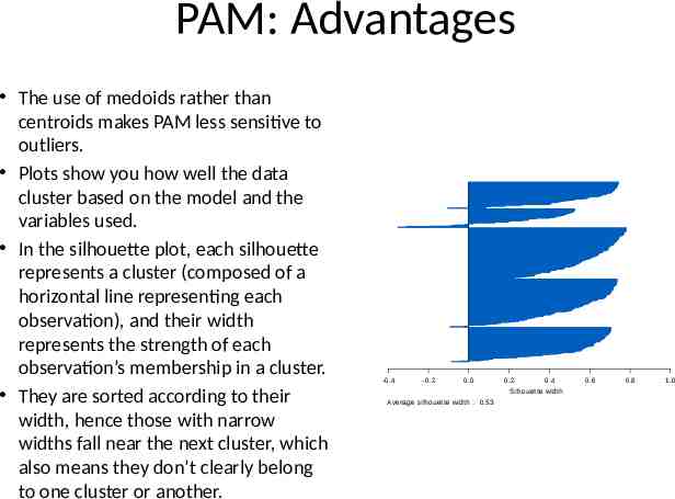
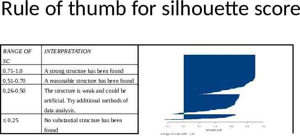
PAM: Advantages The use of medoids rather than centroids makes PAM less sensitive to outliers. Plots show you how well the data cluster based on the model and the variables used. In the silhouette plot, each silhouette represents a cluster (composed of a horizontal line representing each observation), and their width represents the strength of each observation’s membership in a cluster. They are sorted according to their width, hence those with narrow widths fall near the next cluster, which also means they don’t clearly belong to one cluster or another. -0.4 -0.2 0.0 0.2 0.4 Silhouette width Average silhouette width : 0.53 0.6 0.8 1.0
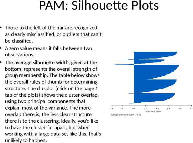
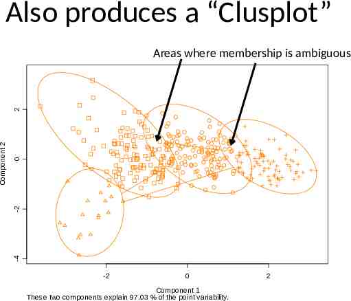
PAM: Silhouette Plots Those to the left of the bar are recognized as clearly misclassified, or outliers that can’t be classified. A zero value means it falls between two observations. The average silhouette width, given at the bottom, represents the overall strength of group membership. The table below shows the overall rules of thumb for determining structure. The clusplot (click on the page 1 tab of the plots) shows the cluster overlap, using two principal components that explain most of the variance. The more overlap there is, the less clear structure there is to the clustering. Ideally, you’d like to have the cluster far apart, but when working with a large data set like this, that’s unlikely to happen. -0.4 -0.2 0.0 0.2 0.4 Silhouette width Average silhouette width : 0.53 0.6 0.8 1.0
Rule of thumb for silhouette score RANGE OF INTERPRETATION SC 0.71-1.0 A strong structure has been found 0.51-0.70 A reasonable structure has been found 0.26-0.50 The structure is weak and could be artificial. Try additional methods of data analysis. 0.25 No substantial structure has been found
Also produces a “Clusplot” 0 -2 -4 Component 2 2 Areas where membership is ambiguous -2 0 Component 1 These two components explain 97.03 % of the point variability. 2
New approaches Artificial Neural Networks: NN essentially uses a nonlinear and flexible regression technique which does not require prior assumptions of the distribution of the data to classify data. NN methods have the advantage of evaluating similarities based on a set of multi-dimensional criteria, as opposed to traditional clustering algorithms which generally use a single measure of dissimilarity. Multivariate Divisive Partitioning (MDP): an analyst chooses a dependent variable or behavior they wish to model and then conducts a stepwise process to determine which variables, and which breaks in the values of those variables, best divides a single segment into two segments with the greatest difference in that behavior. Splitting then continues iteratively until a threshold of similarity in the dependent variable is reached PCA often used as a data reduction tool in highly complex clustering and segmentation. These factors are represented using standardized linear combinations of the original variables. Generally, most of the original variation in the variables is explained in the first principal component. Because each component is orthogonal, each subsequent component should be uncorrelated with the previous one, and hence explain less variance. Thus, while the number of principal components is equal to the number of variables, only a few of the principal components need be used because they explain most of the variance.