The Four Basic Principles of Document Design Robin Williams’ The
7 Slides84.00 KB
The Four Basic Principles of Document Design Robin Williams’ The Non-designer’s Design Book Adapted from by Kelly Daniels
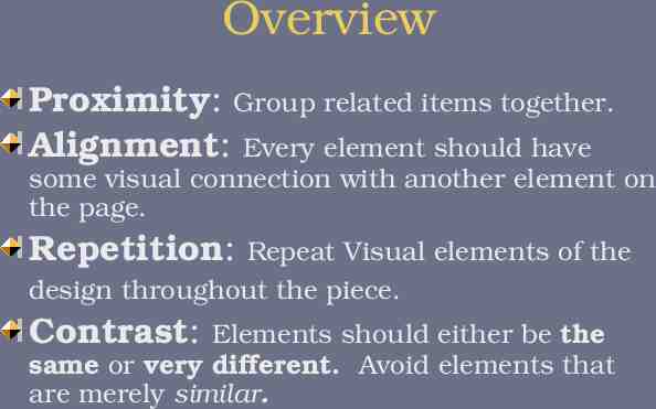
Overview Proximity: Group related items together. Alignment: Every element should have some visual connection with another element on the page. Repetition: Repeat Visual elements of the design throughout the piece. Contrast: Elements should either be the same or very different. Avoid elements that are merely similar.
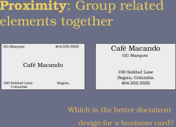
Proximity: Group related elements together GG Marquez 404.555.5555 Café Macando GG Marquez Café Macando 100 Solidad Lane Columbia Bogota, 100 Solidad Lane Bogota, Columbia 404.555.5555 Which is the better document design for a business card?
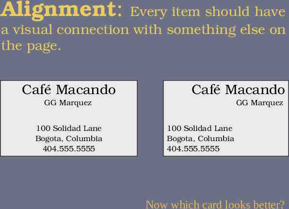
Alignment: Every item should have a visual connection with something else on the page. Café Macando Café Macando GG Marquez 100 Solidad Lane Bogota, Columbia 404.555.5555 GG Marquez 100 Solidad Lane Bogota, Columbia 404.555.5555 Now which card looks better?
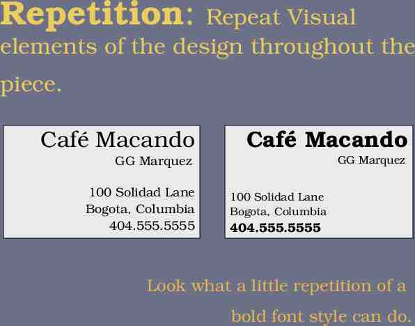
Repetition: Repeat Visual elements of the design throughout the piece. Café Macando Café Macando GG Marquez GG Marquez 100 Solidad Lane Bogota, Columbia 404.555.5555 100 Solidad Lane Bogota, Columbia 404.555.5555 Look what a little repetition of a bold font style can do.
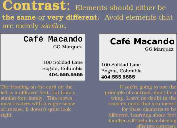
Contrast: Elements should either be the same or very different. Avoid elements that are merely similar. Café Macando GG Marquez 100 Solidad Lane Bogota, Columbia 404.555.5555 The heading on the card on the left is a different font, but from a similar font family. This leaves most readers with a vague sense of unease. It doesn’t quite look right. Café Macando GG Marquez 100 Solidad Lane Bogota, Columbia 404.555.5555 If you’re going to use the principle of contrast, don’t be a wimp. Leave no doubt in the reader’s mind that you meant for these elements to be different. Learning about font families will help in achieving effective contrast.
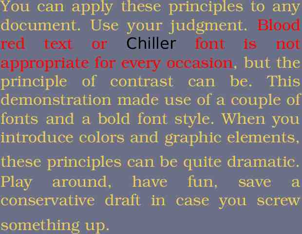
You can apply these principles to any document. Use your judgment. Blood red text or Chiller font is not appropriate for every occasion, but the principle of contrast can be. This demonstration made use of a couple of fonts and a bold font style. When you introduce colors and graphic elements, these principles can be quite dramatic. Play around, have fun, save a conservative draft in case you screw something up.