Review Slides


30 Slides536.23 KB
Review Slides
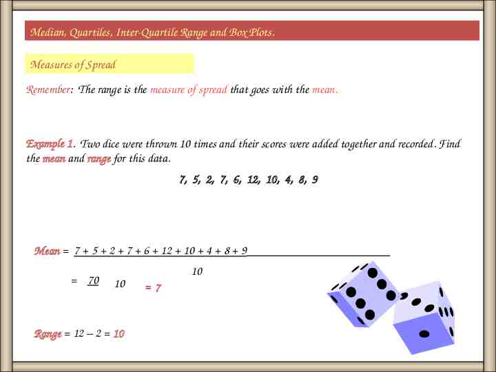
Median, Quartiles, Inter-Quartile Range and Box Plots. Measures of Spread Remember: The range is the measure of spread that goes with the mean. Example 1. Two dice were thrown 10 times and their scores were added together and recorded. Find the mean and range for this data. 7, 5, 2, 7, 6, 12, 10, 4, 8, 9 Mean 7 5 2 7 6 12 10 4 8 9 70 10 Range 12 – 2 10 10 7
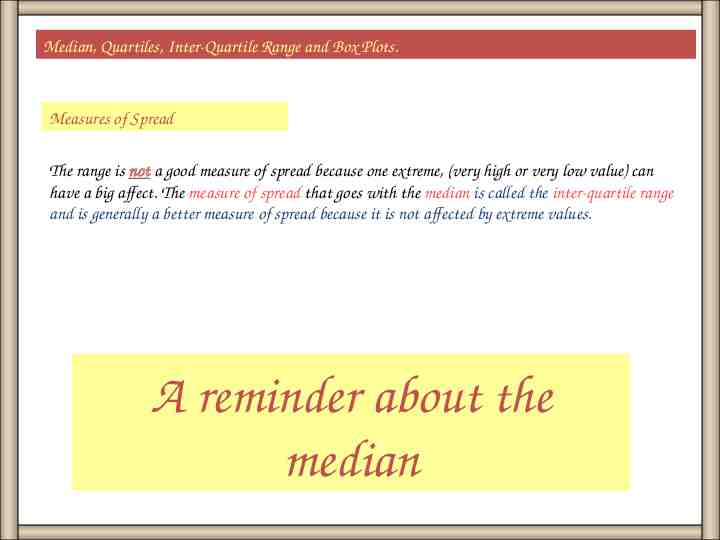
Median, Quartiles, Inter-Quartile Range and Box Plots. Measures of Spread The range is not a good measure of spread because one extreme, (very high or very low value) can have a big affect. The measure of spread that goes with the median is called the inter-quartile range and is generally a better measure of spread because it is not affected by extreme values. A reminder about the median
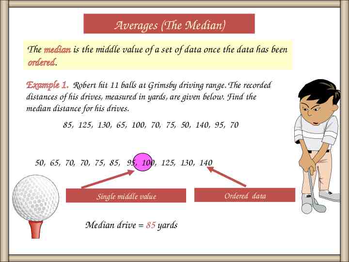
Averages (The Median) The median is the middle value of a set of data once the data has been ordered. Example 1. Robert hit 11 balls at Grimsby driving range. The recorded distances of his drives, measured in yards, are given below. Find the median distance for his drives. 85, 125, 130, 65, 100, 70, 75, 50, 140, 95, 70 50, 65, 70, 70, 75, 85, 95, 100, 125, 130, 140 Single middle value Median drive 85 yards Ordered data
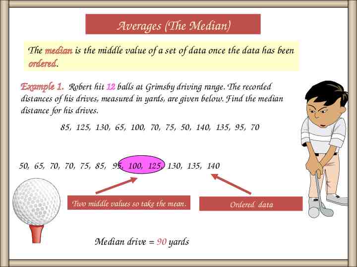
Averages (The Median) The median is the middle value of a set of data once the data has been ordered. Example 1. Robert hit 12 balls at Grimsby driving range. The recorded distances of his drives, measured in yards, are given below. Find the median distance for his drives. 85, 125, 130, 65, 100, 70, 75, 50, 140, 135, 95, 70 50, 65, 70, 70, 75, 85, 95, 100, 125, 130, 135, 140 Two middle values so take the mean. Median drive 90 yards Ordered data
Median, Quartiles, Inter-Quartile Range and Box Plots. Measures of Spread Remember: The range is the measure of spread that goes with the mean. Example 1. Two dice were thrown 10 times and their scores were added together and recorded. Find the mean and range for this data. 7, 5, 2, 7, 6, 12, 10, 4, 8, 9 Mean 7 5 2 7 6 12 10 4 8 9 70 10 Range 12 – 2 10 10 7
Median, Quartiles, Inter-Quartile Range and Box Plots. Measures of Spread The range is not a good measure of spread because one extreme, (very high or very low value) can have a big affect. The measure of spread that goes with the median is called the inter-quartile range and is generally a better measure of spread because it is not affected by extreme values. A reminder about the median
Averages (The Median) The median is the middle value of a set of data once the data has been ordered. Example 1. Robert hit 11 balls at Grimsby driving range. The recorded distances of his drives, measured in yards, are given below. Find the median distance for his drives. 85, 125, 130, 65, 100, 70, 75, 50, 140, 95, 70 50, 65, 70, 70, 75, 85, 95, 100, 125, 130, 140 Single middle value Median drive 85 yards Ordered data
Averages (The Median) The median is the middle value of a set of data once the data has been ordered. Example 1. Robert hit 12 balls at Grimsby driving range. The recorded distances of his drives, measured in yards, are given below. Find the median distance for his drives. 85, 125, 130, 65, 100, 70, 75, 50, 140, 135, 95, 70 50, 65, 70, 70, 75, 85, 95, 100, 125, 130, 135, 140 Two middle values so take the mean. Median drive 90 yards Ordered data
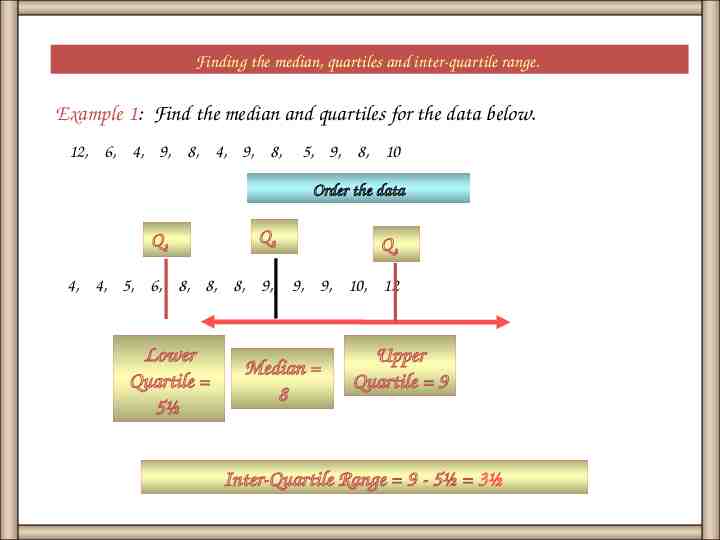
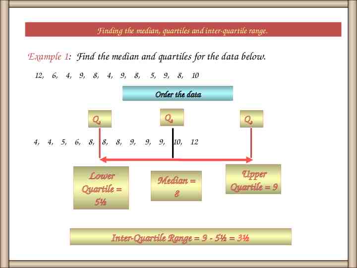
Finding the median, quartiles and inter-quartile range. Example 1: Find the median and quartiles for the data below. 12, 6, 4, 9, 8, 4, 9, 8, 5, 9, 8, 10 Order the data Q2 Q3 4, 4, 5, 6, 8, 8, 8, 9, 9, 9, 10, 12 Q1 Lower Quartile 5½ Median 8 Upper Quartile 9 Inter-Quartile Range 9 - 5½ 3½
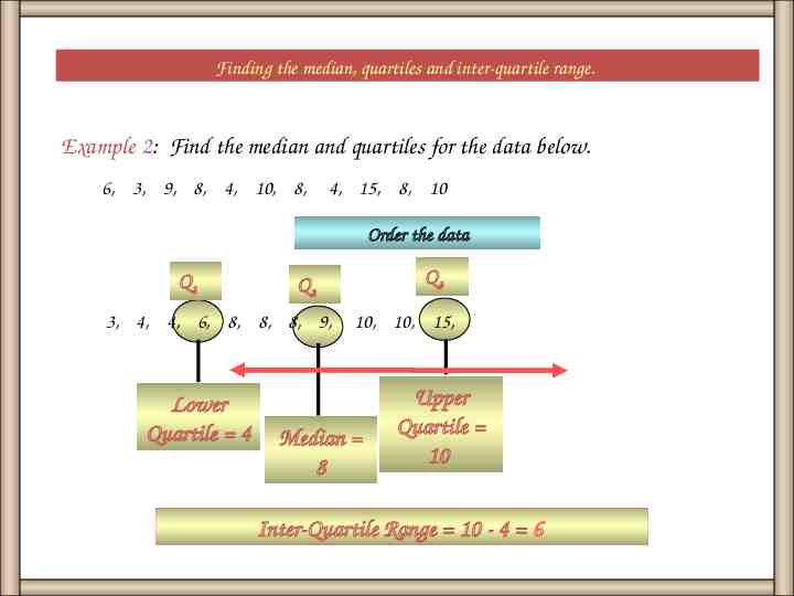
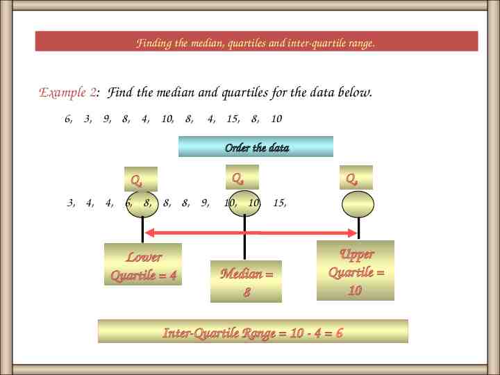
Finding the median, quartiles and inter-quartile range. Example 2: Find the median and quartiles for the data below. 6, 3, 9, 8, 4, 10, 8, 4, 15, 8, 10 Order the data Q1 3, 4, 4, 6, 8, 8, 8, 9, Lower Quartile 4 Q3 Q2 10, 10, 15, Median 8 Upper Quartile 10 Inter-Quartile Range 10 - 4 6
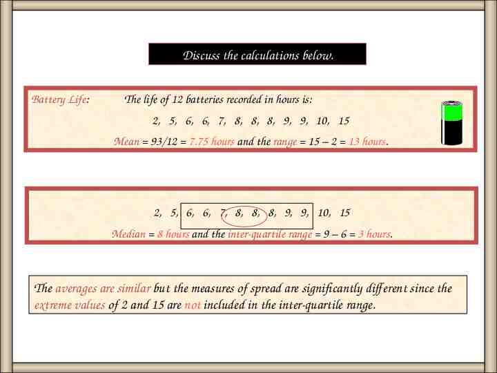
Discuss the calculations below. Battery Life: The life of 12 batteries recorded in hours is: 2, 5, 6, 6, 7, 8, 8, 8, 9, 9, 10, 15 Mean 93/12 7.75 hours and the range 15 – 2 13 hours. 2, 5, 6, 6, 7, 8, 8, 8, 9, 9, 10, 15 Median 8 hours and the inter-quartile range 9 – 6 3 hours. The averages are similar but the measures of spread are significantly different since the extreme values of 2 and 15 are not included in the inter-quartile range.
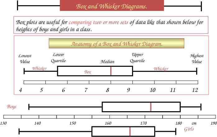
Box and Whisker Diagrams. Box plots are useful for comparing two or more sets of data like that shown below for heights of boys and girls in a class. Anatomy of a Box and Whisker Diagram. Lower Quartile Lowest Value Median Whisker 4 5 Upper Quartile Whisker Box 6 7 Highest Value 8 9 10 11 12 Boys 130 140 150 160 170 180 cm 190 Girls Box Plots
Drawing a Box Plot. Example 1: Draw a Box plot for the data below Q2 Q1 4, 4, 5, 6, 8, 8, 8, 9, 9, 9, 10, 12 Lower Quartile 5½ 4 5 Q3 Median 8 6 7 8 9 Upper Quartile 9 10 11 12
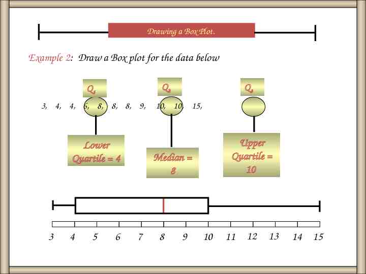
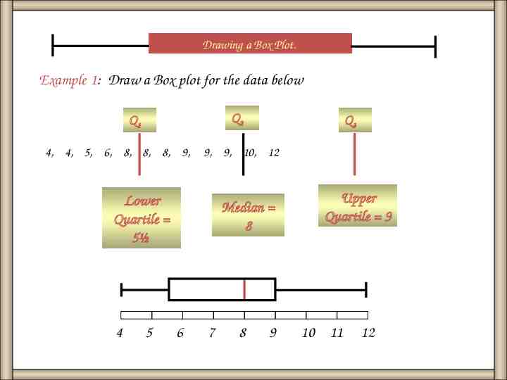
Drawing a Box Plot. Example 2: Draw a Box plot for the data below Q2 Q1 3, 4, 4, 6, 8, 8, 8, 9, Lower Quartile 4 3 4 5 6 Q3 10, 10, 15, Upper Quartile 10 Median 8 7 8 9 10 11 12 13 14 15
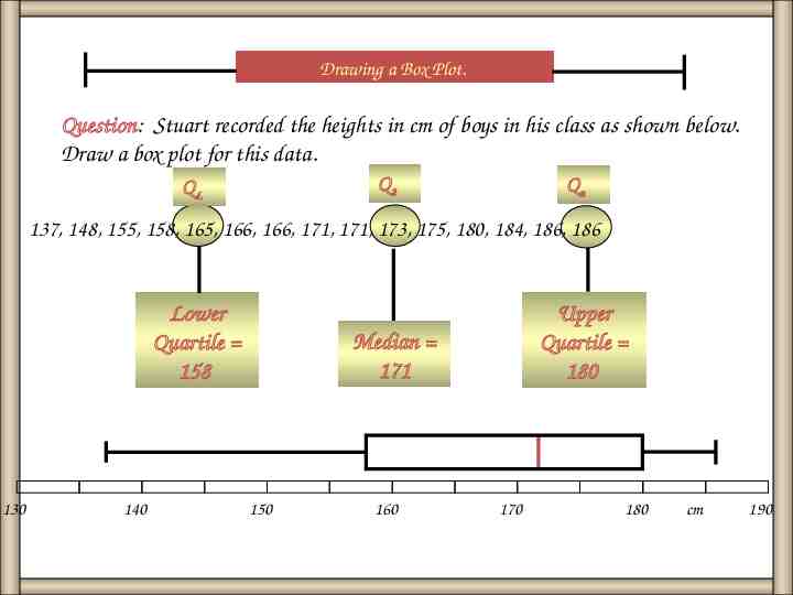
Drawing a Box Plot. Question: Stuart recorded the heights in cm of boys in his class as shown below. Draw a box plot for this data. Q2 QL Qu 137, 148, 155, 158, 165, 166, 166, 171, 171, 173, 175, 180, 184, 186, 186 Lower Quartile 158 130 140 Upper Quartile 180 Median 171 150 160 170 180 cm 190
Finding the median, quartiles and inter-quartile range. Example 1: Find the median and quartiles for the data below. 12, 6, 4, 9, 8, 4, 9, 8, 5, 9, 8, 10 Order the data Q2 Q1 4, 4, 5, 6, 8, 8, 8, 9, Lower Quartile 5½ Q3 9, 9, 10, 12 Median 8 Upper Quartile 9 Inter-Quartile Range 9 - 5½ 3½
Finding the median, quartiles and inter-quartile range. Example 2: Find the median and quartiles for the data below. 6, 3, 9, 8, 4, 10, 8, 4, 15, 8, 10 Order the data Q2 Q1 3, 4, 4, 6, 8, 8, 8, 9, Lower Quartile 4 Q3 10, 10, 15, Median 8 Upper Quartile 10 Inter-Quartile Range 10 - 4 6
Discuss the calculations below. Battery Life: The life of 12 batteries recorded in hours is: 2, 5, 6, 6, 7, 8, 8, 8, 9, 9, 10, 15 Mean 93/12 7.75 hours and the range 15 – 2 13 hours. 2, 5, 6, 6, 7, 8, 8, 8, 9, 9, 10, 15 Median 8 hours and the inter-quartile range 9 – 6 3 hours. The averages are similar but the measures of spread are significantly different since the extreme values of 2 and 15 are not included in the inter-quartile range.
Box and Whisker Diagrams. Box plots are useful for comparing two or more sets of data like that shown below for heights of boys and girls in a class. Anatomy of a Box and Whisker Diagram. Lower Quartile Lowest Value Median Whisker 4 5 Upper Quartile Whisker Box 6 7 Highest Value 8 9 10 11 12 Boys 130 140 150 160 170 180 cm 190 Girls Box Plots
Drawing a Box Plot. Example 1: Draw a Box plot for the data below Q2 Q1 4, 4, 5, 6, 8, 8, 8, 9, 9, 9, 10, 12 Lower Quartile 5½ 4 5 Q3 Median 8 6 7 8 9 Upper Quartile 9 10 11 12
Drawing a Box Plot. Example 2: Draw a Box plot for the data below Q2 Q1 3, 4, 4, 6, 8, 8, 8, 9, Lower Quartile 4 3 4 5 6 Q3 10, 10, 15, Upper Quartile 10 Median 8 7 8 9 10 11 12 13 14 15
Drawing a Box Plot. Question: Stuart recorded the heights in cm of boys in his class as shown below. Draw a box plot for this data. Q2 QL Qu 137, 148, 155, 158, 165, 166, 166, 171, 171, 173, 175, 180, 184, 186, 186 Lower Quartile 158 130 140 Upper Quartile 180 Median 171 150 160 170 180 cm 190
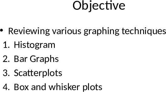
Objective Reviewing various graphing techniques 1. Histogram 2. Bar Graphs 3. Scatterplots 4. Box and whisker plots
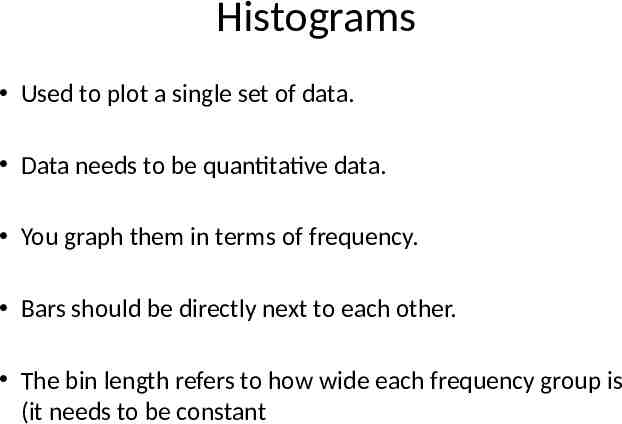
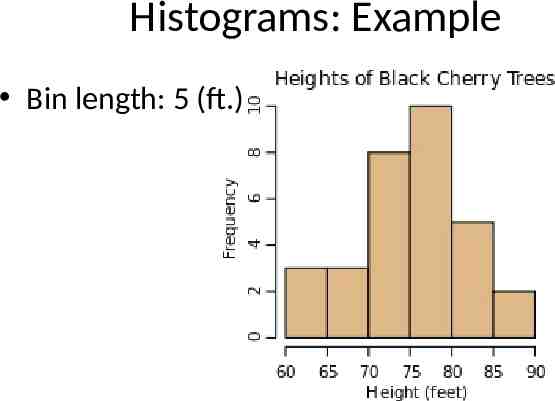
Histograms Used to plot a single set of data. Data needs to be quantitative data. You graph them in terms of frequency. Bars should be directly next to each other. The bin length refers to how wide each frequency group is (it needs to be constant
Histograms: Example Bin length: 5 (ft.)
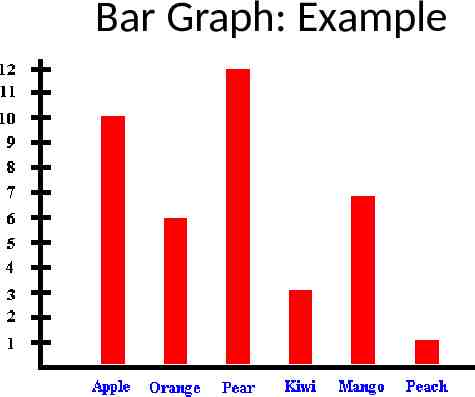
Bar Graphs Also used to graph a single set of data Data needs to be categorical Data still graphed via frequency Bars don’t touch (label under each bar)
Bar Graph: Example
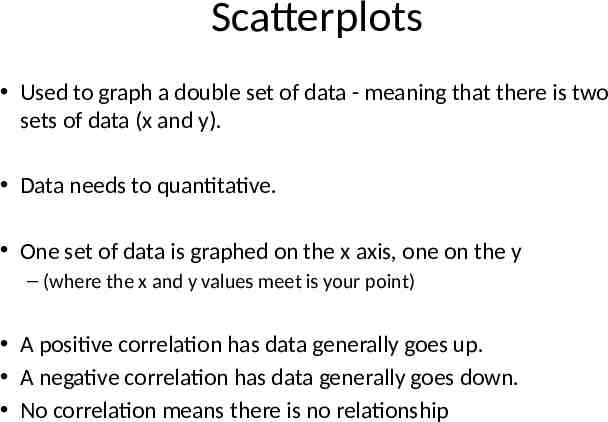
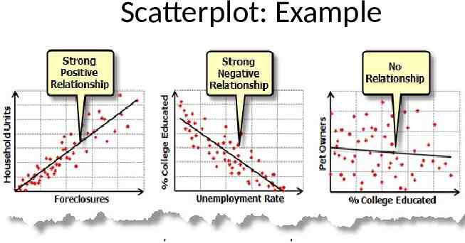
Scatterplots Used to graph a double set of data - meaning that there is two sets of data (x and y). Data needs to quantitative. One set of data is graphed on the x axis, one on the y – (where the x and y values meet is your point) A positive correlation has data generally goes up. A negative correlation has data generally goes down. No correlation means there is no relationship
Scatterplot: Example