QUANTITATIVE DATA ANALYSIS


63 Slides6.83 MB
QUANTITATIVE DATA ANALYSIS
INSTRUCTIONAL GOAL Given a data set, students will review and analyze the results using a variety of statistical tools.
INSTRUCTIONAL OBJECTIVES Describe the purpose and use of distribution charts. Review and analyze distributions and identify limits, variability, and modes.
INSTRUCTIONAL OBJECTIVES Describe the purpose and use of comparison charts. Review and analyze a comparison chart.
INSTRUCTIONAL OBJECTIVES Describe the purpose and use of Pareto charts. Review and analyze a Pareto chart.
INSTRUCTIONAL OBJECTIVES Describe the purpose and use of correlation charts. Review and analyze a correlation chart.
INSTRUCTIONAL OBJECTIVES Describe the purpose and use of control charts. Review and analyze a control chart.
DISTRIBUTION CHART Note: Histogram and Distribution charts can be attribute and variable data.
DISTRIBUTION CHARTS USES Also called a histogram - used to reveal the amount of variation within a system or process
Numbe r HOW IS MY DATA ACTUALLY DISTRIBUTED AROUND THE MEAN?
DISTRIBUTION CHARTS ALWAYS ASK
DISCUSSION: DISTRIBUTION CHARTS
DISTRIBUTION CHART - DATA SET
DISTRIBUTION CHART –SAN DIEGO PADRES
COMPARISON CHARTS
COMPARISON CHARTS Comparison charts are line/trending charts displaying multiple data sets
MAKING COMPARISONS Can assist in finding relationships and/or correlations between data sets
MAKING COMPARISONS
MAKING COMPARISONS
DISCUSSION: COMPARISON CHARTS
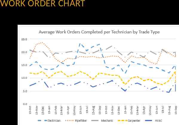
AVERAGE WORK ORDERS-DATA SET
WORK ORDER CHART
PARETO CHARTS
Normally gain more by working on the “tallest” bar
SUGGESTIONS “Drill Down” to lower-level Pareto charts
SUGGESTIONS Develop multiple Pareto charts – same problem, different perspectives
DISCUSSION: PARETO CHARTS
OCCURRENCE REPORTING SYSTEM (ORPS) CATEGORY A Identifier Description Number Reported A1 Design/Engineering 277 A2 Equipment Material 383 A3 Human Performance 688 A4 Management Problem 934 A5 Communication LTA 499 A6 Training Deficiency 161 A7 Other Problem 148
ORPS CHART
ORPS SUBCATEGORY A4 Identifier Description Number Reported A4B1 The processes used to control or direct work-related plant activities, including how manpower and material was allocated for a particular objective. Note: This cause section addresses management-controlled practices and policies, and requires that the investigator gain familiarity with the standards or expectations that exist for performing work. [See note for A4B4.] 319 A4B2 Evaluation of the processes whereby manpower and material were allocated to successfully perform assigned tasks. Note: B2 serves as an expansion to B1, Management Methods, since both B1 and B2 are important interrelated factors. B2 provides more in-depth causal nodes for evaluating manpower and material issues impacting performance of work-related activities. 106 A4B3 Problems in how the work to be performed was organized. This would include work scope, planning, assignment, and scheduling of a task to be performed. Note: While B3 addresses the organization and planning of work, failures in this node usually imply related failures in Supervisory Methods addressed in B4. 231 A4B4 Causes that can be traced back to the immediate supervision and evaluated techniques that were used to monitor, direct, and control work assignments. Note: This is supervision as a function not as a title. A manager can be the supervisor of another manager or a nonsupervisor [by title] can be functioning as a supervisor. Problems with other than immediate supervision are coded under B1, B2, or B5 [which does not say that immediate supervision problems cannot be multiple coded under those B nodes]. 114 A4B5 Problems caused by the process by which changes were controlled and implemented by management as organizational needs change to accommodate new business needs. 164
A4B CHART
CORRELATION CHARTS
CORRELATION CHARTS USES Also commonly called scatter diagrams or XY charts Used to study the possible relationship between one variable and another variable Performance metrics To influence outcomes
Degree of relatedness between variables Correlations range from 0 to 1.0
CORRELATION CHART Interpret the data
CORRELATION CHARTS CAUTIONS Correlation charts cannot prove that one variable causes the other – May make clear whether a relationship exists – Strength of that relationship More data is better
CORRELATION CHARTS Go to tab for Healthcare Example
DISCUSSION: CORRELATION CHARTS
OAAS VS. SIGNIFICANT FINDINGS-DATA SET
SIGNIFICANT FINDINGS CHART
TRAINING HOURS VS PERFORMANCE - DATA SET
PERFORMANCE CHART
WORK VS BACKLOGGED WORK ORDERS - DATA SET
WORK ORDER BACKLOG CHART
CONTROL CHARTS
CONTROL CHARTS USES Control charts are used to measure – Process variability – Whether a process is in good “statistical control” Useful for keeping processes within an established range
CONTROL CHARTS TYPES OF VARIATION
INTERPRETING CONTROL CHARTS Look for common and special causes Fluctuation results from process variation Common cause/inside the limits Special cause/outside the limits Process is in “statistical control” if it’s not being affected by special causes
INTERPRETING CONTROL CHARTS
ADDITIONAL COMMENTS Guidelines for interpreting the control chart are “guidelines” There are also practical economic limits There are often regulatory-type control limits
DISCUSSION: CONTROL CHARTS
EQUIPMENT FAILURE-DATA SET
EQUIPMENT FAILURE CHART
COOLING WATER SYSTEM FLOW-DATA SET
FLOW CHART
Questions or Comments
REVIEW HISTOGRAM A histogram reveals the amount of system or process variation. Shows the distribution to help forecast or predict
REVIEW COMPARISON CHART Comparison charts are line/trending charts that display multiple data sets Used to identify relationships among data sets Compare same units of measure, or normalize
REVIEW PARETO CHART A Pareto chart is a column or bar chart Helps to determine Focus for problem solving Good visual for displaying causal factors
REVIEW CORRELATION CHART Used to study the possible relationship between one variable and another variable Correlations can be positive, negative, or no correlation
REVIEW CONTROL CHART Control Charts display process variability Control charts are used to determine “statistical process control” Control doesn’t mean that the product or service will meet your needs Common-cause variation is inherent in the process Special-cause variation occurs because something different or unusual has occurred in the process
Questions or Comments