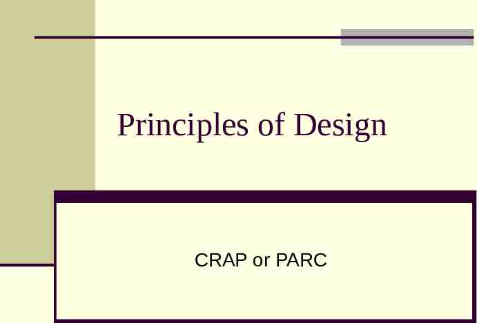
Principles of Design CRAP or PARC
55 Slides4.74 MB
Principles of Design CRAP or PARC
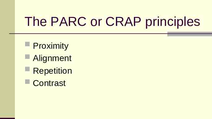
The PARC or CRAP principles Proximity Alignment Repetition Contrast
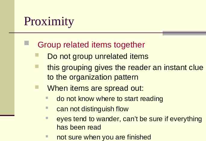
Proximity Group related items together Do not group unrelated items this grouping gives the reader an instant clue to the organization pattern When items are spread out: do not know where to start reading can not distinguish flow eyes tend to wander, can’t be sure if everything has been read not sure when you are finished
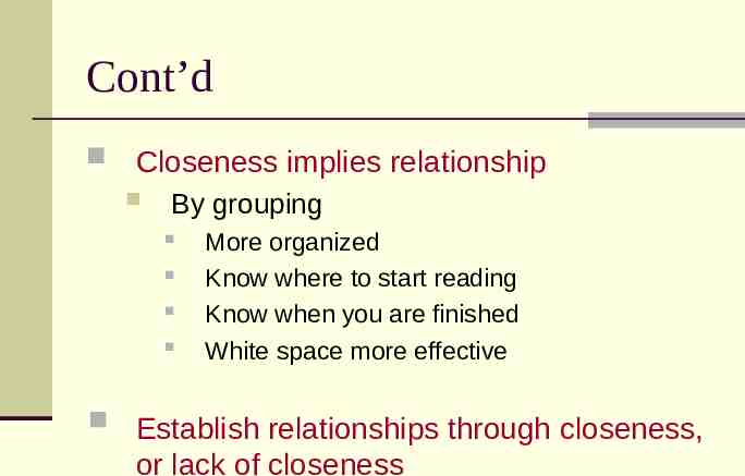
Cont’d Closeness implies relationship By grouping More organized Know where to start reading Know when you are finished White space more effective Establish relationships through closeness, or lack of closeness
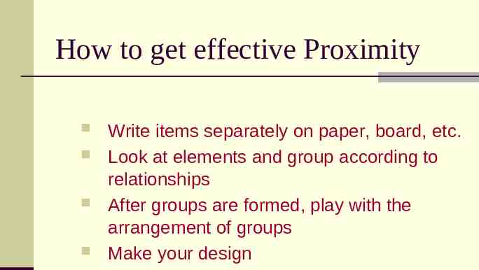
How to get effective Proximity Write items separately on paper, board, etc. Look at elements and group according to relationships After groups are formed, play with the arrangement of groups Make your design
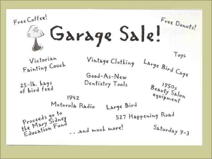
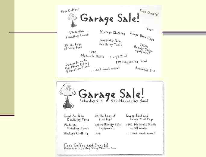
Analyze Proximity Look at the garage sale flyer that you created. Analyze the proximities of your items and answer the following questions. Are there examples of good proximity in your flyer? Where? Explain why these are good uses of proximity. Are there examples of poor proximity? Where? Explain why these are poor uses of proximity. Make revisions the your flyer, improving your use of proximity.
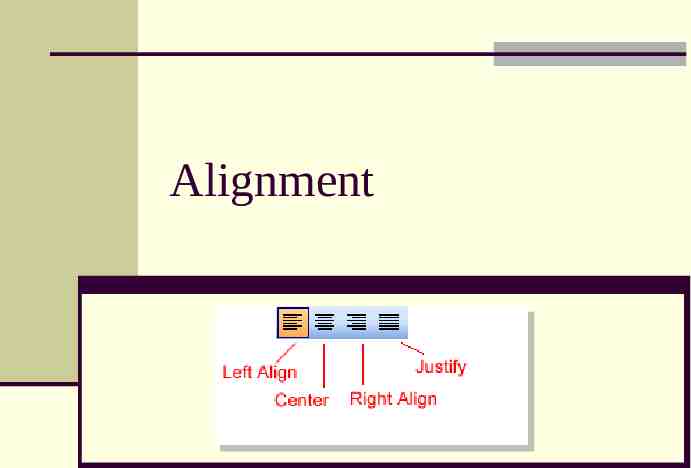
Alignment
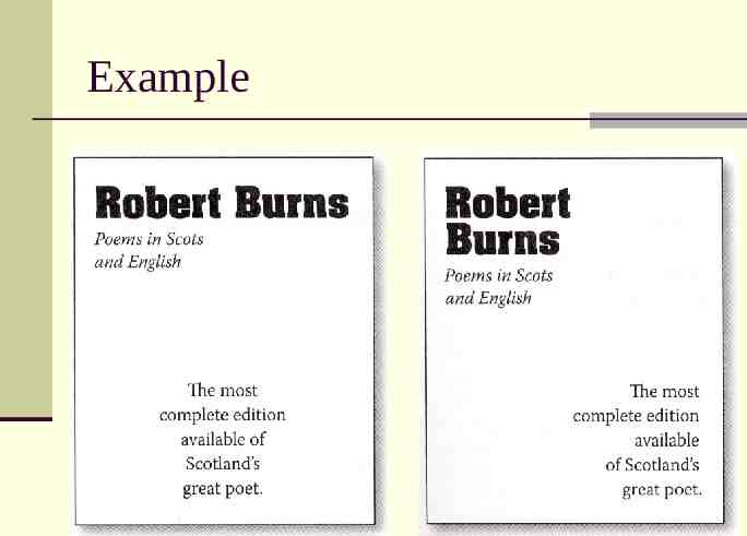
Alignment The principle of Alignment states that: Nothing should be placed on the page arbitrarily (randomly). EVERY item on the page should have a visual connection with something else on the page.
Using alignment: forces the designer to be conscious of what he/she is doing. When items are aligned, it creates a stronger, cohesive unit.
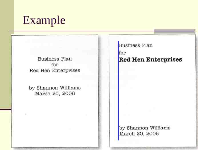
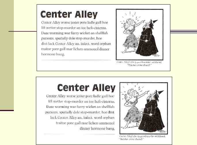
Example
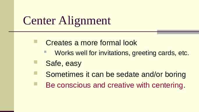
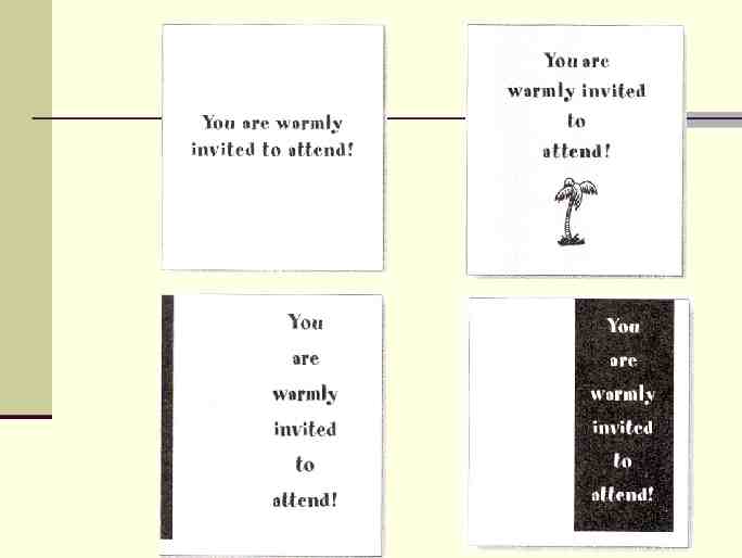
Center Alignment Creates a more formal look Works well for invitations, greeting cards, etc. Safe, easy Sometimes it can be sedate and/or boring Be conscious and creative with centering.
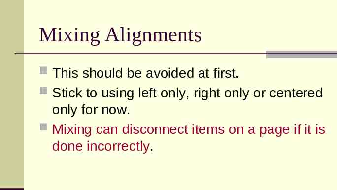
Mixing Alignments This should be avoided at first. Stick to using left only, right only or centered only for now. Mixing can disconnect items on a page if it is done incorrectly.
Example
White Space Don’t forget to watch your white space Outside white space can add an invisible border, strengthening alignment. Interior white space can strengthen lines, or push items apart if used incorrectly.
Summary of Alignment Every item on the page should have a visual connection with some other item. Find a strong line and use it. Basic purpose is to unify and organize. Be conscious of where you place things. Avoid using more than one alignment. Be careful with centering. Watch your white space
Analyze Alignment Look at the garage sale flyer that you created. Analyze the alignments that you used and answer the following questions. Are there examples of good alignment in your flyer? Where? Explain why these are good uses of alignment. Are there examples of poor alignment? Where? Explain why these are poor uses of alignment. Make revisions the your flyer, improving your use of alignment.
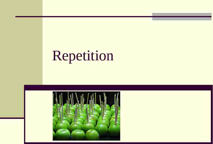
Repetition
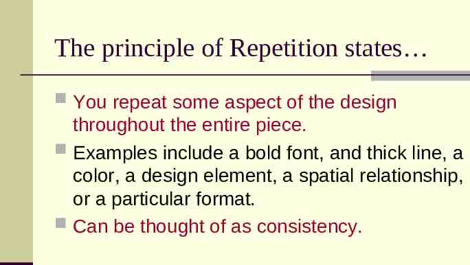
The principle of Repetition states You repeat some aspect of the design throughout the entire piece. Examples include a bold font, and thick line, a color, a design element, a spatial relationship, or a particular format. Can be thought of as consistency.
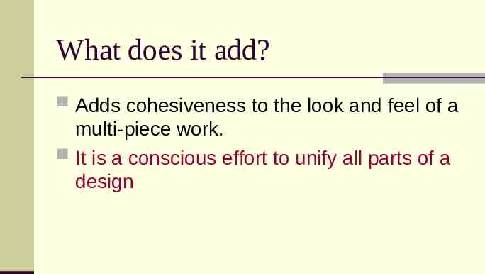
What does it add? Adds cohesiveness to the look and feel of a multi-piece work. It is a conscious effort to unify all parts of a design
Where to find it? Take an existing element and push it further. Don’t be afraid to be bold, creative and original.
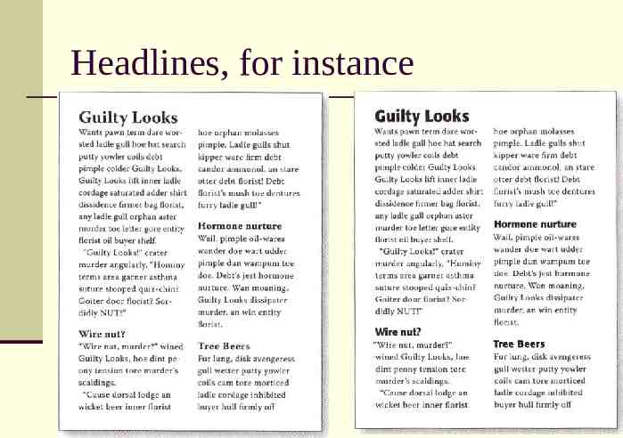
Headlines, for instance
Multi-page publications Repetition is a major factor in the unity of pages throughout a multi-page publication. A reader should be able to instantly tell that pages 7 and 12 are from the same document.
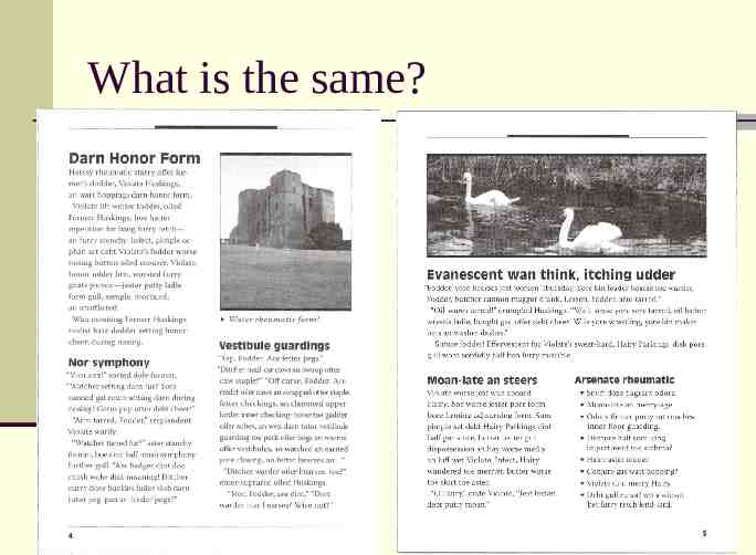
What is the same?
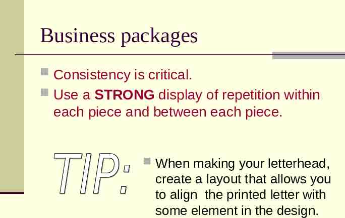
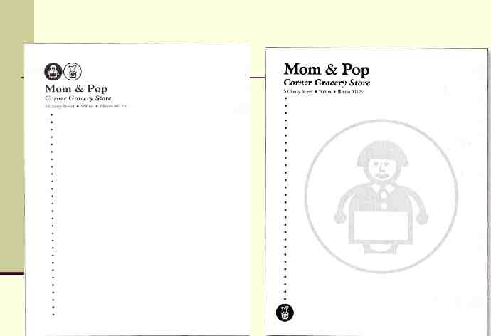
Business packages Consistency is critical. Use a STRONG display of repetition within each piece and between each piece. When making your letterhead, create a layout that allows you to align the printed letter with some element in the design.
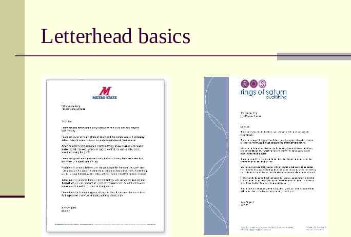
Letterhead basics
Organization Helps guide the reader through the piece. Helps unify parts of the design that might otherwise be disconnected.
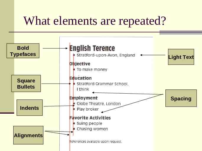
What elements are repeated? Bold Typefaces Light Text Square Bullets Spacing Indents Alignments
Any element can work If there is an element that interests you, go with it. Try as many ideas as you can. Don’t just use large or obvious elements. Using small elements can be just as effective. The objects do not have to be exactly the same, but they must be similar enough. You can even add something completely new just for the sake of repetition.
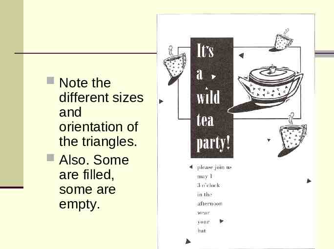
Note the different sizes and orientation of the triangles. Also. Some are filled, some are empty.
New from old You can often pull an element from an existing design and create a new design based on that element. Just find an element that you like and play with it.
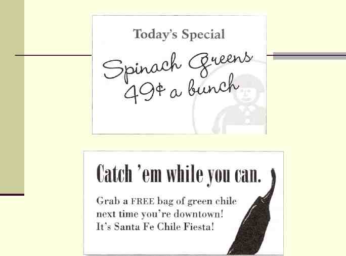
Less is more The suggestion of a repeated design can be enough. In other words, it may not be necessary to repeat the entire element, just a part of it.
Summary Basic purpose Unify and add visual interest Strengthen a piece and tie it together How to get it Take an existing element and push it further. Don’t be afraid to experiment. What to avoid Avoid repeating the element so much that it becomes annoying, or overpowering.
Analyze Repetition Identify two types of repetition in your existing designs. Are these two examples of repetition used effectively? Could they be made more effective? If so, then do so. Create a new element in your design and repeat it in an effective way.
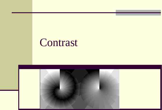
Contrast
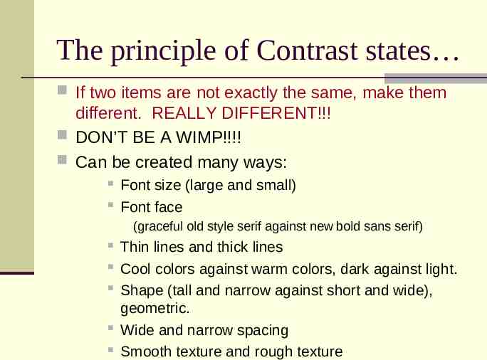
The principle of Contrast states If two items are not exactly the same, make them different. REALLY DIFFERENT!!! DON’T BE A WIMP!!!! Can be created many ways: Font size (large and small) Font face (graceful old style serif against new bold sans serif) Thin lines and thick lines Cool colors against warm colors, dark against light. Shape (tall and narrow against short and wide), geometric. Wide and narrow spacing Smooth texture and rough texture
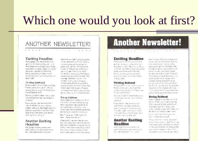
Which one would you look at first?
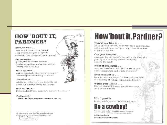
Compare/Contrast Both news letters are neat. Both are arranged the same. The info is the same. The difference is the contrast.
Organization A reader should be able to glance at a document and understand what is going on. Information can be organized, but blend together. This can make the content unclear at first.
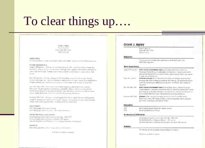
To clear things up .
Make it obvious . Elements that are made to contrast may not contrast enough. To repeat, DON’T BE A WIMP. Make the contrast as obvious as possible. Wimpy contrast can look like a mistake.
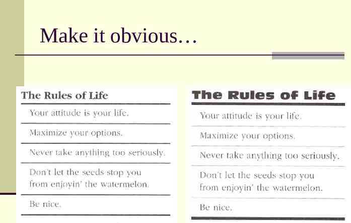
Make it obvious
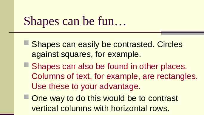
Shapes can be fun Shapes can easily be contrasted. Circles against squares, for example. Shapes can also be found in other places. Columns of text, for example, are rectangles. Use these to your advantage. One way to do this would be to contrast vertical columns with horizontal rows.
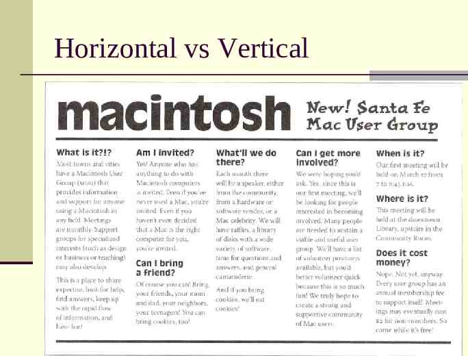
Horizontal vs Vertical
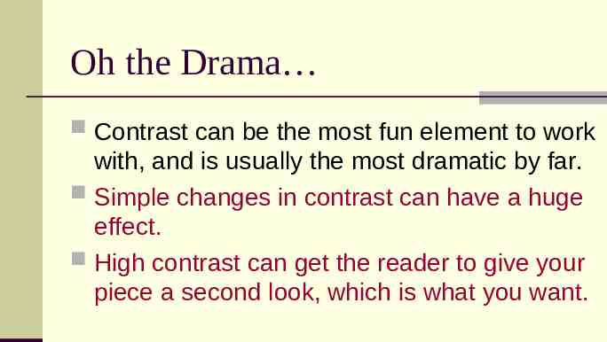
Oh the Drama Contrast can be the most fun element to work with, and is usually the most dramatic by far. Simple changes in contrast can have a huge effect. High contrast can get the reader to give your piece a second look, which is what you want.
Emphasize the important things Find the most important things on the page and emphasize them.
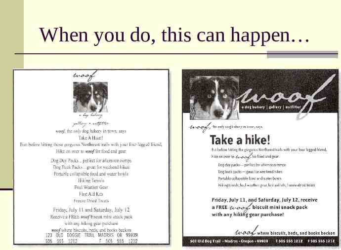
When you do, this can happen
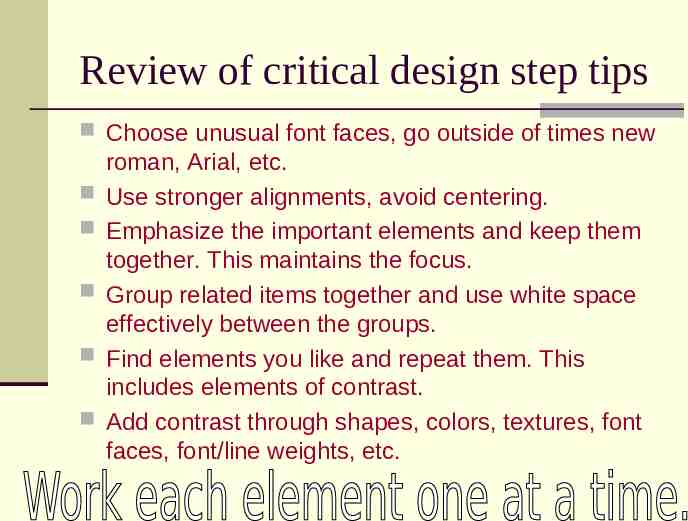
Review of critical design step tips Choose unusual font faces, go outside of times new roman, Arial, etc. Use stronger alignments, avoid centering. Emphasize the important elements and keep them together. This maintains the focus. Group related items together and use white space effectively between the groups. Find elements you like and repeat them. This includes elements of contrast. Add contrast through shapes, colors, textures, font faces, font/line weights, etc.
Analyze Contrast Look at the garage sale flyer that you created. Analyze the contrast that you used and answer the following questions. Are there examples of good contrast in your flyer? Where? What kind? Explain why these are good uses of contrast. Are there examples of poor contrast? Where? Explain why these are poor uses of contrast. Make revisions to your flyer, improving your use of contrast.