Data visualization in Python Martijn Tennekes, Ali Hürriyetoglu THE
26 Slides3.25 MB
Data visualization in Python Martijn Tennekes, Ali Hürriyetoglu THE CONTRACTOR IS ACTING UNDER A FRAMEWORK CONTRACT CONCLUDED WITH THE COMMISSION Eurostat
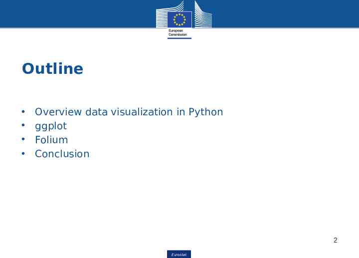
Outline Overview data visualization in Python ggplot Folium Conclusion 2 Eurostat Eurostat
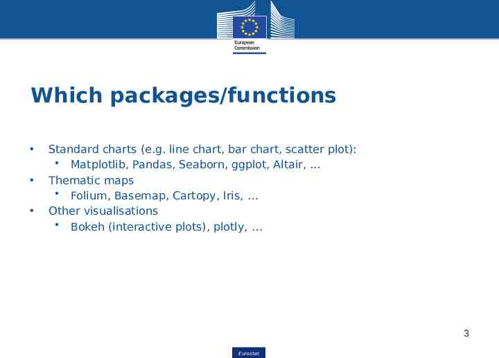
Which packages/functions Standard charts (e.g. line chart, bar chart, scatter plot): Matplotlib, Pandas, Seaborn, ggplot, Altair, . Thematic maps Folium, Basemap, Cartopy, Iris, Other visualisations Bokeh (interactive plots), plotly, 3 Eurostat Eurostat
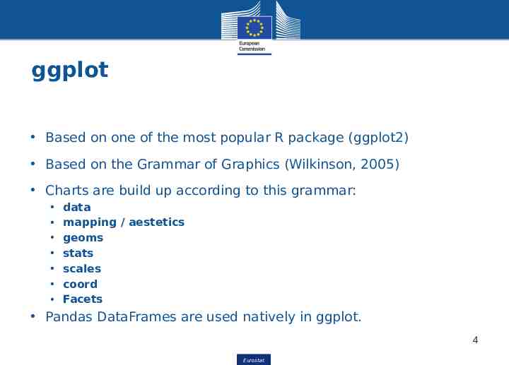
ggplot Based on one of the most popular R package (ggplot2) Based on the Grammar of Graphics (Wilkinson, 2005) Charts are build up according to this grammar: data mapping / aestetics geoms stats scales coord Facets Pandas DataFrames are used natively in ggplot. 4 Eurostat Eurostat
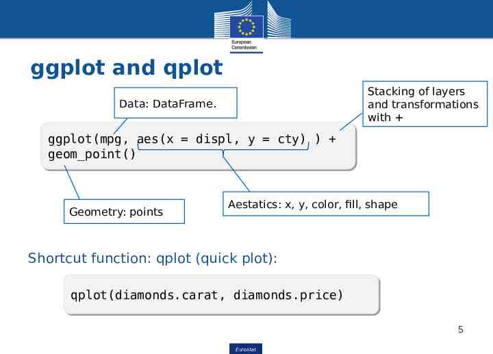
ggplot and qplot Stacking of layers and transformations with Data: DataFrame. ggplot(mpg, ggplot(mpg, aes(x aes(x displ, displ, yy cty) cty) )) geom point() geom point() Geometry: points Aestatics: x, y, color, fill, shape Shortcut function: qplot (quick plot): qplot(diamonds.carat, qplot(diamonds.carat, diamonds.price) diamonds.price) 5 Eurostat Eurostat
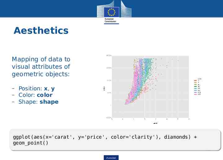
Aesthetics Mapping of data to visual attributes of geometric objects: – Position: x, y – Color: color – Shape: shape ggplot(aes(x 'carat', ggplot(aes(x 'carat', y 'price', y 'price', color 'clarity'), color 'clarity'), diamonds) diamonds) geom point() geom point() 6 Eurostat Eurostat
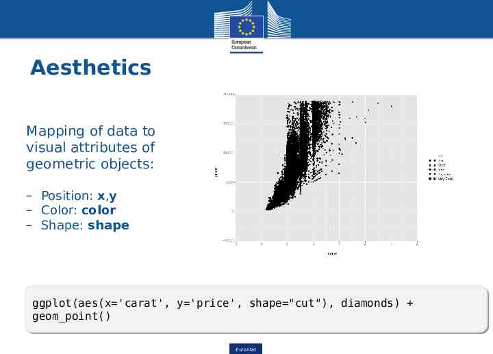
Aesthetics Mapping of data to visual attributes of geometric objects: – Position: x,y – Color: color – Shape: shape ggplot(aes(x 'carat', ggplot(aes(x 'carat', y 'price', y 'price', shape "cut"), shape "cut"), diamonds) diamonds) geom point() geom point() 7 Eurostat Eurostat
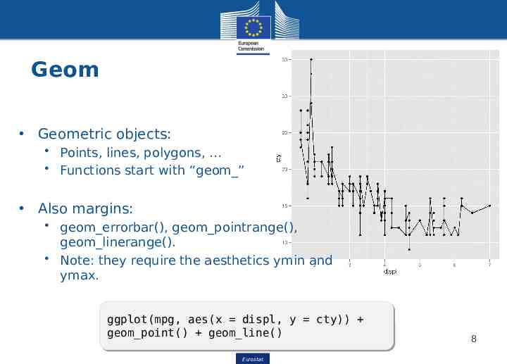
Geom Geometric objects: Points, lines, polygons, Functions start with “geom ” Also margins: geom errorbar(), geom pointrange(), geom linerange(). Note: they require the aesthetics ymin and ymax. ggplot(mpg, ggplot(mpg, aes(x aes(x displ, displ, yy cty)) cty)) geom point() geom point() geom line() geom line() Eurostat Eurostat 8
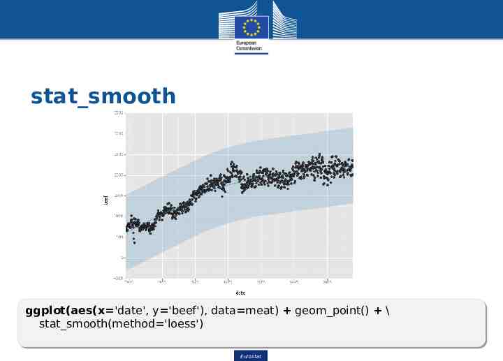
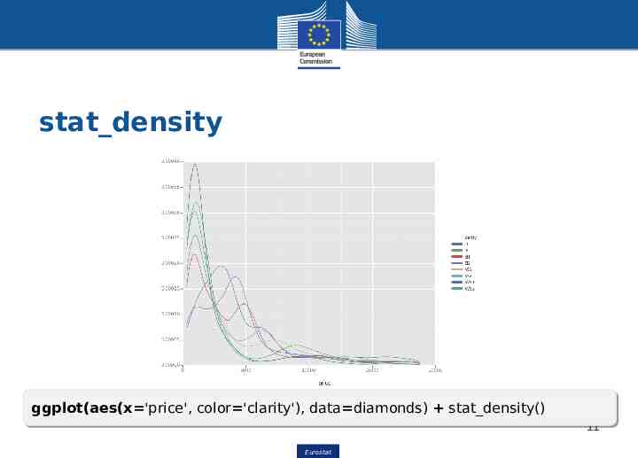
Stat stat smooth() and stat density() enable statistical transformation Most geoms have default stat (and the other way round) geom and stat form a layer One or more layers form a plot 9 Eurostat Eurostat
stat smooth ggplot(aes(x 'date', ggplot(aes(x 'date', y 'beef'), y 'beef'), data meat) data meat) geom point() geom point() \\ stat smooth(method 'loess') stat smooth(method 'loess') Eurostat Eurostat 10
stat density ggplot(aes(x 'price', ggplot(aes(x 'price', color 'clarity'), color 'clarity'), data diamonds) data diamonds) stat density() stat density() 11 Eurostat Eurostat
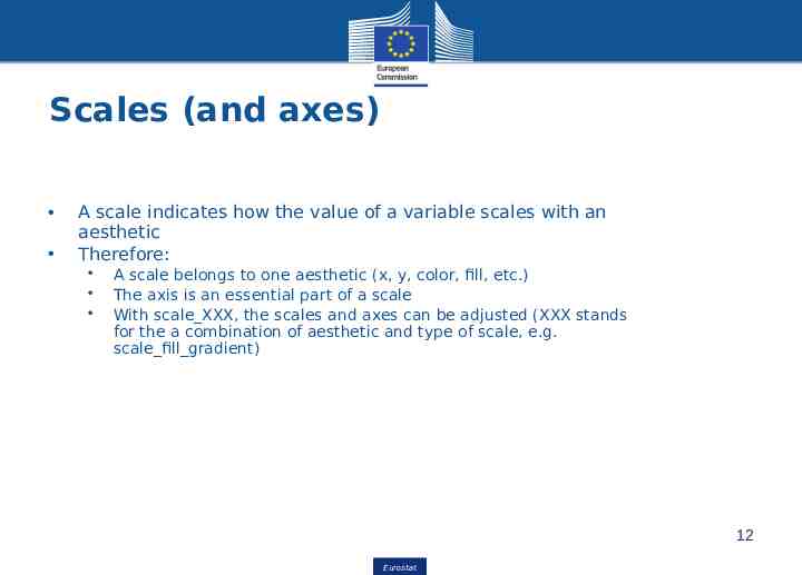
Scales (and axes) A scale indicates how the value of a variable scales with an aesthetic Therefore: A scale belongs to one aesthetic (x, y, color, fill, etc.) The axis is an essential part of a scale With scale XXX, the scales and axes can be adjusted (XXX stands for the a combination of aesthetic and type of scale, e.g. scale fill gradient) 12 Eurostat Eurostat
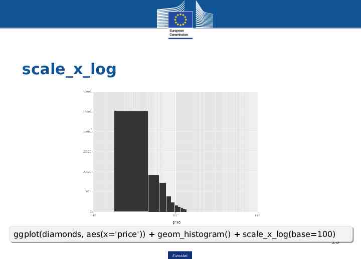
scale x log ggplot(diamonds, ggplot(diamonds, aes(x 'price')) aes(x 'price')) geom histogram() geom histogram() scale x log(base 100) scale x log(base 100) 13 Eurostat Eurostat
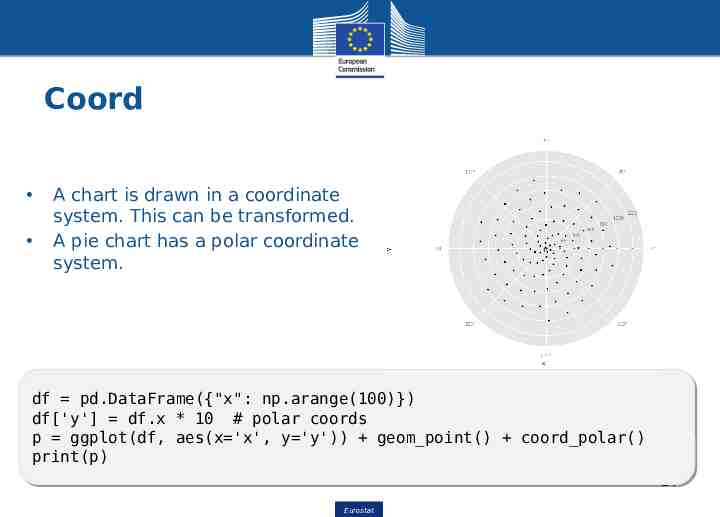
Coord A chart is drawn in a coordinate system. This can be transformed. A pie chart has a polar coordinate system. df df pd.DataFrame({"x": pd.DataFrame({"x": np.arange(100)}) np.arange(100)}) df['y'] df['y'] df.x df.x ** 10 10 ## polar polar coords coords pp ggplot(df, ggplot(df, aes(x 'x', aes(x 'x', y 'y')) y 'y')) geom point() geom point() coord polar() coord polar() print(p) print(p) 14 Eurostat Eurostat
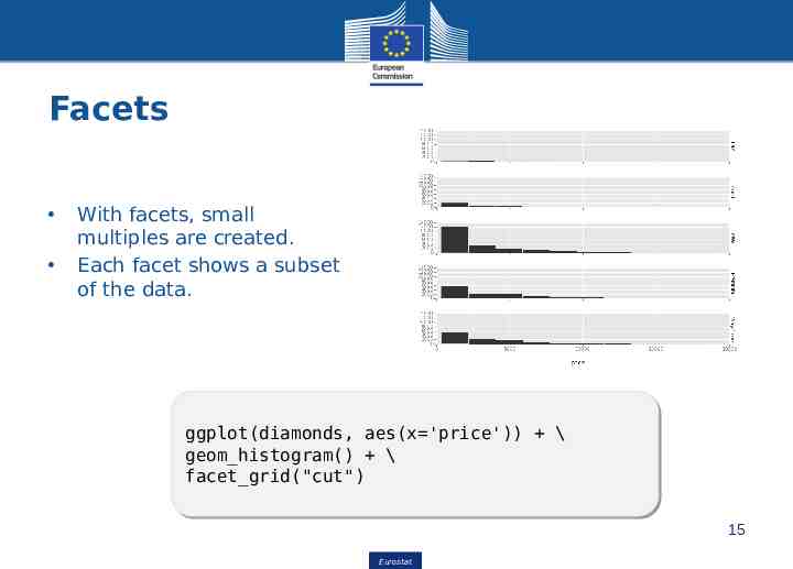
Facets With facets, small multiples are created. Each facet shows a subset of the data. ggplot(diamonds, ggplot(diamonds, aes(x 'price')) aes(x 'price')) \\ geom histogram() geom histogram() \\ facet grid("cut") facet grid("cut") 15 Eurostat Eurostat
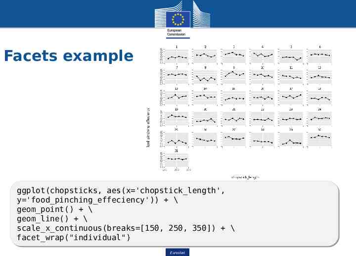
Facets example ggplot(chopsticks, ggplot(chopsticks, aes(x 'chopstick length', aes(x 'chopstick length', y 'food pinching effeciency')) y 'food pinching effeciency')) \\ geom point() geom point() \\ geom line() geom line() \\ scale x continuous(breaks [150, scale x continuous(breaks [150, 250, 250, 350]) 350]) \\ facet wrap("individual") facet wrap("individual") Eurostat Eurostat 16
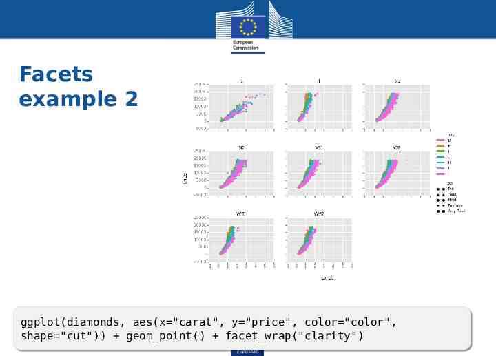
Facets example 2 ggplot(diamonds, ggplot(diamonds, aes(x "carat", aes(x "carat", y "price", y "price", color "color", color "color", shape "cut")) shape "cut")) geom point() geom point() facet wrap("clarity") facet wrap("clarity") Eurostat Eurostat 17
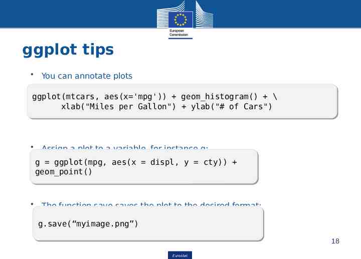
ggplot tips You can annotate plots ggplot(mtcars, ggplot(mtcars, aes(x 'mpg')) aes(x 'mpg')) geom histogram() geom histogram() \\ xlab("Miles xlab("Miles per per Gallon") Gallon") ylab("# ylab("# of of Cars") Cars") Assign a plot to a variable, for instance g: gg ggplot(mpg, ggplot(mpg, aes(x aes(x displ, displ, yy cty)) cty)) geom point() geom point() The function save saves the plot to the desired format: g.save(“myimage.png”) g.save(“myimage.png”) 18 Eurostat Eurostat
Folium: Thematic maps A thematic map is a visualization where statistical information with a spatial component is shown. Other libraries are: Basemap, Cartopy, Iris Folium builds on the data wrangling strengths of the Python ecosystem and the mapping strengths of the Leaflet.js library. Manipulate your data in Python, then visualize it in on a Leaflet map via Folium. 19 Eurostat Eurostat
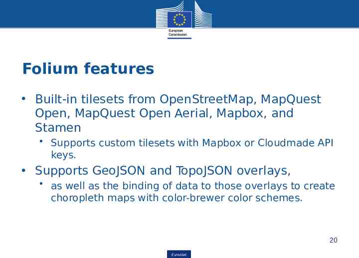
Folium features Built-in tilesets from OpenStreetMap, MapQuest Open, MapQuest Open Aerial, Mapbox, and Stamen Supports custom tilesets with Mapbox or Cloudmade API keys. Supports GeoJSON and TopoJSON overlays, as well as the binding of data to those overlays to create choropleth maps with color-brewer color schemes. 20 Eurostat Eurostat
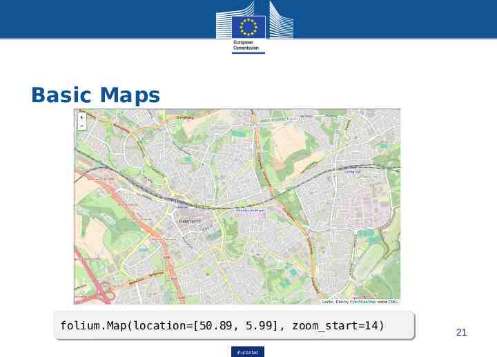
Basic Maps folium.Map(location [50.89, folium.Map(location [50.89, 5.99], 5.99], zoom start 14) zoom start 14) Eurostat Eurostat 21
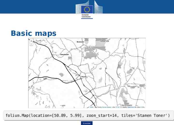
Basic maps folium.Map(location [50.89, folium.Map(location [50.89, 5.99], 5.99], zoom start 14, zoom start 14, tiles 'Stamen tiles 'Stamen Toner') Toner') 22 Eurostat Eurostat
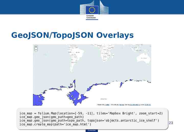
GeoJSON/TopoJSON Overlays ice map ice map folium.Map(location [-59, folium.Map(location [-59, -11], -11], tiles 'Mapbox tiles 'Mapbox Bright', Bright', zoom start 2) zoom start 2) ice map.geo json(geo path geo path) ice map.geo json(geo path geo path) ice map.geo json(geo path topo path, ice map.geo json(geo path topo path, topojson 'objects.antarctic ice shelf') topojson 'objects.antarctic ice shelf') ice map.create map(path 'ice map.html') ice map.create map(path 'ice map.html') Eurostat Eurostat 23
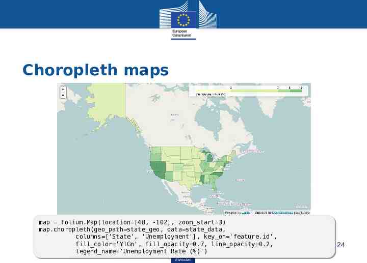
Choropleth maps map map folium.Map(location [48, folium.Map(location [48, -102], -102], zoom start 3) zoom start 3) map.choropleth(geo path state geo, map.choropleth(geo path state geo, data state data, data state data, columns ['State', columns ['State', 'Unemployment'], 'Unemployment'], key on 'feature.id', key on 'feature.id', fill color 'YlGn', fill opacity 0.7, fill color 'YlGn', fill opacity 0.7, line opacity 0.2, line opacity 0.2, legend name 'Unemployment legend name 'Unemployment Rate Rate (%)') (%)') Eurostat Eurostat 24
Summary Python has many options for data visualization Each visualisation library has a particular audience Javascript backend is mostly used to extend power of the visualisation Python’s extensive data processing tools integrates well with visualisation requirements 25 Eurostat Eurostat
References http://yhat.github.io/ggplot/ https://folium.readthedocs.io/en/latest/ 26 Eurostat Eurostat