Report Design & Data Monitor using Crystal Dashboard Design EGN
62 Slides3.39 MB
Report Design & Data Monitor using Crystal Dashboard Design EGN 5622 Enterprise Systems Integration Spring, 2012
Report Design & Data Monitor using Crystal Dashboard Design Concepts and Theory
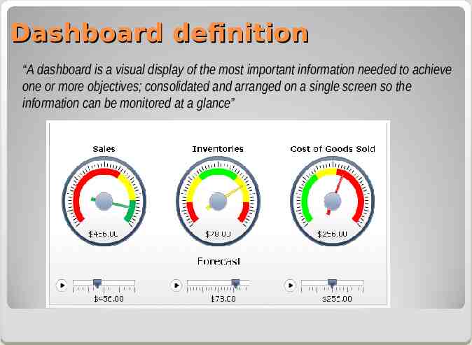
Dashboard definition “A dashboard is a visual display of the most important information needed to achieve one or more objectives; consolidated and arranged on a single screen so the information can be monitored at a glance”
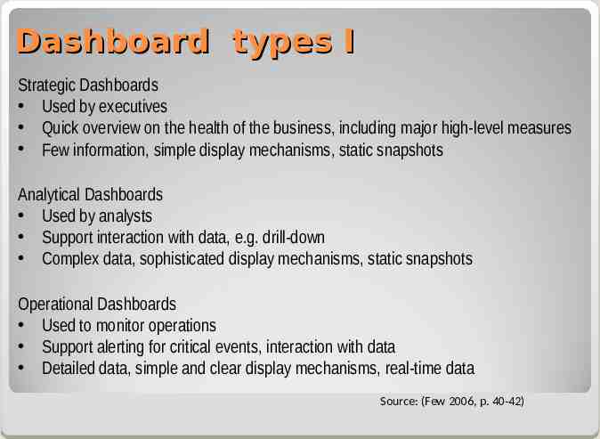
Dashboard types I Strategic Dashboards Used by executives Quick overview on the health of the business, including major high-level measures Few information, simple display mechanisms, static snapshots Analytical Dashboards Used by analysts Support interaction with data, e.g. drill-down Complex data, sophisticated display mechanisms, static snapshots Operational Dashboards Used to monitor operations Support alerting for critical events, interaction with data Detailed data, simple and clear display mechanisms, real-time data Source: (Few 2006, p. 40-42)
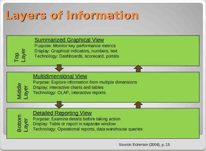
Layers of information Top Layer Summarized Graphical View Purpose: Monitor key performance metrics Display: Graphical indicators, numbers, text Technology: Dashboards, scorecard, portals Bottom Layer Middle Layer Multidimensional View Purpose: Explore information from multiple dimensions Display: Interactive charts and tables Technology: OLAP, interactive reports Detailed Reporting View Purpose: Examine details before taking action Display: Table or report in separate window Technology: Operational reports, data warehouse queries Source: Eckerson (2006), p. 15
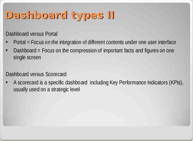
Dashboard types II Dashboard versus Portal Portal Focus on the integration of different contents under one user interface Dashboard Focus on the compression of important facts and figures on one single screen Dashboard versus Scorecard A scorecard is a specific dashboard including Key Performance Indicators (KPIs), usually used on a strategic level
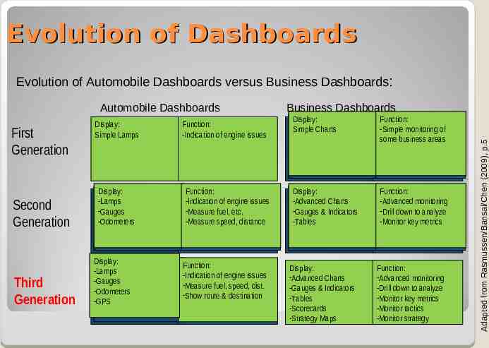
Evolution of Dashboards Evolution of Automobile Dashboards versus Business Dashboards: First Generation Second Generation Third Generation Business Dashboards Display: Simple Lamps Function: -Indication of engine issues Display: Display: Display: Simple Charts Charts Simple Simple Charts Function: Function: Function: -Simple monitoring monitoring of -Simple -Simple monitoring ofof some business areas somebusiness businessareas areas some Display: Display: Display: -Lamps -Lamps -Lamps --Gauges Gauges -Gauges -Odometers Odometers -Odometers Function: Function: Function: -Indication of of engine engine issues issues -Indication -Indication of engine issues fuel, etc. etc. --Measure Measurefuel, fuel, -Measure etc. -Measure speed, distance -Measurespeed, speed,distance distance -Measure Display: Display: Display: -Advanced Charts Charts -Advanced -Advanced Charts & Indicators Indicators --Gauges Gauges&& -Gauges Indicators -Tables -Tables -Tables Function: Function: Function: -Advanced monitoring monitoring -Advanced -Advanced monitoring down to to analyze analyze --Drill Drilldown down -Drill to analyze -Monitor key metrics -Monitorkey keymetrics metrics -Monitor Display: Display: -Display: Lamps -Lamps -Lamps -Gauges -Gauges -Gauges -Odometers -Odometers -Odometers -GPS -GPS -GPS Function: Function: of engine engine issues issues --Indication Indication of fuel, speed, speed, dist. dist. --Measure Measure fuel, --Show Show route route & & destination destination Display: -Advanced Charts -Gauges & Indicators -Tables -Scorecards -Strategy Maps Function: -Advanced monitoring -Drill down to analyze -Monitor key metrics -Monitor tactics -Monitor strategy Adapted from Rasmussen/Bansal/Chen (2009), p.5 Automobile Dashboards
Report Design & Data Monitor using Crystal Dashboard Design SAP Implementation
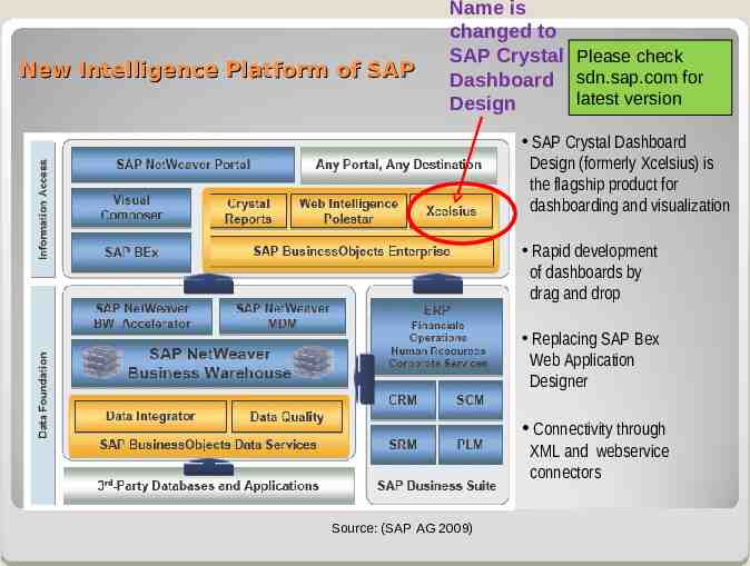
New Intelligence Platform of SAP Name is changed to SAP Crystal Please check Dashboard sdn.sap.com for latest version Design SAP Crystal Dashboard Design (formerly Xcelsius) is the flagship product for dashboarding and visualization Rapid development of dashboards by drag and drop Replacing SAP Bex Web Application Designer Connectivity through XML and webservice connectors Source: (SAP AG 2009)
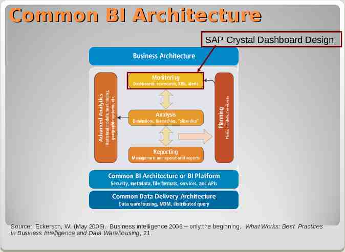
Common BI Architecture SAP Crystal Dashboard Design Source: Eckerson, W. (May 2006). Business intelligence 2006 – only the beginning. What Works: Best Practices in Business Intelligence and Data Warehousing, 21.
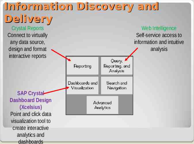
Information Discovery and Delivery Crystal Reports Connect to virtually any data source, design and format interactive reports SAP Crystal Dashboard Design (Xcelsius) Point and click data visualization tool to create interactive analytics and dashboards Web Intelligence Self-service access to information and intuitive analysis
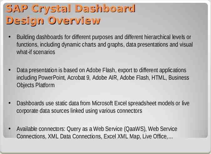
SAP Crystal Dashboard Design Overview Building dashboards for different purposes and different hierarchical levels or functions, including dynamic charts and graphs, data presentations and visual what-if scenarios Data presentation is based on Adobe Flash, export to different applications including PowerPoint, Acrobat 9, Adobe AIR, Adobe Flash, HTML, Business Objects Platform Dashboards use static data from Microsoft Excel spreadsheet models or live corporate data sources linked using various connectors Available connectors: Query as a Web Service (QaaWS), Web Service Connections, XML Data Connections, Excel XML Map, Live Office,
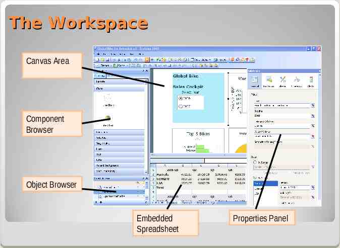
The Workspace Canvas Area Component Browser Object Browser Embedded Spreadsheet Properties Panel
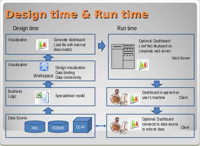
Design time & Run time Design time Visualization Run time Generate dashboard (.swf file with internal data model) Optional: Dashboard (.swf file) deployed on corporate web server Web Server Visualization Design visualization Data binding Workspace Data connectivity Business Logic Spreadsheet model Data Source XML RDBMS OLAP Dashboard is opened on user‘s machine Client Optional: Dashboard connects to data source Client to refresh data
SAP Crystal Dashboard Design and MVC (Model View Control) pattern Controller View (before adjustment) View (after adjustment) Model
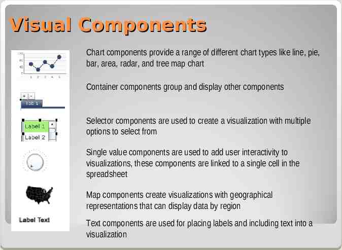
Visual Components Chart components provide a range of different chart types like line, pie, bar, area, radar, and tree map chart Container components group and display other components Selector components are used to create a visualization with multiple options to select from Single value components are used to add user interactivity to visualizations, these components are linked to a single cell in the spreadsheet Map components create visualizations with geographical representations that can display data by region Text components are used for placing labels and including text into a visualization
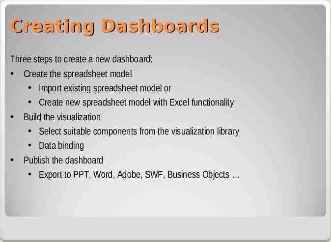
Creating Dashboards Three steps to create a new dashboard: Create the spreadsheet model Import existing spreadsheet model or Create new spreadsheet model with Excel functionality Build the visualization Select suitable components from the visualization library Data binding Publish the dashboard Export to PPT, Word, Adobe, SWF, Business Objects
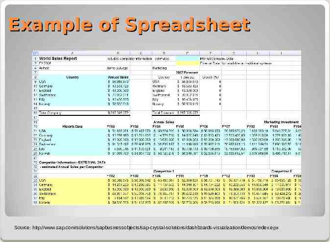
Example of Spreadsheet Source: http://www.sap.com/solutions/sapbusinessobjects/sap-crystal-solutions/dashboards-visualization/demos/index.epx
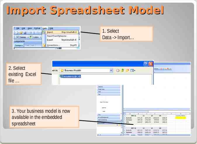
Import Spreadsheet Model 1. Select Data - Import 2. Select existing Excel file 3. Your business model is now available in the embedded spreadsheet
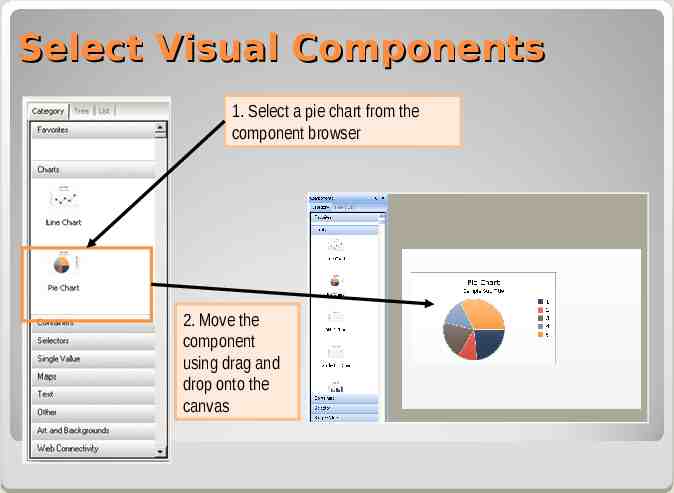
Select Visual Components 1. Select a pie chart from the component browser 2. Move the component using drag and drop onto the canvas
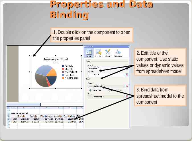
Properties and Data Binding 1. Double click on the component to open the properties panel 2. Edit title of the component: Use static values or dynamic values from spreadsheet model 3. Bind data from spreadsheet model to the component
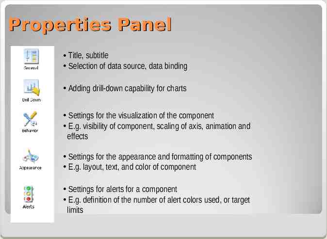
Properties Panel Title, subtitle Selection of data source, data binding Adding drill-down capability for charts Settings for the visualization of the component E.g. visibility of component, scaling of axis, animation and effects Settings for the appearance and formatting of components E.g. layout, text, and color of component Settings for alerts for a component E.g. definition of the number of alert colors used, or target limits
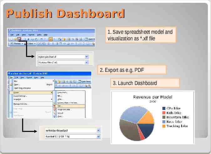
Publish Dashboard 1. Save spreadsheet model and visualization as *.xlf file 2. Export as e.g. PDF 3. Launch Dashboard
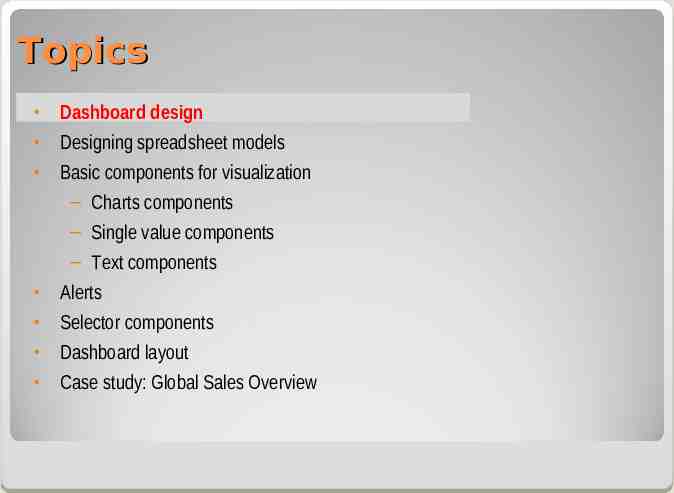
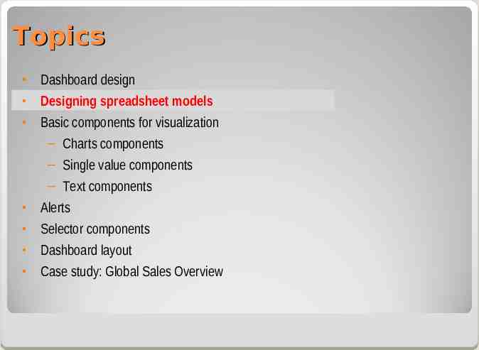
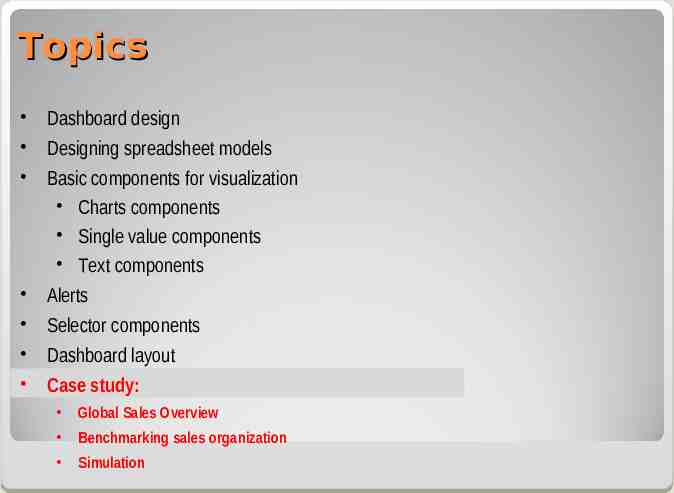
Topics Dashboard design Designing spreadsheet models Basic components for visualization – Charts components – Single value components – Text components Alerts Selector components Dashboard layout Case study: Global Sales Overview
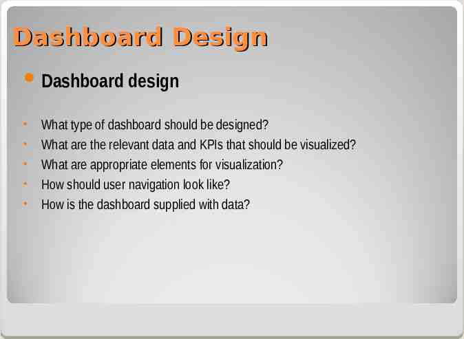
Dashboard Design Dashboard design What type of dashboard should be designed? What are the relevant data and KPIs that should be visualized? What are appropriate elements for visualization? How should user navigation look like? How is the dashboard supplied with data?
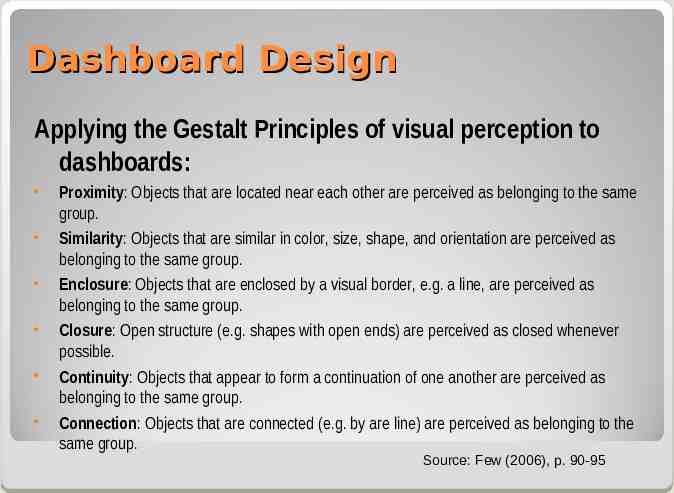
Dashboard Design Applying the Gestalt Principles of visual perception to dashboards: Proximity: Objects that are located near each other are perceived as belonging to the same group. Similarity: Objects that are similar in color, size, shape, and orientation are perceived as belonging to the same group. Enclosure: Objects that are enclosed by a visual border, e.g. a line, are perceived as belonging to the same group. Closure: Open structure (e.g. shapes with open ends) are perceived as closed whenever possible. Continuity: Objects that appear to form a continuation of one another are perceived as belonging to the same group. Connection: Objects that are connected (e.g. by are line) are perceived as belonging to the same group. Source: Few (2006), p. 90-95
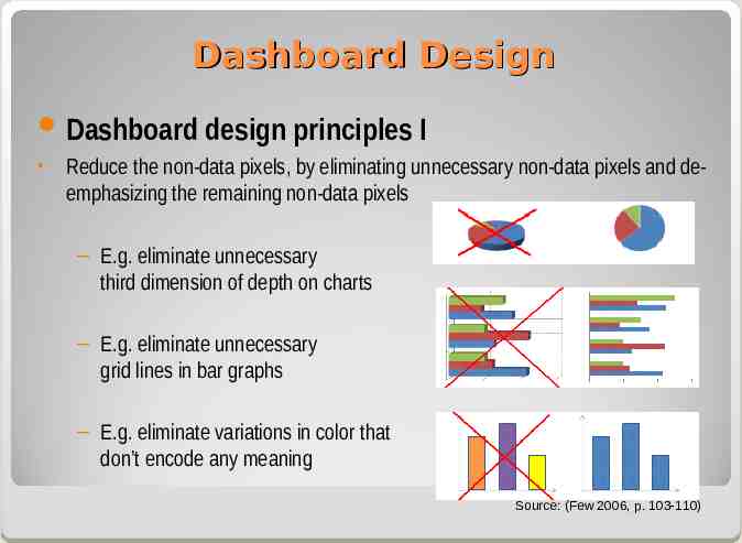
Dashboard Design Dashboard design principles I Reduce the non-data pixels, by eliminating unnecessary non-data pixels and deemphasizing the remaining non-data pixels – E.g. eliminate unnecessary third dimension of depth on charts – E.g. eliminate unnecessary grid lines in bar graphs – E.g. eliminate variations in color that don’t encode any meaning Source: (Few 2006, p. 103-110)
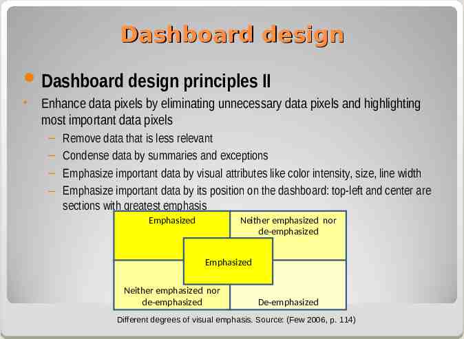
Dashboard design Dashboard design principles II Enhance data pixels by eliminating unnecessary data pixels and highlighting most important data pixels – – – – Remove data that is less relevant Condense data by summaries and exceptions Emphasize important data by visual attributes like color intensity, size, line width Emphasize important data by its position on the dashboard: top-left and center are sections with greatest emphasis Emphasized Neither emphasized nor de-emphasized Emphasized Neither emphasized nor de-emphasized De-emphasized Different degrees of visual emphasis. Source: (Few 2006, p. 114)
Topics Dashboard design Designing spreadsheet models Basic components for visualization – Charts components – Single value components – Text components Alerts Selector components Dashboard layout Case study: Global Sales Overview
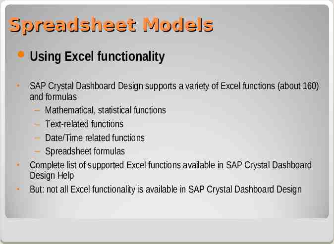
Spreadsheet Models Using Excel functionality SAP Crystal Dashboard Design supports a variety of Excel functions (about 160) and formulas – Mathematical, statistical functions – Text-related functions – Date/Time related functions – Spreadsheet formulas Complete list of supported Excel functions available in SAP Crystal Dashboard Design Help But: not all Excel functionality is available in SAP Crystal Dashboard Design
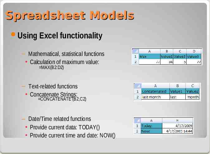
Spreadsheet Models Using Excel functionality – Mathematical, statistical functions Calculation of maximum value: MAX(B2:D2) – Text-related functions Concatenate Strings: CONCATENATE (B2,C2) – Date/Time related functions Provide current data: TODAY() Provide current time and date: NOW()
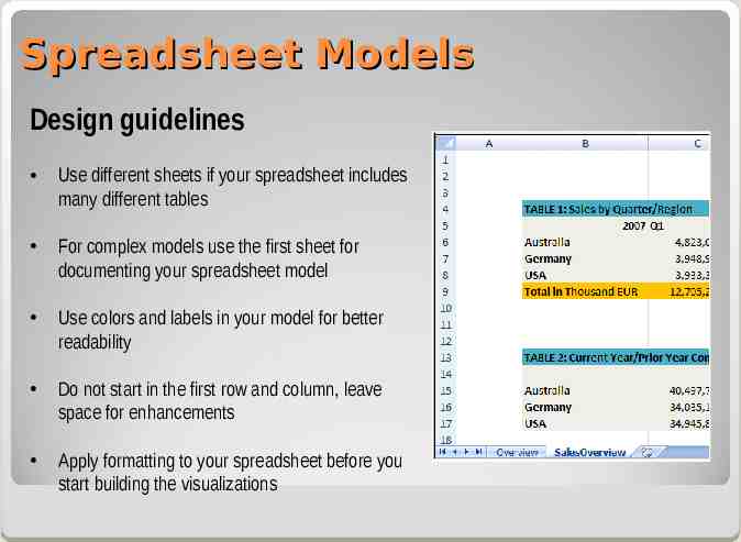
Spreadsheet Models Design guidelines Use different sheets if your spreadsheet includes many different tables For complex models use the first sheet for documenting your spreadsheet model Use colors and labels in your model for better readability Do not start in the first row and column, leave space for enhancements Apply formatting to your spreadsheet before you start building the visualizations
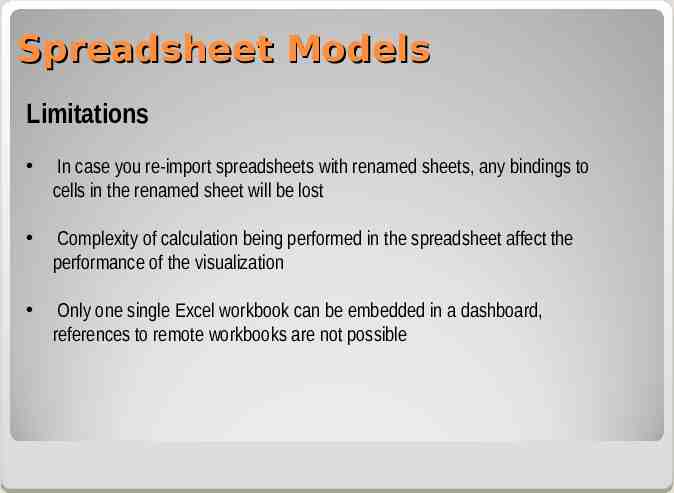
Spreadsheet Models Limitations In case you re-import spreadsheets with renamed sheets, any bindings to cells in the renamed sheet will be lost Complexity of calculation being performed in the spreadsheet affect the performance of the visualization Only one single Excel workbook can be embedded in a dashboard, references to remote workbooks are not possible
Topics Dashboard design Designing spreadsheet models Basic components for visualization – Charts components – Single value components – Text components Alerts Selector components Dashboard layout Case study: Global Sales Overview
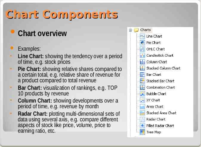
Chart Components Chart overview Examples: Line Chart: showing the tendency over a period of time, e.g. stock prices Pie Chart: showing relative shares compared to a certain total, e.g. relative share of revenue for a product compared to total revenue Bar Chart: visualization of rankings, e.g. TOP 10 products by revenue Column Chart: showing developments over a period of time, e.g. revenue by month Radar Chart: plotting multi-dimensional sets of data using several axis, e.g. compare different aspects of stock like price, volume, price to earning ratio, etc.
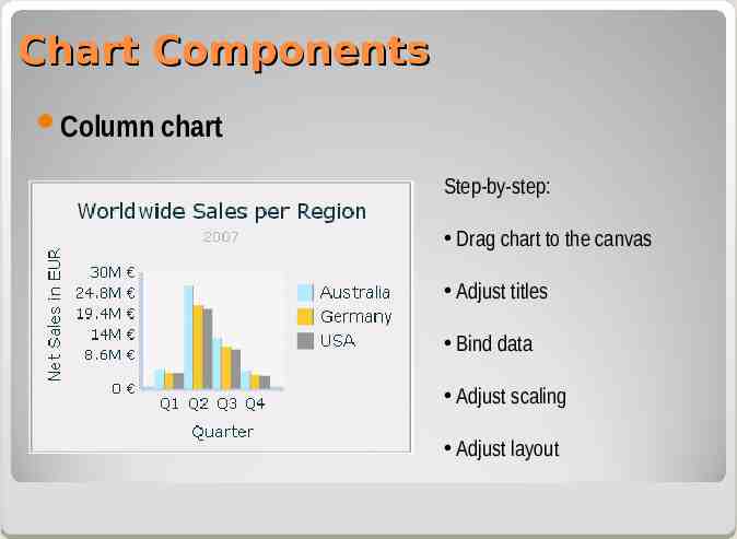
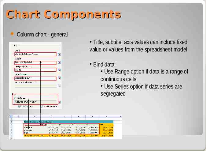
Chart Components Column chart Step-by-step: Drag chart to the canvas Adjust titles Bind data Adjust scaling Adjust layout
Chart Components Column chart - general Title, subtitle, axis values can include fixed value or values from the spreadsheet model Bind data: Use Range option if data is a range of continuous cells Use Series option if data series are segregated
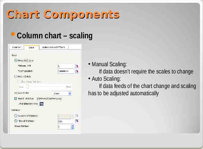
Chart Components Column chart – scaling Manual Scaling: If data doesn’t require the scales to change Auto Scaling: If data feeds of the chart change and scaling has to be adjusted automatically
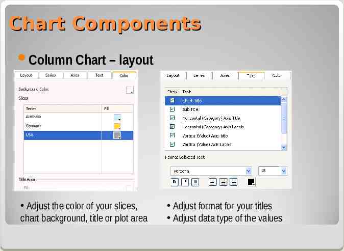
Chart Components Column Chart – layout Adjust the color of your slices, chart background, title or plot area Adjust format for your titles Adjust data type of the values
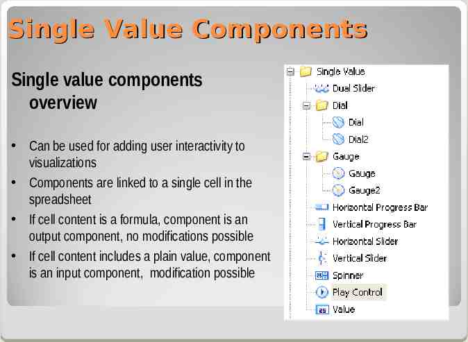
Single Value Components Single value components overview Can be used for adding user interactivity to visualizations Components are linked to a single cell in the spreadsheet If cell content is a formula, component is an output component, no modifications possible If cell content includes a plain value, component is an input component, modification possible
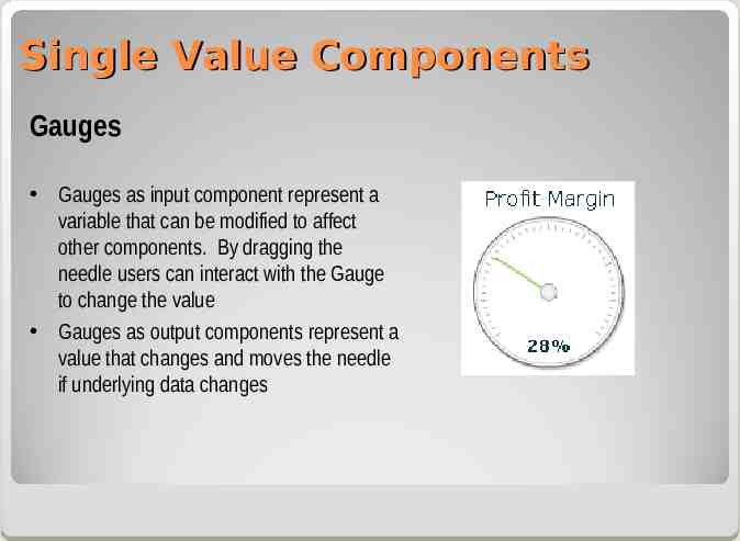
Single Value Components Gauges Gauges as input component represent a variable that can be modified to affect other components. By dragging the needle users can interact with the Gauge to change the value Gauges as output components represent a value that changes and moves the needle if underlying data changes
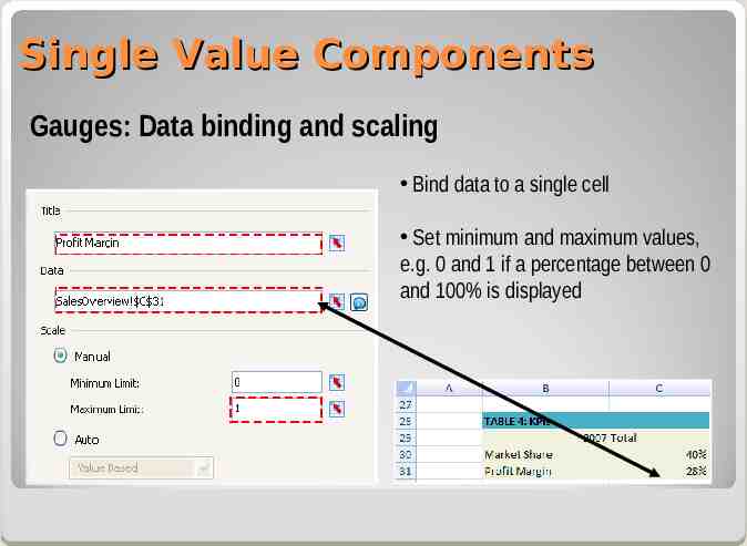
Single Value Components Gauges: Data binding and scaling Bind data to a single cell Set minimum and maximum values, e.g. 0 and 1 if a percentage between 0 and 100% is displayed
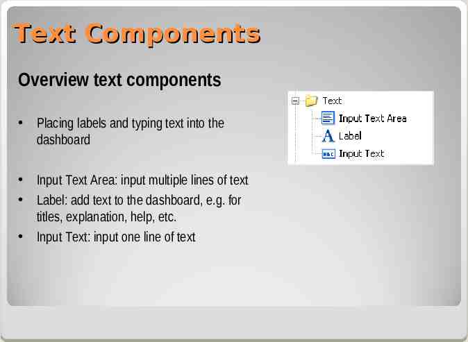
Text Components Overview text components Placing labels and typing text into the dashboard Input Text Area: input multiple lines of text Label: add text to the dashboard, e.g. for titles, explanation, help, etc. Input Text: input one line of text
Topics Dashboard design Designing spreadsheet models Basic components for visualization Charts components Single value components Text components Alerts Selector components Dashboard layout Case study: Global Sales Overview
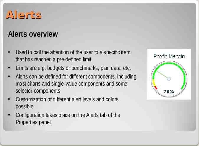
Alerts Alerts overview Used to call the attention of the user to a specific item that has reached a pre-defined limit Limits are e.g. budgets or benchmarks, plan data, etc. Alerts can be defined for different components, including most charts and single-value components and some selector components Customization of different alert levels and colors possible Configuration takes place on the Alerts tab of the Properties panel
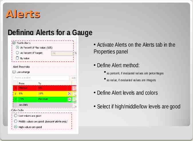
Alerts Defining Alerts for a Gauge Activate Alerts on the Alerts tab in the Properties panel Define Alert method: as percent, if evaluated values are percentages as value, if evaluated values are integers Define Alert levels and colors Select if high/middle/low levels are good
Topics Dashboard design Designing spreadsheet models Basic components for visualization – Charts components – Single value components – Text components Alerts Selector components Dashboard layout Case study: Global Sales Overview
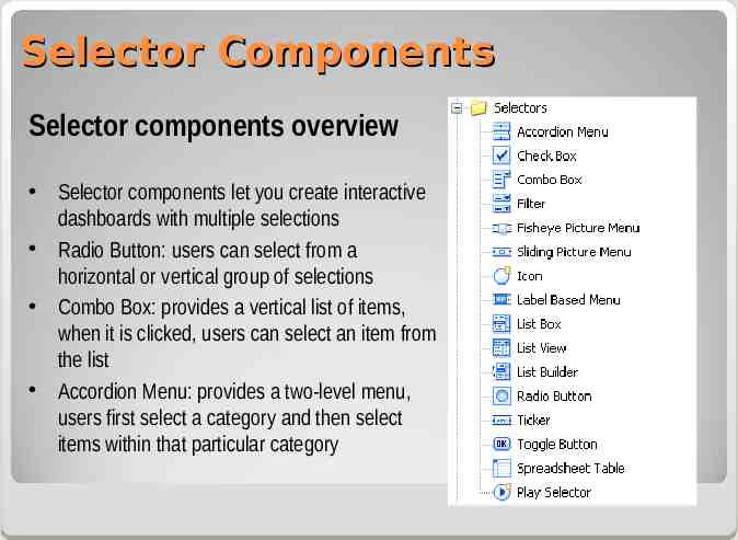
Selector Components Selector components overview Selector components let you create interactive dashboards with multiple selections Radio Button: users can select from a horizontal or vertical group of selections Combo Box: provides a vertical list of items, when it is clicked, users can select an item from the list Accordion Menu: provides a two-level menu, users first select a category and then select items within that particular category
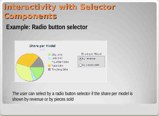
Interactivity with Selector Components Example: Radio button selector The user can select by a radio button selector if the share per model is shown by revenue or by pieces sold
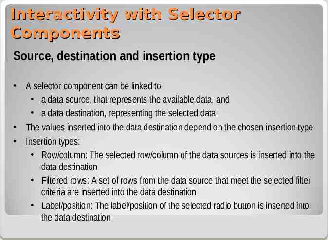
Interactivity with Selector Components Source, destination and insertion type A selector component can be linked to a data source, that represents the available data, and a data destination, representing the selected data The values inserted into the data destination depend on the chosen insertion type Insertion types: Row/column: The selected row/column of the data sources is inserted into the data destination Filtered rows: A set of rows from the data source that meet the selected filter criteria are inserted into the data destination Label/position: The label/position of the selected radio button is inserted into the data destination
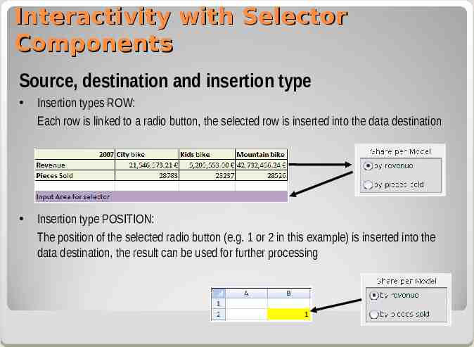
Interactivity with Selector Components Source, destination and insertion type Insertion types ROW: Each row is linked to a radio button, the selected row is inserted into the data destination Insertion type POSITION: The position of the selected radio button (e.g. 1 or 2 in this example) is inserted into the data destination, the result can be used for further processing
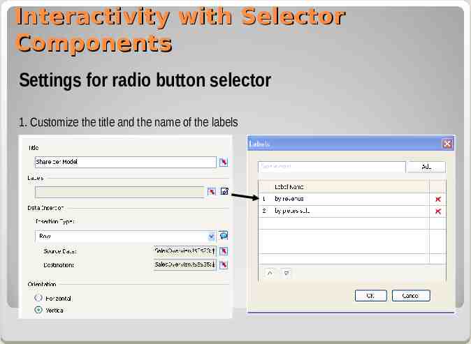
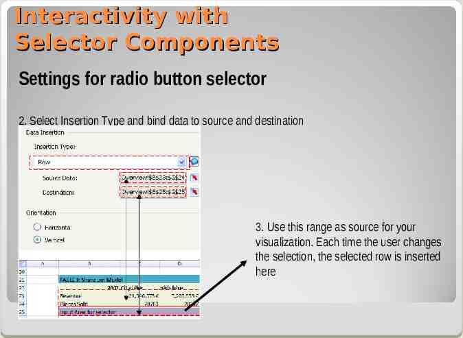
Interactivity with Selector Components Settings for radio button selector 1. Customize the title and the name of the labels
Interactivity with Selector Components Settings for radio button selector 2. Select Insertion Type and bind data to source and destination 3. Use this range as source for your visualization. Each time the user changes the selection, the selected row is inserted here
Topics Dashboard design Designing spreadsheet models Basic components for visualization Charts components Single value components Text components Alerts Selector components Dashboard layout Case study: Global Sales Overview
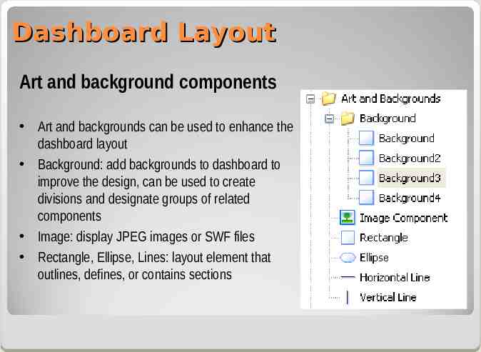
Dashboard Layout Art and background components Art and backgrounds can be used to enhance the dashboard layout Background: add backgrounds to dashboard to improve the design, can be used to create divisions and designate groups of related components Image: display JPEG images or SWF files Rectangle, Ellipse, Lines: layout element that outlines, defines, or contains sections
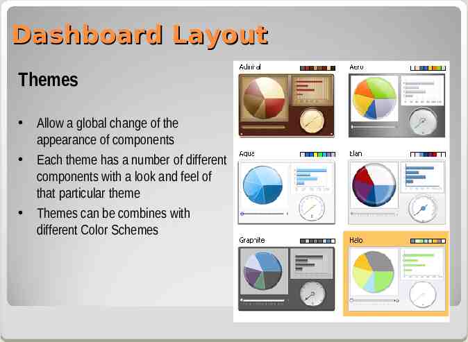
Dashboard Layout Themes Allow a global change of the appearance of components Each theme has a number of different components with a look and feel of that particular theme Themes can be combines with different Color Schemes
Topics Dashboard design Designing spreadsheet models Basic components for visualization Charts components Single value components Text components Alerts Selector components Dashboard layout Case study: Global Sales Overview Benchmarking sales organization Simulation
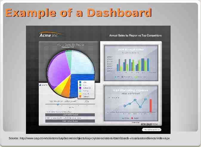
Example of a Dashboard Source: http://www.sap.com/solutions/sapbusinessobjects/sap-crystal-solutions/dashboards-visualization/demos/index.epx
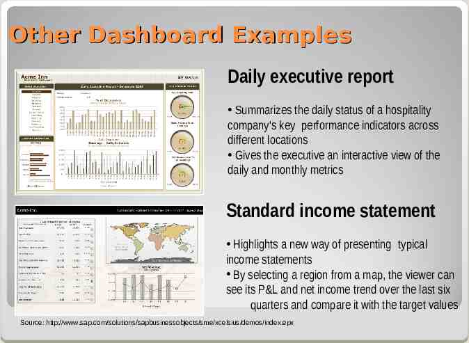
Other Dashboard Examples Daily executive report Summarizes the daily status of a hospitality company's key performance indicators across different locations Gives the executive an interactive view of the daily and monthly metrics Standard income statement Highlights a new way of presenting typical income statements By selecting a region from a map, the viewer can see its P&L and net income trend over the last six quarters and compare it with the target values Source: http://www.sap.com/solutions/sapbusinessobjects/sme/xcelsius/demos/index.epx
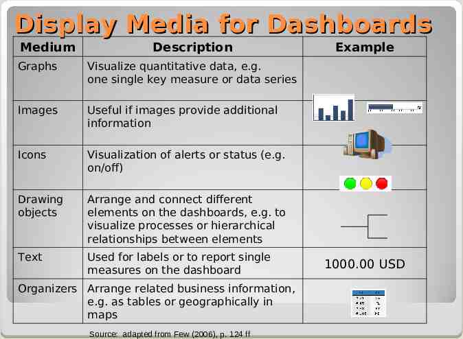
Display Media for Dashboards Medium Description Graphs Visualize quantitative data, e.g. one single key measure or data series Images Useful if images provide additional information Icons Visualization of alerts or status (e.g. on/off) Drawing objects Arrange and connect different elements on the dashboards, e.g. to visualize processes or hierarchical relationships between elements Text Used for labels or to report single measures on the dashboard Organizers Arrange related business information, e.g. as tables or geographically in maps Source: adapted from Few (2006), p. 124 ff Example 1000.00 USD
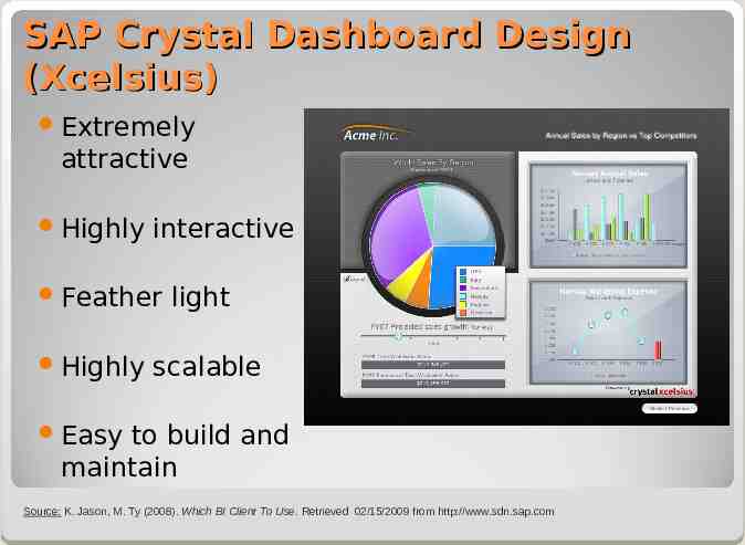
SAP Crystal Dashboard Design (Xcelsius) Extremely attractive Highly interactive Feather Highly light scalable Easy to build and maintain Source: K. Jason, M. Ty (2008). Which BI Client To Use. Retrieved 02/15/2009 from http://www.sdn.sap.com
Exercises: Task 1: Basic Concepts: Global sales overview Task 2: Advanced Techniques: Benchmarking sales organization Task 3: What-if scenarios: Simulation