Pareto Chart QM 2017 04/15/2024 Lean Six Sigma 1

6 Slides146.45 KB
Pareto Chart QM 2017 04/15/2024 Lean Six Sigma 1
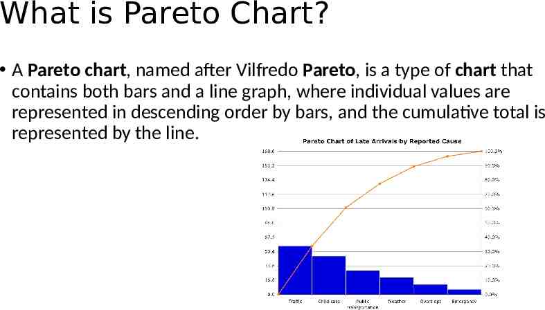
What is Pareto Chart? A Pareto chart, named after Vilfredo Pareto, is a type of chart that contains both bars and a line graph, where individual values are represented in descending order by bars, and the cumulative total is represented by the line.
When to use Pareto Chart? When to Use a Pareto Chart. When analyzing data about the frequency of problems or causes in a process. When there are many problems or causes and you want to focus on the most significant. When analyzing broad causes by looking at their specific components.
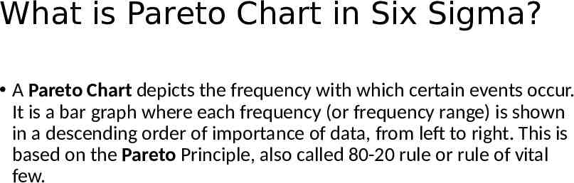
What is Pareto Chart in Six Sigma? A Pareto Chart depicts the frequency with which certain events occur. It is a bar graph where each frequency (or frequency range) is shown in a descending order of importance of data, from left to right. This is based on the Pareto Principle, also called 80-20 rule or rule of vital few.
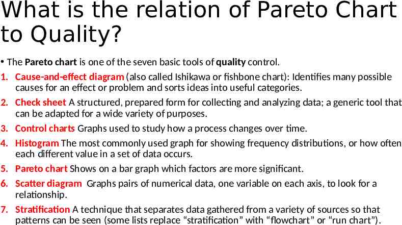
What is the relation of Pareto Chart to Quality? The Pareto chart is one of the seven basic tools of quality control. 1. Cause-and-effect diagram (also called Ishikawa or fishbone chart): Identifies many possible causes for an effect or problem and sorts ideas into useful categories. 2. Check sheet A structured, prepared form for collecting and analyzing data; a generic tool that can be adapted for a wide variety of purposes. 3. Control charts Graphs used to study how a process changes over time. 4. Histogram The most commonly used graph for showing frequency distributions, or how often each different value in a set of data occurs. 5. Pareto chart Shows on a bar graph which factors are more significant. 6. Scatter diagram Graphs pairs of numerical data, one variable on each axis, to look for a relationship. 7. Stratification A technique that separates data gathered from a variety of sources so that patterns can be seen (some lists replace “stratification” with “flowchart” or “run chart”).
Thank you