Information Design Goal: identify methods for representing

13 Slides450.00 KB
Information Design Goal: identify methods for representing and arranging the objects and actions possible in a system in a way that facilitates perception and understanding
Making Sense of Information Do I understand what the system is telling me? Were my actions successful? Have I made progress? – Must connect results of interpretation with other task knowledge – Building the “big picture” Design goal: help the user make connections between UI information and task goals – Determine whether to continue, elaborate, revise, or replace the current task goal – Sets up next trip around the execution/evaluation cycle
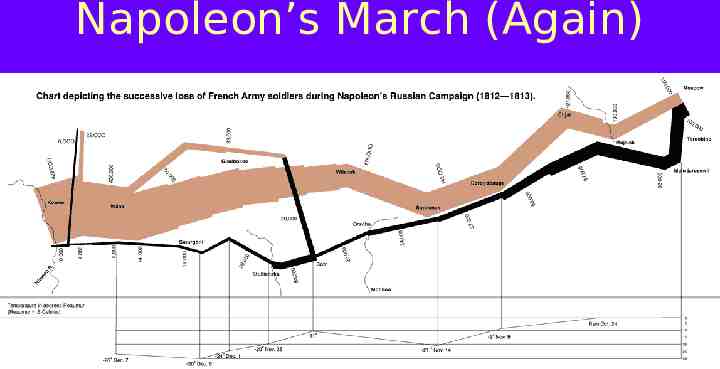
Napoleon’s March (Again)
Making Sense What is the system telling me? Was I successful? Am I ready to make another move? – Integrating information interpretation with task knowledge – Building a “big picture” across actions and screens – Errors or problems often detected and corrected here Design goal: organize and present information to make contact with user’s task goals – Aid decision to continue, elaborate, or change goals – Set up next trip around the task-action cycle
Consistency Internal consistency within a system – On the same screen: button shape & labels, fonts, etc. – From screen to screen: UI controls, layout, font family – Applies to text vocabulary too (move backward vs. reverse) External consistency across different systems – e.g., the Mac family of apps, windows, the web – Enables transfer of learning from one system to another – Mismatches lead to interference Caution: consistency is in the eye of beholder 2nd caution: consider special needs of user’s task
A Visual Design Program Visual features used consistently, design “signature” – e.g., title bar, tool palette, window border, title line, standardized set of components and layout – Not necessarily a functional feature, e.g. special border Promotes a sense of unity and coherence – Easier to make connections from screen to screen Caution: repeated gratuitous decoration or animation creates a design program that detracts
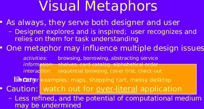
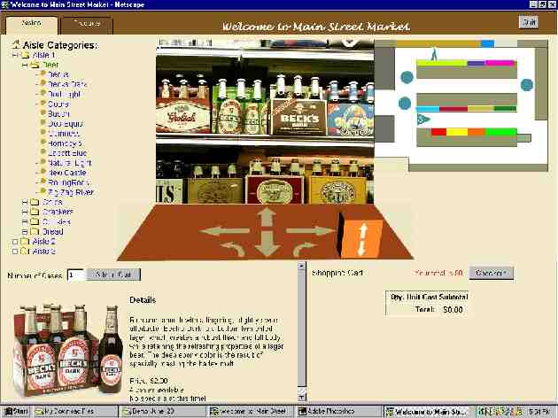
Visual Metaphors As always, they serve both designer and user – Designer explores and is inspired; user recognizes and relies on them for task understanding One metaphor may influence multiple design issues activities: browsing, borrowing, abstracting service information: shelves, card catalog, alphabetical order interaction: sequential browsing, cover first, check-out Other examples: maps, shopping cart, messy desktop library Caution: watch out for over-literal application – Less refined, and the potential of computational medium may be undermined
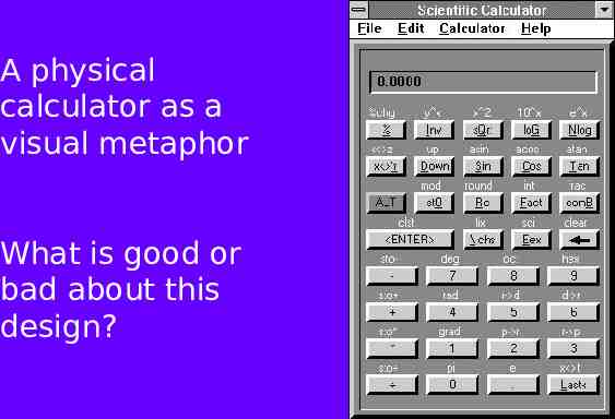
A physical calculator as a visual metaphor What is good or bad about this design?
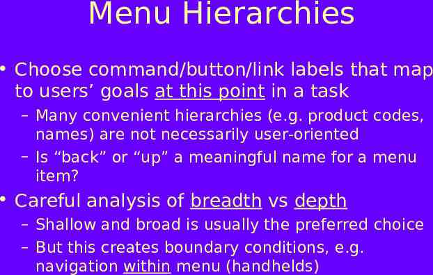
Menu Hierarchies Choose command/button/link labels that map to users’ goals at this point in a task – Many convenient hierarchies (e.g. product codes, names) are not necessarily user-oriented – Is “back” or “up” a meaningful name for a menu item? Careful analysis of breadth vs depth – Shallow and broad is usually the preferred choice – But this creates boundary conditions, e.g. navigation within menu (handhelds)
Yahoo’s Menus
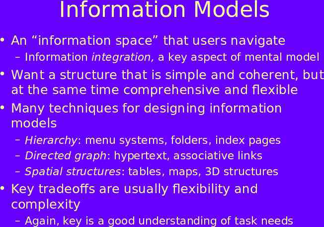
Information Models An “information space” that users navigate – Information integration, a key aspect of mental model Want a structure that is simple and coherent, but at the same time comprehensive and flexible Many techniques for designing information models – Hierarchy: menu systems, folders, index pages – Directed graph: hypertext, associative links – Spatial structures: tables, maps, 3D structures Key tradeoffs are usually flexibility and complexity – Again, key is a good understanding of task needs
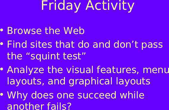
Friday Activity Browse the Web Find sites that do and don’t pass the “squint test” Analyze the visual features, menu layouts, and graphical layouts Why does one succeed while another fails?