Effective Data Presentation Making Figures and Tables Dr. Gail


23 Slides434.00 KB
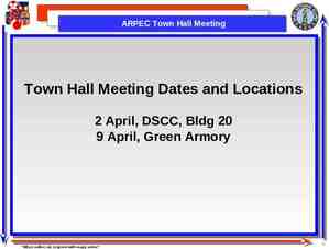
Effective Data Presentation Making Figures and Tables Dr. Gail P. Taylor University of Texas at San Antonio Professional Skills Development 02/04/2009
Acknowledgements Scientific Papers and Presentations, by Martha Davis. Academic press, 1997 Survival Skills and Ethics Program: www.pitt.edu/ survival Department of Biology, Bates College http://abacus.bates.edu/ ganders o/biology/resources/writing/HTWto c.html
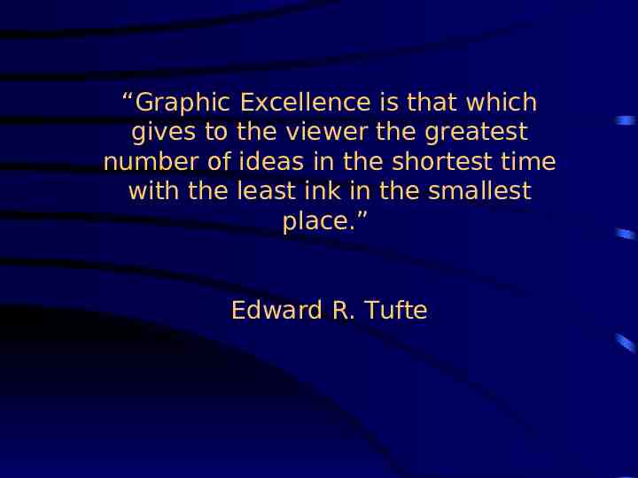
“Graphic Excellence is that which gives to the viewer the greatest number of ideas in the shortest time with the least ink in the smallest place.” Edward R. Tufte
Guidelines Simplify message without falsifying data Generally need either graph or table Present with clarity, brevity Note prior conventions
What types of data presentation formats do you know? How are they different?
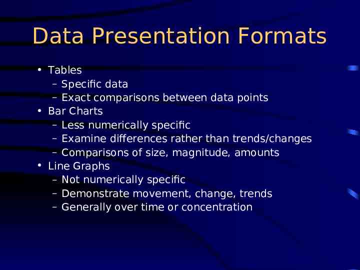
Data Presentation Formats Tables – Specific data – Exact comparisons between data points Bar Charts – Less numerically specific – Examine differences rather than trends/changes – Comparisons of size, magnitude, amounts Line Graphs – Not numerically specific – Demonstrate movement, change, trends – Generally over time or concentration
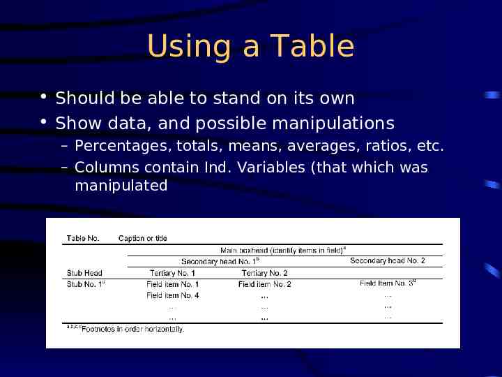
Using a Table Should be able to stand on its own Show data, and possible manipulations – Percentages, totals, means, averages, ratios, etc. – Columns contain Ind. Variables (that which was manipulated
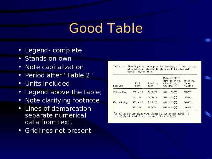
Good Table Legend- complete Stands on own Note capitalization Period after "Table 2" Units included Legend above the table; Note clarifying footnote Lines of demarcation separate numerical data from text. Gridlines not present
More on Tables Limit total items/columns – (But more than than 6-8 datapoints) No vertical lines Do not overload with headings Use captions/footnotes for definitions Strings of “0’s” or unchanging data might not be included Use restraint with decimal places Obvious abbreviations can be included Don’t repeat data in text, just call attention to main points
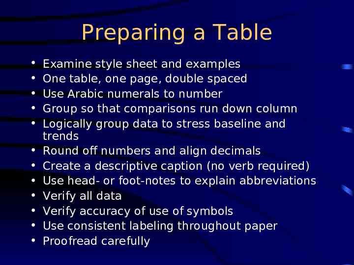
Preparing a Table Examine style sheet and examples One table, one page, double spaced Use Arabic numerals to number Group so that comparisons run down column Logically group data to stress baseline and trends Round off numbers and align decimals Create a descriptive caption (no verb required) Use head- or foot-notes to explain abbreviations Verify all data Verify accuracy of use of symbols Use consistent labeling throughout paper Proofread carefully
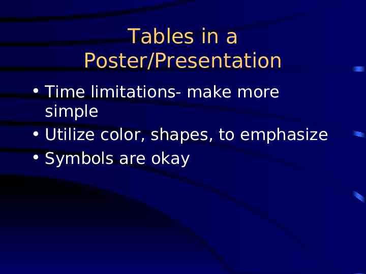
Tables in a Poster/Presentation Time limitations- make more simple Utilize color, shapes, to emphasize Symbols are okay
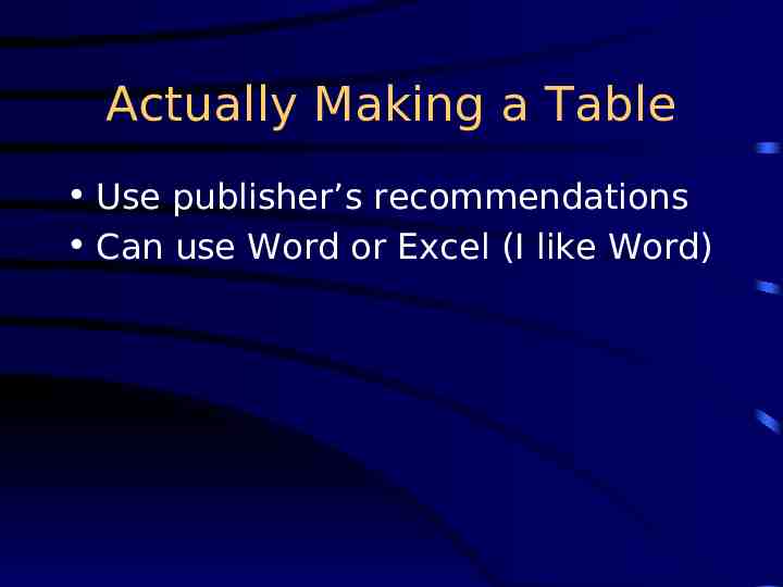
Actually Making a Table Use publisher’s recommendations Can use Word or Excel (I like Word)
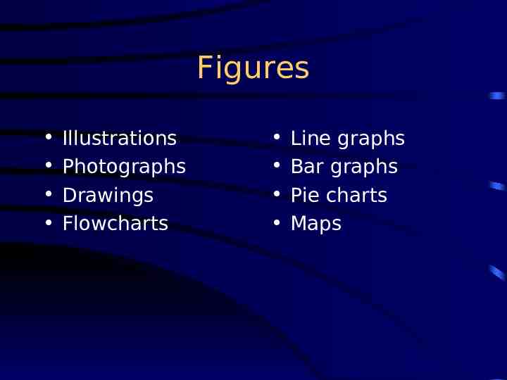
Figures Illustrations Photographs Drawings Flowcharts Line graphs Bar graphs Pie charts Maps
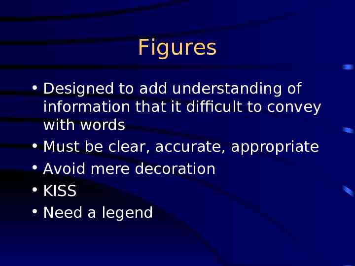
Figures Designed to add understanding of information that it difficult to convey with words Must be clear, accurate, appropriate Avoid mere decoration KISS Need a legend
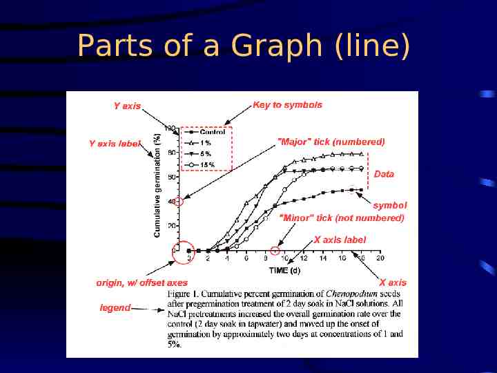
Parts of a Graph (line)
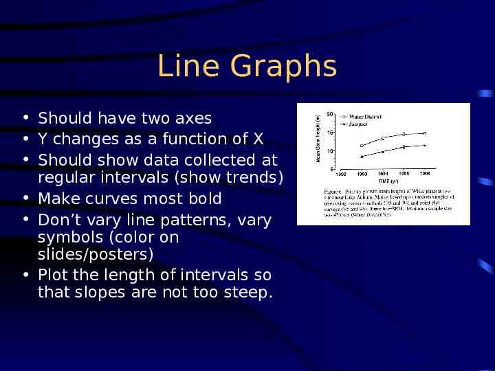
Line Graphs Should have two axes Y changes as a function of X Should show data collected at regular intervals (show trends) Make curves most bold Don’t vary line patterns, vary symbols (color on slides/posters) Plot the length of intervals so that slopes are not too steep.
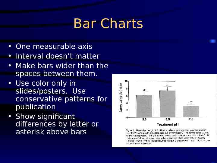
Bar Charts One measurable axis Interval doesn’t matter Make bars wider than the spaces between them. Use color only in slides/posters. Use conservative patterns for publication Show significant differences by letter or asterisk above bars
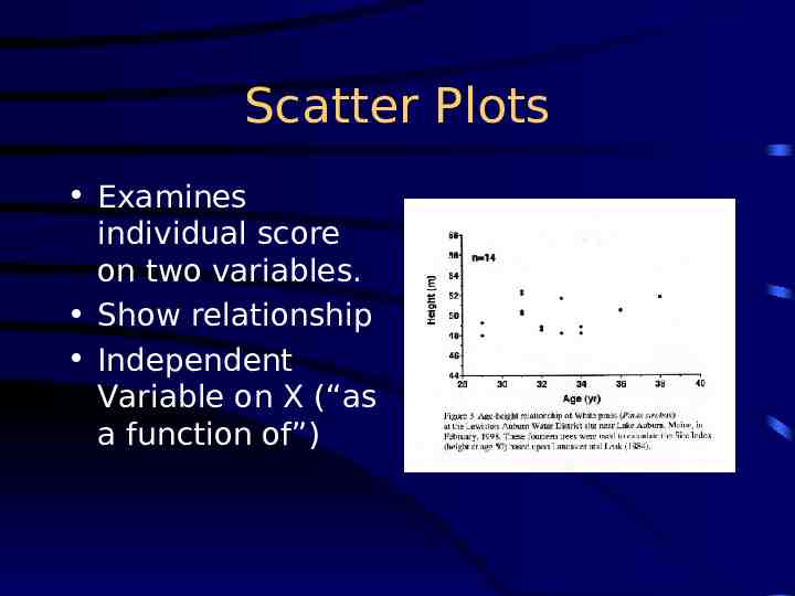
Scatter Plots Examines individual score on two variables. Show relationship Independent Variable on X (“as a function of”)
Recommendations for Figures (Part 1) Read publishers recommendations regarding size, color, format! Is it needed? Do not have a title Can it be understood at a glance? Limit curves (3-5) or bars (6-8; 9-10 grouped) Plot independent variable on X (time, concentration), dependent on Y (what happened?) Avoid wasted space; legend on field
Recommendations (Part 2) Label axes and show units of measure. Use tics and subtics, to not crowd with numbers Position, size, shape, length, symbols, angle, color: all are cues. Use when appropriate, and avoid misuse. Start scales at “0,” unless you make it clear (tic marks) that you are doing otherwise. For a journal, type caption on a separate page so that the figure can be photographed and the type set separately.
Figure Legends Must accompany Figures. Should give pertinent, clarifying information – – – – key to abbreviations sample size statistical results a brief description of how the data were acquired Should allow Table/Figure to stand alone In the legend, both “Table” and “Figure” are spelled out completely
How to refer to a Table/Figure Every table/figure must be referred to in the text It is best to refer to them in parenthesis: – Germination rates were significantly higher after 24 hr water soak than in the control (Fig. 1) . – DNA sequence homologies for the purple gene from the four congeners (Table 1) show a strong similarity, differing at most by 4 base pairs. – Note: Fig., here is abbreviated. Not on headings, though. Avoid sentences that only direct you to the table: – Table 1 shows the summary results for male and female height at Bates College.
A little more Info Figures and tables are numbered independently, in the sequence in which they are referred. In a thesis or class paper, place them as near where you refer to them as possible For manuscripts, follow publisher’s directions (historically, legends were are on a separate page)