Module 3: Data presentation & interpretation


28 Slides808.00 KB
Module 3: Data presentation & interpretation
Module 3: Learning Objectives Understand different ways to best summarize data Choose the right table/graph for the right data Interpret data to consider the programmatic relevance
Summarizing data Tables Simplest way to summarize data Data are presented as absolute numbers or percentages Charts and graphs Visual representation of data Data are presented as absolute numbers or percentages
Basic guidance when summarizing data Ensure graphic has a title Label the components of your graphic Indicate source of data with date Provide number of observations (n xx) as a reference point Add footnote if more information is needed
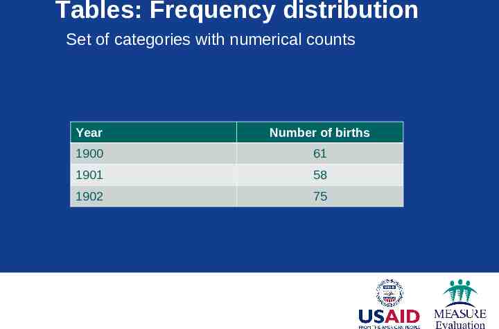
Tables: Frequency distribution Set of categories with numerical counts Year Number of births 1900 61 1901 58 1902 75
Tables: Relative frequency number of values within an interval total number of values in the table Year x 100 # births (n) Relative frequency (%) 1900–1909 35 27 1910–1919 46 34 1920–1929 51 39 Total 132 100.0
Tables Percentage of births by decade between 1900 and 1929 Year Number of births (n) Relative frequency (%) 1900–1909 35 27 1910–1919 46 34 1920–1929 51 39 Total 132 100.0 Source: U.S. Census data, 1900–1929.
Charts and graphs Charts and graphs are used to portray: Trends, relationships, and comparisons The most informative are simple and selfexplanatory
Use the right type of graphic Charts and graphs Bar chart: comparisons, categories of data Line graph: display trends over time Pie chart: show percentages or proportional share
Bar chart Comparing categories 6 5 4 Site 1 3 Site 2 Site 3 2 1 0 Quarter 1 Quarter 2 Quarter 3 Quarter 4
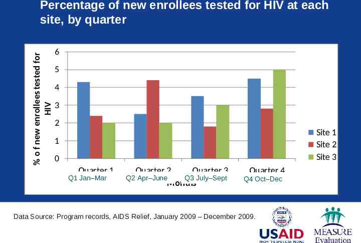
% o f new enrollees tested for HIV Percentage of new enrollees tested for HIV at each site, by quarter 6 5 4 3 2 Site 1 Site 2 Site 3 1 0 Quarter 1 Q1 Jan–Mar Quarter 2 Quarter 3 Q2 Apr–June Q3 July–Sept Months Quarter 4 Q4 Oct–Dec Data Source: Program records, AIDS Relief, January 2009 – December 2009.rce: Quarterly Country Summary: Nigeria, 2008
Has the program met its goal? % of new enrollees tested for HIV Percentage of new enrollees tested for HIV at each site, by quarter 60% 50% 40% 30% Site 1 Site 2 Site 3 20% 10% Target 0% Quarter 1 Quarter 2 Quarter 3 Quarter 4 Data Source: Program records, AIDS Relief, January 2009 – December 2009. quarterly Country Summary: Nigeria, 2008
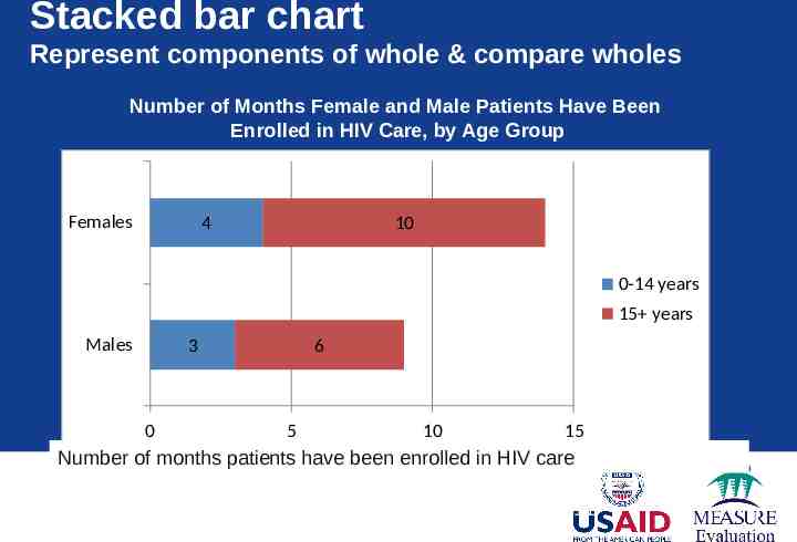
Stacked bar chart Represent components of whole & compare wholes Number of Months Female and Male Patients Have Been Enrolled in HIV Care, by Age Group Females 4 10 0-14 years 15 years Males 3 6 0 5 10 15 Number of months patients have been enrolled in HIV care Data source: AIDSRelief program records January 2009 - 20011
Line graph Displays trends over time Number of Clinicians Working in Each Clinic During Years 1–4* Number of clinicians 6 5 4 Clinic 1 3 Clinic 2 2 Clinic 3 1 0 Year 1 *Includes doctors and nurses Year 2 Year 3 Year 4
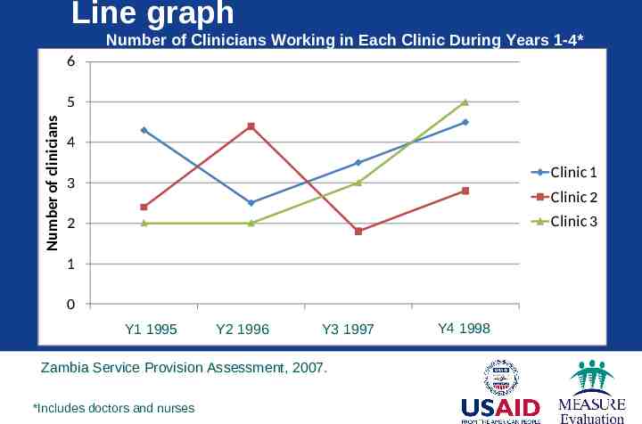
Line graph Number of Clinicians Working in Each Clinic During Years 1-4* 6 Number of clinicians 5 4 Clinic 1 3 Clinic 2 Clinic 3 2 1 0 Y1 1995 Year 1 Y2Year 19962 Y3Year 19973 Zambia Service Provision Assessment, 2007. *Includes doctors and nurses Y4 1998 Year 4
Pie chart Contribution to the total 100% Percentage of All Patients Enrolled by Quarter 8% 10% 1st Qtr 2nd Qtr 23% N 150 3rd Qtr 59% 4th Qtr
Interpreting data
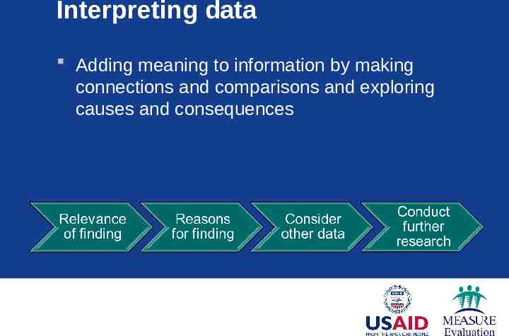
Interpreting data Adding meaning to information by making connections and comparisons and exploring causes and consequences
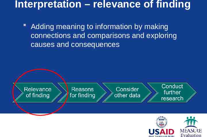
Interpretation – relevance of finding Adding meaning to information by making connections and comparisons and exploring causes and consequences
Interpretation – relevance of finding Does the indicator meet the target? How far from the target is it? How does it compare (to other time periods, other facilities)? Are there any extreme highs and lows in the data?
Interpretation – possible causes? Supplement with expert opinion Others with knowledge of the program or target population
Interpretation – consider other data Use routine service data to clarify questions Calculate nurse-to-client ratio, review commodities data against client load, etc. Use other data sources
Interpretation – other data sources Situation analyses Demographic and health surveys Performance improvement data
Interpretation – conduct further research Data gap conduct further research Methodology depends on questions being asked and resources available
Key messages Use the right graph for the right data Tables – can display a large amount of data Graphs/charts – visual, easier to detect patterns Label the components of your graphic Interpreting data adds meaning by making connections and comparisons to program Service data are good at tracking progress & identifying concerns – do not show causality
Activity: Calculating coverage and retention
Learning Objectives Use basic statistics to measure coverage and retention Develop graphs that display performance measures (utilization, trends) Interpret performance measures for programmatic decision making
Small group activity Form groups of 4–6 Each group reviews 2 worksheets from Excel file and answers the questions (1 hr 45 min) Each group presents 2 findings from each worksheet, focusing on the programmatic relevance of the findings (10 min per group) Audience provides feedback on analysis and interpretation (notes errors, additional interpretation) (10 min per group)