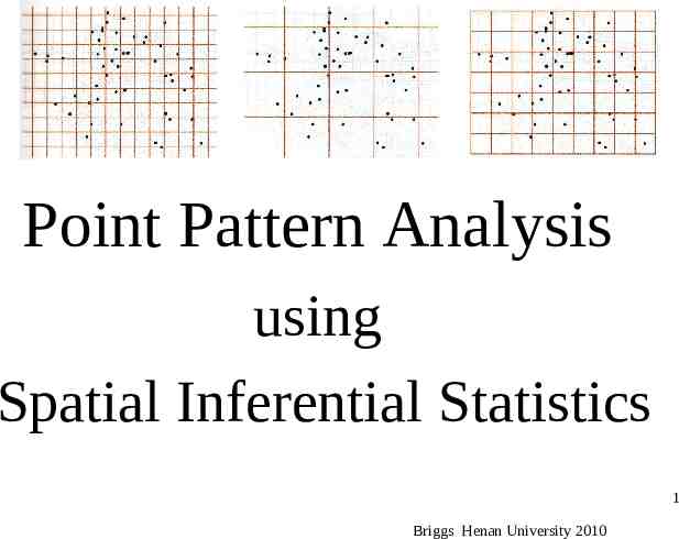
Point Pattern Analysis using Spatial Inferential Statistics
34 Slides4.79 MB
Point Pattern Analysis using Spatial Inferential Statistics 1 Briggs Henan University 2010
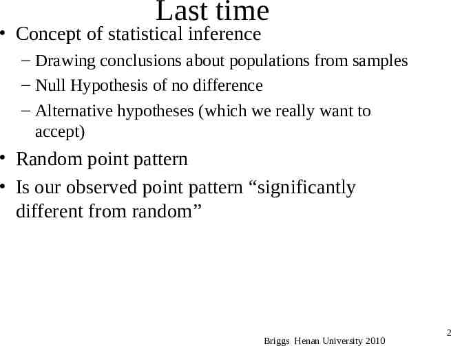
Last time Concept of statistical inference – Drawing conclusions about populations from samples – Null Hypothesis of no difference – Alternative hypotheses (which we really want to accept) Random point pattern Is our observed point pattern “significantly different from random” Briggs Henan University 2010 2
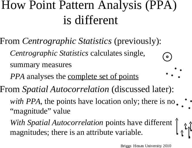
How Point Pattern Analysis (PPA) is different From Centrographic Statistics (previously): Centrographic Statistics calculates single, summary measures PPA analyses the complete set of points From Spatial Autocorrelation (discussed later): with PPA, the points have location only; there is no “magnitude” value With Spatial Autocorrelation points have different magnitudes; there is an attribute variable. Briggs Henan University 2010 3
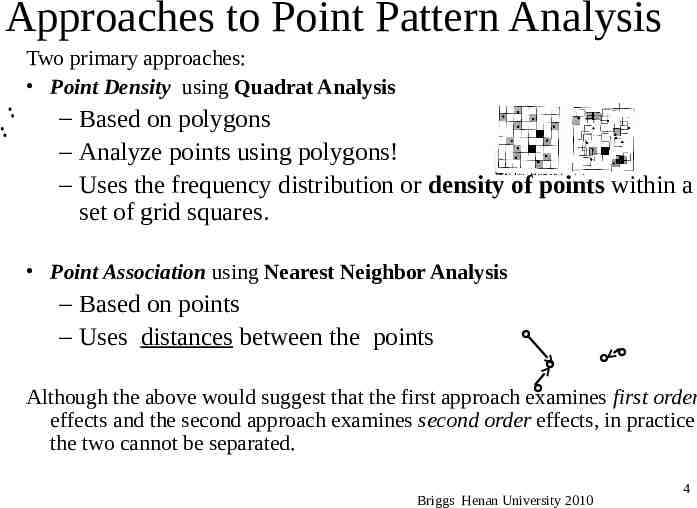
Approaches to Point Pattern Analysis Two primary approaches: Point Density using Quadrat Analysis – Based on polygons – Analyze points using polygons! – Uses the frequency distribution or density of points within a set of grid squares. Point Association using Nearest Neighbor Analysis – Based on points – Uses distances between the points Although the above would suggest that the first approach examines first order effects and the second approach examines second order effects, in practice the two cannot be separated. Briggs Henan University 2010 4
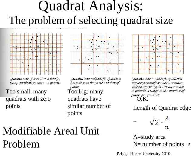
Quadrat Analysis: The problem of selecting quadrat size Too small: many quadrats with zero points Too big: many quadrats have similar number of points Modifiable Areal Unit Problem O.K. Length of Quadrat edge A study area N number of points Briggs Henan University 2010 5
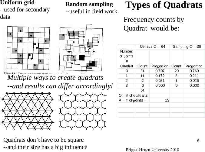
Uniform grid --used for secondary data Random sampling --useful in field work Types of Quadrats Frequency counts by Quadrat would be: Census Q 64 Multiple ways to create quadrats --and results can differ accordingly! Quadrats don’t have to be square --and their size has a big influence Number of points in Quadrat 0 1 2 3 Count 51 11 2 0 64 Q # of quadarts P # of points Sampling Q 38 Proportion Count 0.797 29 0.172 8 0.031 1 0.000 0 Proportion 0.763 0.211 0.026 0.000 15 6 Briggs Henan University 2010
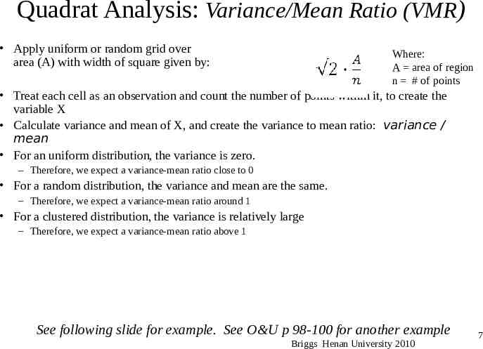
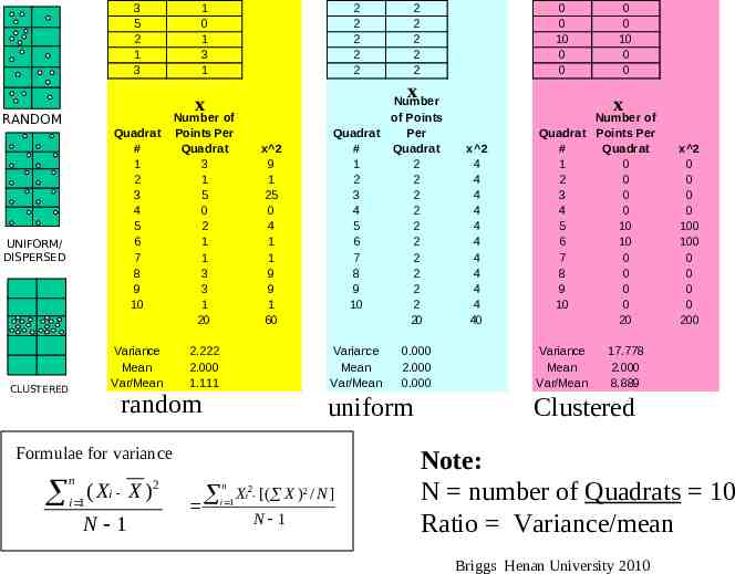
Quadrat Analysis: Variance/Mean Ratio (VMR) Apply uniform or random grid over area (A) with width of square given by: Where: A area of region n # of points Treat each cell as an observation and count the number of points within it, to create the variable X Calculate variance and mean of X, and create the variance to mean ratio: variance / mean For an uniform distribution, the variance is zero. – Therefore, we expect a variance-mean ratio close to 0 For a random distribution, the variance and mean are the same. – Therefore, we expect a variance-mean ratio around 1 For a clustered distribution, the variance is relatively large – Therefore, we expect a variance-mean ratio above 1 See following slide for example. See O&U p 98-100 for another example Briggs Henan University 2010 7
3 5 2 1 3 1 0 1 3 1 2 2 2 2 2 UNIFORM/ DISPERSED CLUSTERED Quadrat # 1 2 3 4 5 6 7 8 9 10 Number of Points Per Quadrat 3 1 5 0 2 1 1 3 3 1 20 Variance Mean Var/Mean 2.222 2.000 1.111 x 2 9 1 25 0 4 1 1 9 9 1 60 Number of Points Quadrat Per # Quadrat 1 2 2 2 3 2 4 2 5 2 6 2 7 2 8 2 9 2 10 2 20 Variance Mean Var/Mean random 2 ( X i X ) i 1 N 1 0.000 2.000 0.000 uniform Formulae for variance n 0 0 10 0 0 x x RANDOM 2 2 2 2 2 n i 1 Xi2 [( X )2 / N ] N 1 0 0 10 0 0 x x 2 4 4 4 4 4 4 4 4 4 4 40 Number of Quadrat Points Per # Quadrat 1 0 2 0 3 0 4 0 5 10 6 10 7 0 8 0 9 0 10 0 20 Variance Mean Var/Mean x 2 0 0 0 0 100 100 0 0 0 0 200 17.778 2.000 8.889 Clustered Note: N number of Quadrats 10 Ratio Variance/mean Briggs Henan University 2010
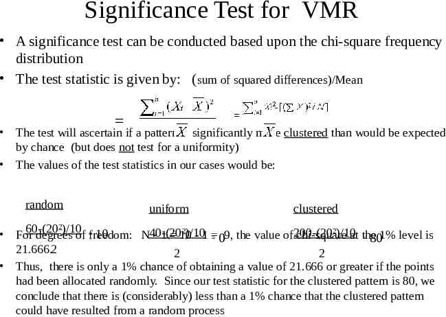
Significance Test for VMR A significance test can be conducted based upon the chi-square frequency distribution The test statistic is given by: (sum of squared differences)/Mean The test will ascertain if a pattern is significantly more clustered than would be expected by chance (but does not test for a uniformity) The values of the test statistics in our cases would be: random uniform clustered 2 60-(20 )/10 2 2 )/10 )/10at the For 10 degrees of freedom: N40-(20 - 1 10 -1 chi-square 09, the value of200-(20 801% level is 21.666.2 2 2 Thus, there is only a 1% chance of obtaining a value of 21.666 or greater if the points had been allocated randomly. Since our test statistic for the clustered pattern is 80, we conclude that there is (considerably) less than a 1% chance that the clustered pattern could have resulted from a random process
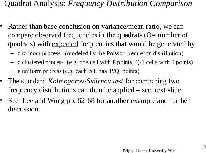
Quadrat Analysis: Frequency Distribution Comparison Rather than base conclusion on variance/mean ratio, we can compare observed frequencies in the quadrats (Q number of quadrats) with expected frequencies that would be generated by – a random process (modeled by the Poisson frequency distribution) – a clustered process (e.g. one cell with P points, Q-1 cells with 0 points) – a uniform process (e.g. each cell has P/Q points) The standard Kolmogorov-Smirnov test for comparing two frequency distributions can then be applied – see next slide See Lee and Wong pp. 62-68 for another example and further discussion. Briggs Henan University 2010 10
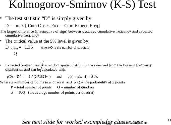
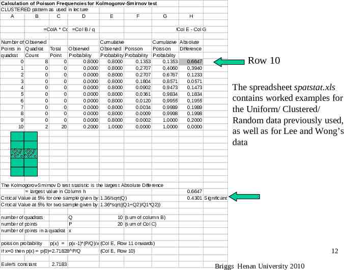
Kolmogorov-Smirnov (K-S) Test The test statistic “D” is simply given by: D max [ Cum Obser. Freq – Cum Expect. Freq] The largest difference (irrespective of sign) between observed cumulative frequency and expected cumulative frequency The critical value at the 5% level is given by: D (at 5%) 1.36 where Q is the number of quadrats Q Expected frequencies for a random spatial distribution are derived from the Poisson frequency distribution and can be calculated with: p(0) e-λ 1 / (2.71828P/Q) and p(x) p(x - 1) * λ /x Where x number of points in a quadrat and p(x) the probability of x points P total number of points Q number of quadrats λ P/Q (the average number of points per quadrat) See next slide for worked exampleBriggs for Henan cluster case University 2010 11
Calculation of Poisson Frequencies for Kolmogorov-Smirnov test CLUSTERED pattern as used in lecture A B C D E F G ColA * ColB Col B / q H !Col E - Col G Number of Observed Cumulative Cumulative Absolute Points in Quadrat Total Observed Observed Poisson Poisson Difference quadrat Count Point Probability Probability Probability Probability 0 8 0 0.8000 0.8000 0.1353 0.1353 0.6647 1 0 0 0.0000 0.8000 0.2707 0.4060 0.3940 2 0 0 0.0000 0.8000 0.2707 0.6767 0.1233 3 0 0 0.0000 0.8000 0.1804 0.8571 0.0571 4 0 0 0.0000 0.8000 0.0902 0.9473 0.1473 5 0 0 0.0000 0.8000 0.0361 0.9834 0.1834 6 0 0 0.0000 0.8000 0.0120 0.9955 0.1955 7 0 0 0.0000 0.8000 0.0034 0.9989 0.1989 8 0 0 0.0000 0.8000 0.0009 0.9998 0.1998 9 0 0 0.0000 0.8000 0.0002 1.0000 0.2000 10 2 20 0.2000 1.0000 0.0000 1.0000 0.0000 The Kolmogorov-Smirnov D test statistic is the largest Absolute Difference largest value in Column h Critical Value at 5% for one sample given by: 1.36/sqrt(Q) Critical Value at 5% for two sample given by: 1.36*sqrt((Q1 Q2)/Q1*Q2)) number of quadrats Q number of points P number of points in a quadrat x poisson probability The spreadsheet spatstat.xls contains worked examples for the Uniform/ Clustered/ Random data previously used, as well as for Lee and Wong’s data 0.6647 0.4301 Significant 10 (sum of column B) 20 (sum of Col C) p(x) p(x-1)*(P/Q)/x (Col E, Row 11 onwards) if x 0 then p(x) p(0) 2.71828 P/Q Euler's constant Row 10 2.7183 12 (Col E, Row 10) Briggs Henan University 2010
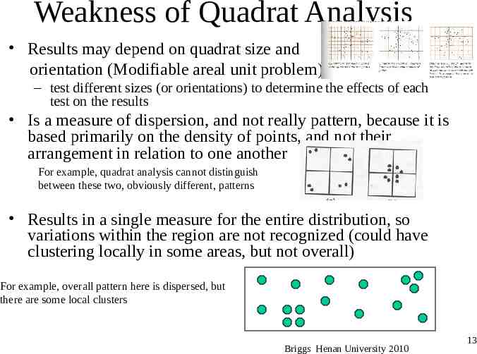
Weakness of Quadrat Analysis Results may depend on quadrat size and orientation (Modifiable areal unit problem) – test different sizes (or orientations) to determine the effects of each test on the results Is a measure of dispersion, and not really pattern, because it is based primarily on the density of points, and not their arrangement in relation to one another For example, quadrat analysis cannot distinguish between these two, obviously different, patterns Results in a single measure for the entire distribution, so variations within the region are not recognized (could have clustering locally in some areas, but not overall) For example, overall pattern here is dispersed, but there are some local clusters Briggs Henan University 2010 13
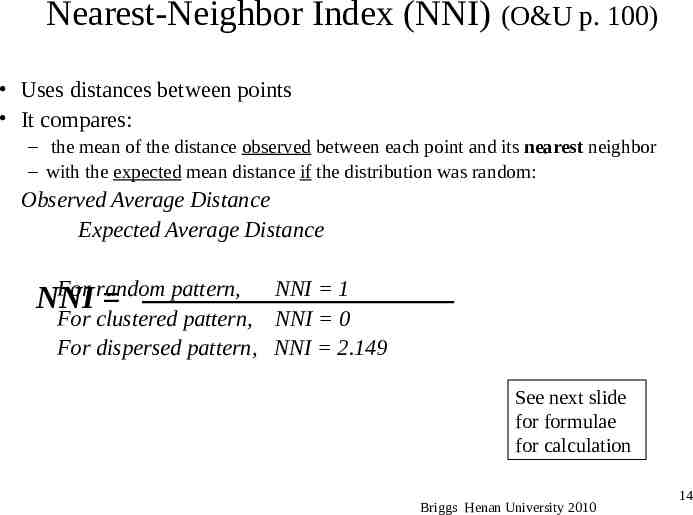
Nearest-Neighbor Index (NNI) (O&U p. 100) Uses distances between points It compares: – the mean of the distance observed between each point and its nearest neighbor – with the expected mean distance if the distribution was random: Observed Average Distance Expected Average Distance For random pattern, NNI NNI 1 For clustered pattern, NNI 0 For dispersed pattern, NNI 2.149 See next slide for formulae for calculation Briggs Henan University 2010 14
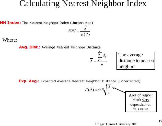
Calculating Nearest Neighbor Index Where: The average distance to nearest neighbor Area of region: result very dependent on this value Briggs Henan University 2010 15
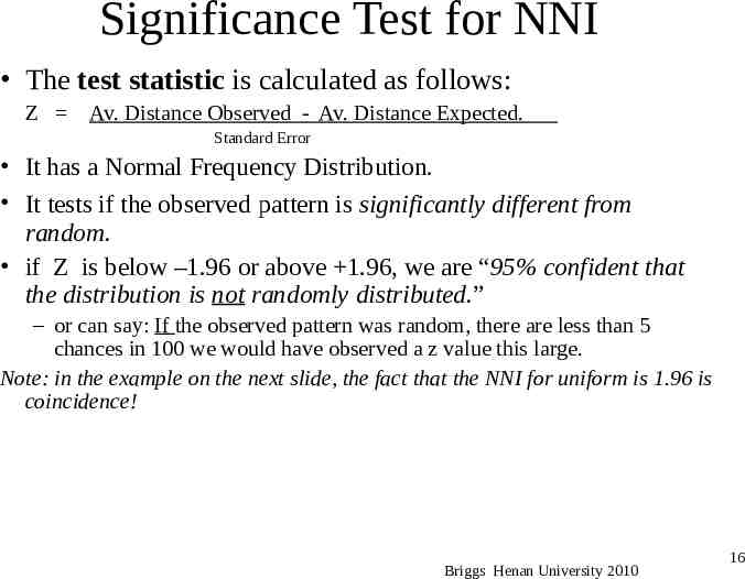
Significance Test for NNI The test statistic is calculated as follows: Z Av. Distance Observed - Av. Distance Expected. Standard Error It has a Normal Frequency Distribution. It tests if the observed pattern is significantly different from random. if Z is below –1.96 or above 1.96, we are “95% confident that the distribution is not randomly distributed.” – or can say: If the observed pattern was random, there are less than 5 chances in 100 we would have observed a z value this large. Note: in the example on the next slide, the fact that the NNI for uniform is 1.96 is coincidence! Briggs Henan University 2010 16
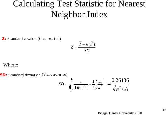
Calculating Test Statistic for Nearest Neighbor Index Where: (Standard error) 0.26136 n2 / A Briggs Henan University 2010 17
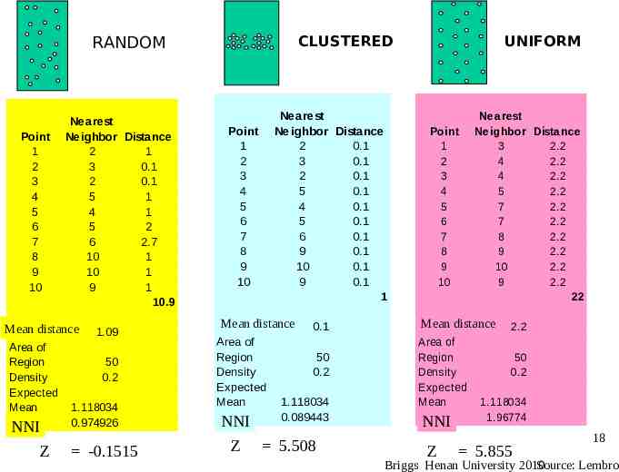
CLUSTERED RANDOM Point 1 2 3 4 5 6 7 8 9 10 Nearest Neighbor Distance 2 1 3 0.1 2 0.1 5 1 4 1 5 2 6 2.7 10 1 10 1 9 1 10.9 Meanrdistance Area of Region Density Expected Mean R NNI Z 1.09 50 0.2 1.118034 0.974926 -0.1515 Nearest Neighbor Distance 2 0.1 3 0.1 2 0.1 5 0.1 4 0.1 5 0.1 6 0.1 9 0.1 10 0.1 9 0.1 1 Point 1 2 3 4 5 6 7 8 9 10 Mean r distance Area of Region Density Expected Mean RNNI Z 0.1 50 0.2 1.118034 0.089443 5.508 UNIFORM Point 1 2 3 4 5 6 7 8 9 10 Nearest Neighbor Distance 3 2.2 4 2.2 4 2.2 5 2.2 7 2.2 7 2.2 8 2.2 9 2.2 10 2.2 9 2.2 22 Mean r distance Area of Region Density Expected Mean RNNI Z 2.2 50 0.2 1.118034 1.96774 5.855 18 Briggs Henan University 2010 Source: Lembro
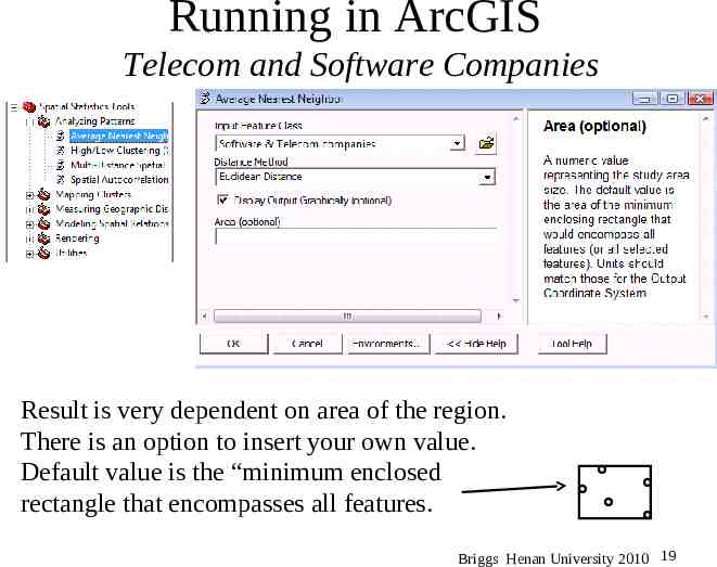
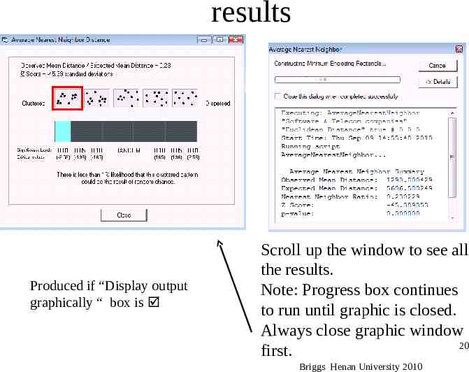
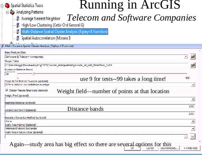
Running in ArcGIS Telecom and Software Companies Result is very dependent on area of the region. There is an option to insert your own value. Default value is the “minimum enclosed rectangle that encompasses all features. Briggs Henan University 2010 19
results Produced if “Display output graphically “ box is Scroll up the window to see all the results. Note: Progress box continues to run until graphic is closed. Always close graphic window 20 first. Briggs Henan University 2010
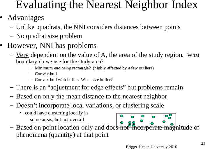
Evaluating the Nearest Neighbor Index Advantages – Unlike quadrats, the NNI considers distances between points – No quadrat size problem However, NNI has problems – Very dependent on the value of A, the area of the study region. What boundary do we use for the study area? – Minimum enclosing rectangle? (highly affected by a few outliers) – Convex hull – Convex hull with buffer. What size buffer? – There is an “adjustment for edge effects” but problems remain – Based on only the mean distance to the nearest neighbor – Doesn’t incorporate local variations, or clustering scale could have clustering locally in some areas, but not overall – Based on point location only and does not incorporate magnitude of phenomena (quantity) at that point Briggs Henan University 2010 21
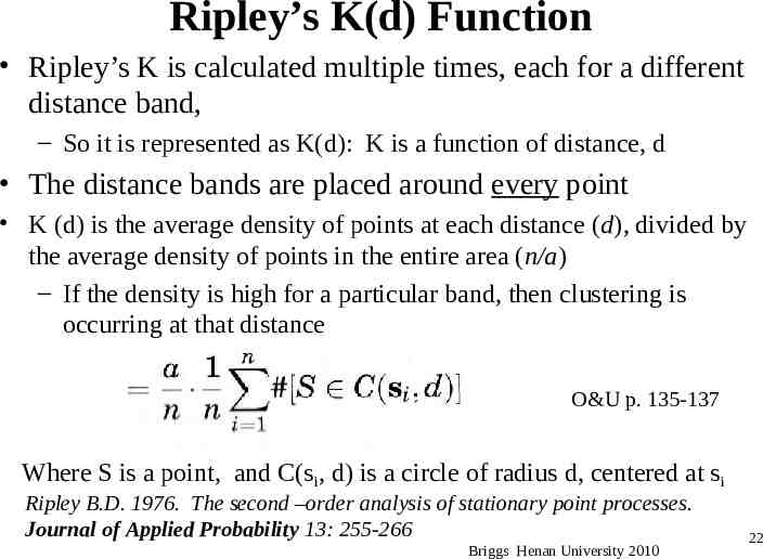
Ripley’s K(d) Function Ripley’s K is calculated multiple times, each for a different distance band, – So it is represented as K(d): K is a function of distance, d The distance bands are placed around every point K (d) is the average density of points at each distance (d), divided by the average density of points in the entire area (n/a) – If the density is high for a particular band, then clustering is occurring at that distance O&U p. 135-137 Where S is a point, and C(si, d) is a circle of radius d, centered at si Ripley B.D. 1976. The second –order analysis of stationary point processes. Journal of Applied Probability 13: 255-266 Briggs Henan University 2010 22
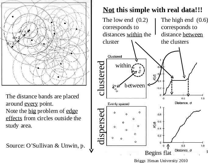
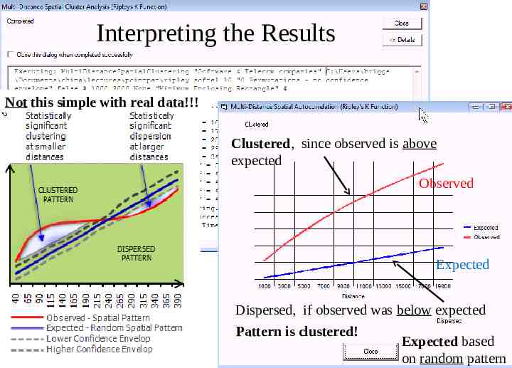
Not this simple with real data!!! Source: O’Sullivan & Unwin, p. The high end (0.6) corresponds to distance between the clusters within between dispersed The distance bands are placed around every point. Note the big problem of edge effects from circles outside the study area. clustered The low end (0.2) corresponds to distances within the cluster Begins flat Briggs Henan University 2010 23
Running in ArcGIS Telecom and Software Companies use 9 for tests--99 takes a long time! Weight field—number of points at that location Distance bands Result is very dependent on area of the region. Can insert your own value. Again—study area has big effect so there are several options for this Briggs Henan University 2010 24
Interpreting the Results Not this simple with real data!!! Clustered, since observed is above expected Observed Expected Dispersed, if observed was below expected Pattern is clustered! Expected based on random pattern
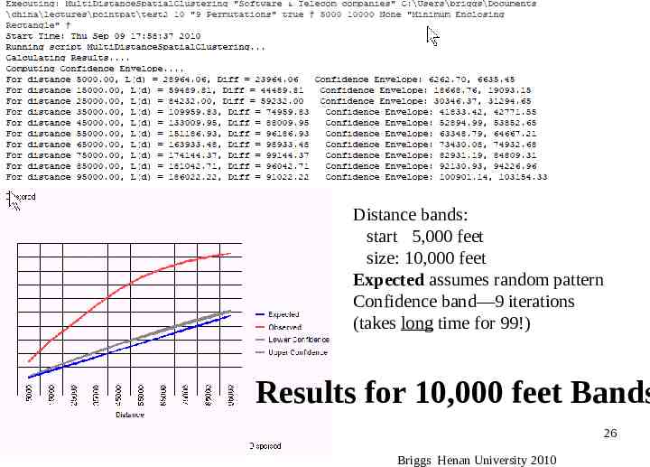
Distance bands: start 5,000 feet size: 10,000 feet Expected assumes random pattern Confidence band—9 iterations (takes long time for 99!) Results for 10,000 feet Bands 26 Briggs Henan University 2010
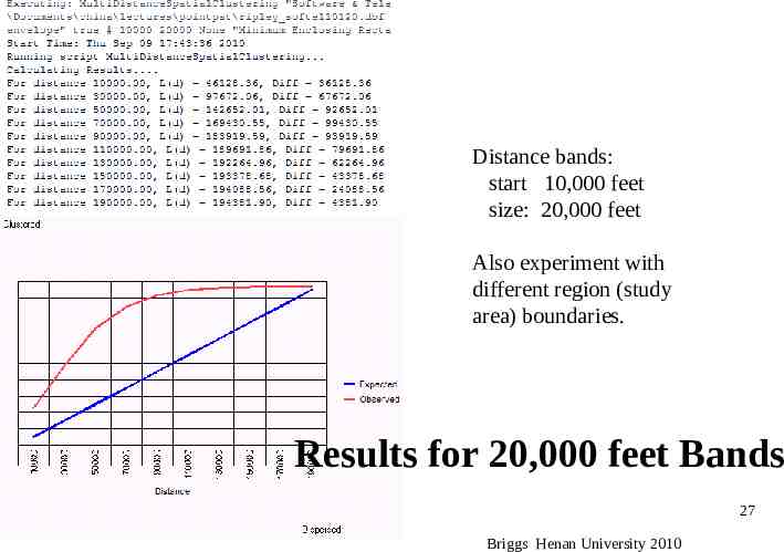
Distance bands: start 10,000 feet size: 20,000 feet Also experiment with different region (study area) boundaries. Results for 20,000 feet Bands 27 Briggs Henan University 2010
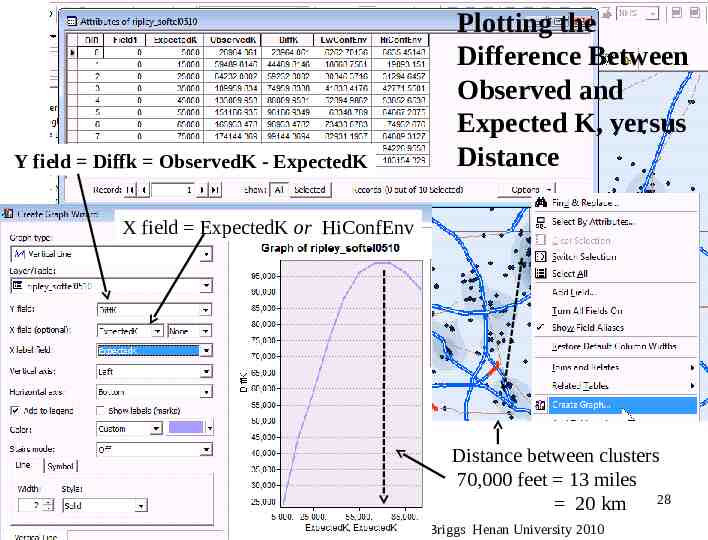
Y field Diffk ObservedK - ExpectedK Plotting the Difference Between Observed and Expected K, versus Distance X field ExpectedK or HiConfEnv Distance between clusters 70,000 feet 13 miles 28 20 km Briggs Henan University 2010
Problems with Ripley K(d) Dependent on study area boundary (edge effect) – Circles go outside study area – Special adjustments are available (see O&U p. 148) – Try different options for boundary in ArcGIS Affected by circle radii selected – Try different values Each point has unit value—no magnitude or quantity – Weight field assumes “X” points at that location – e.g. X 3, then 3 points at that location Briggs Henan University 2010 29
What have we learned? How to measure and test if spatial patterns are clustered or dispersed. 30 Briggs Henan University 2010
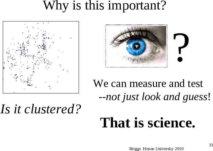
Why is this important? ? Is it clustered? We can measure and test --not just look and guess! That is science. Briggs Henan University 2010 31
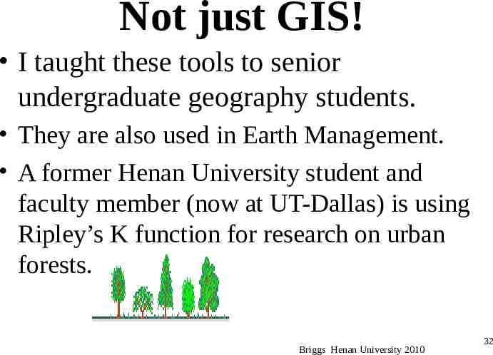
Not just GIS! I taught these tools to senior undergraduate geography students. They are also used in Earth Management. A former Henan University student and faculty member (now at UT-Dallas) is using Ripley’s K function for research on urban forests. Briggs Henan University 2010 32
Next Time No classes next week Next class will be Wednesday November 17 Topic Spatial Autocorrelation – Unlike PPA, in Spatial Autocorrelation points have different magnitudes; there is an attribute variable. – Briggs Henan University 2010 33
34 Briggs Henan University 2010