Hello and Welcome! Introduction Syllabus MyStatLab demo
19 Slides2.08 MB
Hello and Welcome! Introduction Syllabus MyStatLab demo Excel data analysis toolpak installation demo Motivation and examples This week: Population and sample Graphical statistics Descriptive statistics
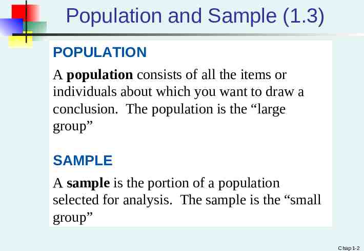
Population and Sample (1.3) POPULATION A population consists of all the items or individuals about which you want to draw a conclusion. The population is the “large group” SAMPLE A sample is the portion of a population selected for analysis. The sample is the “small group” Chap 1-2
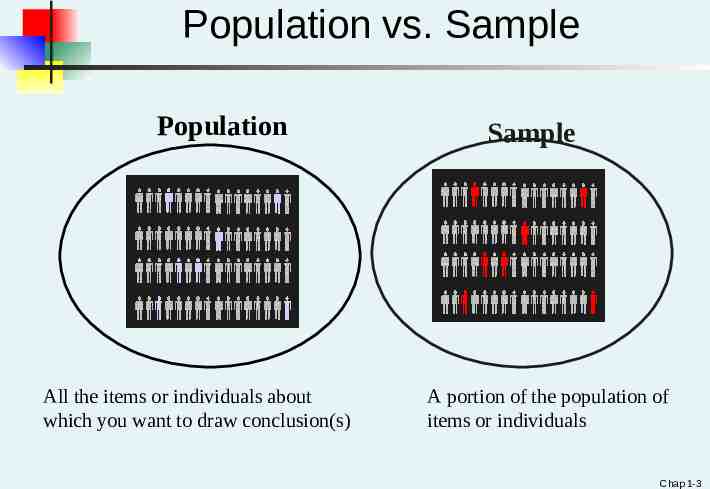
Population vs. Sample Population All the items or individuals about which you want to draw conclusion(s) Sample A portion of the population of items or individuals Chap 1-3
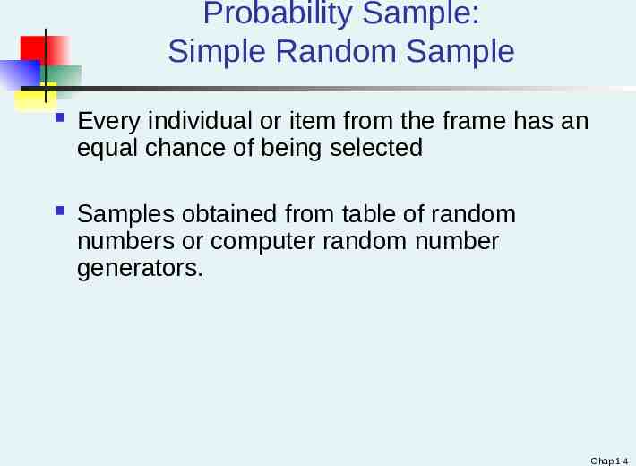
Probability Sample: Simple Random Sample Every individual or item from the frame has an equal chance of being selected Samples obtained from table of random numbers or computer random number generators. Chap 1-4
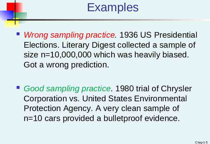
Examples Wrong sampling practice. 1936 US Presidential Elections. Literary Digest collected a sample of size n 10,000,000 which was heavily biased. Got a wrong prediction. Good sampling practice. 1980 trial of Chrysler Corporation vs. United States Environmental Protection Agency. A very clean sample of n 10 cars provided a bulletproof evidence. Chap 1-5
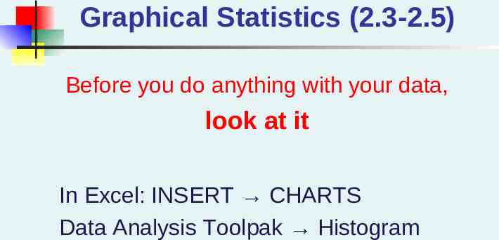
Graphical Statistics (2.3-2.5) Before you do anything with your data, look at it In Excel: INSERT CHARTS Data Analysis Toolpak Histogram
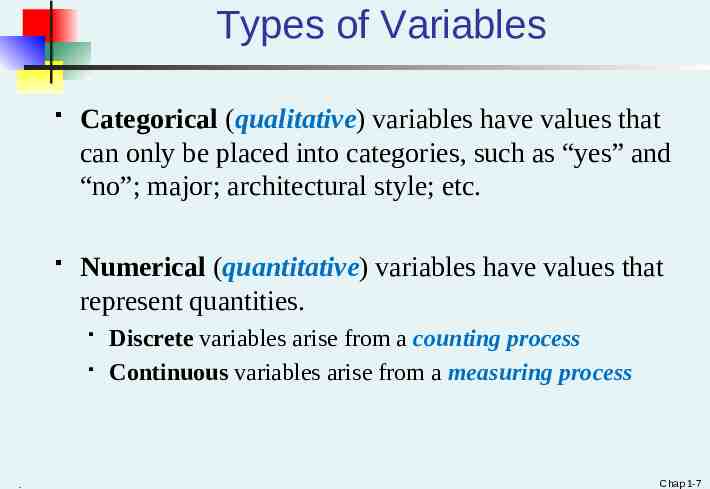
Types of Variables Categorical (qualitative) variables have values that can only be placed into categories, such as “yes” and “no”; major; architectural style; etc. Numerical (quantitative) variables have values that represent quantities. . Discrete variables arise from a counting process Continuous variables arise from a measuring process Chap 1-7
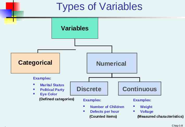
Types of Variables Variables Categorical Numerical Examples: Marital Status Political Party Eye Color (Defined categories) Discrete Examples: . Continuous Number of Children Defects per hour (Counted items) Examples: Weight Voltage (Measured characteristics) Chap 1-8
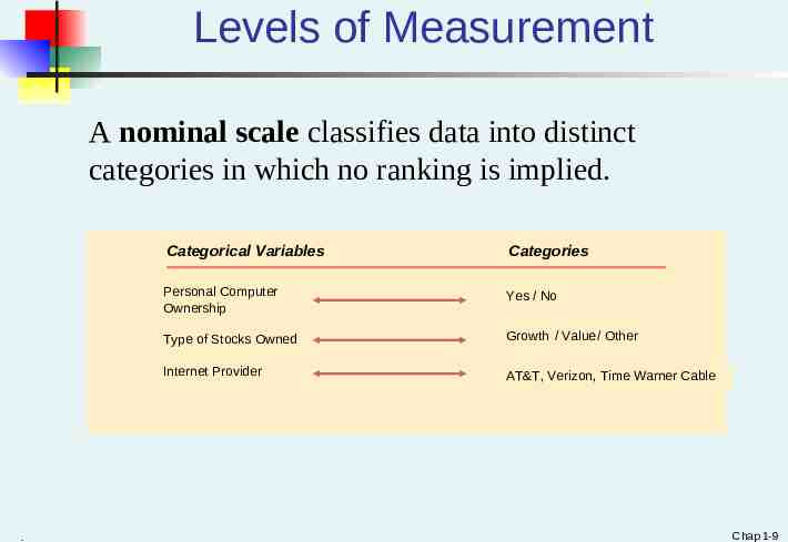
Levels of Measurement A nominal scale classifies data into distinct categories in which no ranking is implied. . Categorical Variables Categories Personal Computer Ownership Yes / No Type of Stocks Owned Growth / Value/ Other Internet Provider AT&T, Verizon, Time Warner Cable Chap 1-9
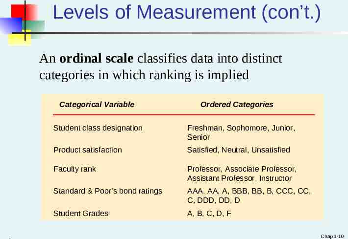
Levels of Measurement (con’t.) An ordinal scale classifies data into distinct categories in which ranking is implied Categorical Variable . Ordered Categories Student class designation Freshman, Sophomore, Junior, Senior Product satisfaction Satisfied, Neutral, Unsatisfied Faculty rank Professor, Associate Professor, Assistant Professor, Instructor Standard & Poor’s bond ratings AAA, AA, A, BBB, BB, B, CCC, CC, C, DDD, DD, D Student Grades A, B, C, D, F Chap 1-10
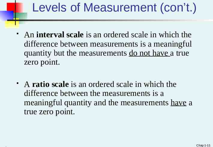
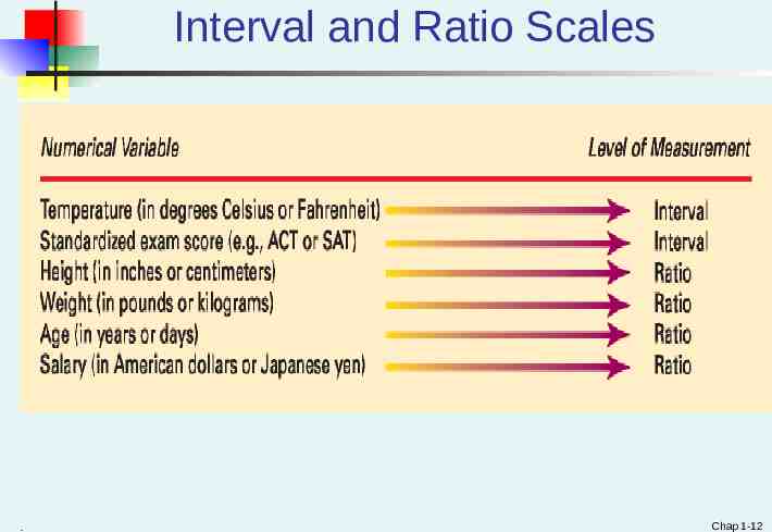
Levels of Measurement (con’t.) . An interval scale is an ordered scale in which the difference between measurements is a meaningful quantity but the measurements do not have a true zero point. A ratio scale is an ordered scale in which the difference between the measurements is a meaningful quantity and the measurements have a true zero point. Chap 1-11
Interval and Ratio Scales . Chap 1-12
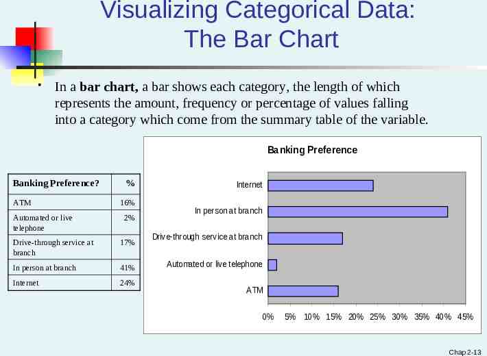
Visualizing Categorical Data: The Bar Chart In a bar chart, a bar shows each category, the length of which represents the amount, frequency or percentage of values falling into a category which come from the summary table of the variable. Banking Preference Banking Preference? ATM Automated or live telephone % 16% 2% Drive-through service at branch 17% In person at branch 41% Internet 24% Internet In person at branch Drive-through service at branch Automated or live telephone ATM 0% 5% 10% 15% 20% 25% 30% 35% 40% 45% Chap 2-13
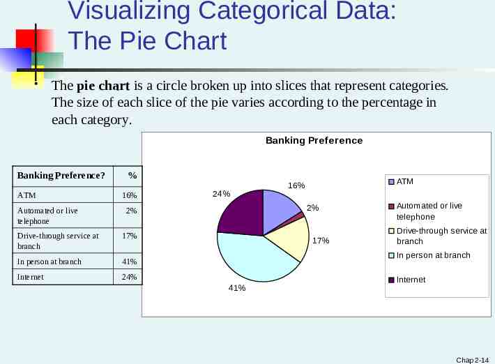
Visualizing Categorical Data: The Pie Chart The pie chart is a circle broken up into slices that represent categories. The size of each slice of the pie varies according to the percentage in each category. Banking Preference Banking Preference? ATM Automated or live telephone % 16% 24% 2% 2% Drive-through service at branch 17% In person at branch 41% Internet 24% ATM 16% 17% Automated or live telephone Drive-through service at branch In person at branch 41% Internet Chap 2-14
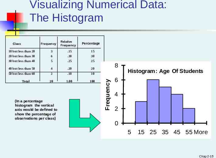
Visualizing Numerical Data: The Histogram Frequency Relative Frequency Percentage 10 but less than 20 20 but less than 30 30 but less than 40 3 6 5 .15 .30 .25 15 30 25 40 but less than 50 50 but less than 60 4 2 .20 .10 20 10 20 1.00 100 Total (In a percentage histogram the vertical axis would be defined to show the percentage of observations per class) 8 Frequency Class Histogram: Age Of Students 6 4 2 0 5 15 25 35 45 55 More Chap 2-15
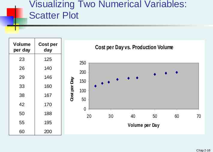
Visualizing Two Numerical Variables: Scatter Plot Cost per day 23 125 26 140 29 146 33 160 38 167 42 170 50 188 55 195 60 200 Cost per Day vs. Production Volume 250 200 Cost per Day Volume per day 150 100 50 0 20 30 40 50 60 70 Volume per Day Chap 2-16
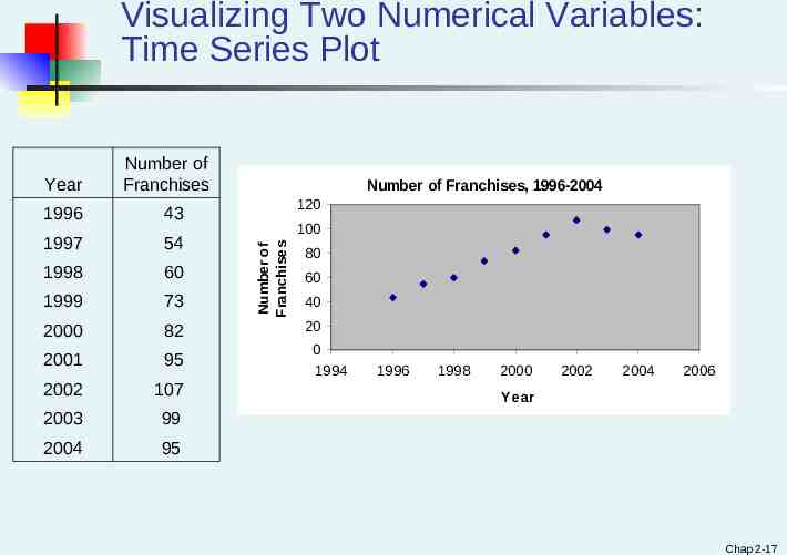
Visualizing Two Numerical Variables: Time Series Plot 1996 43 1997 54 1998 60 1999 73 2000 82 2001 95 2002 107 2003 99 2004 95 Number of Franchises, 1996-2004 120 100 Number of Franchises Year Number of Franchises 80 60 40 20 0 1994 1996 1998 2000 2002 2004 2006 Year Chap 2-17
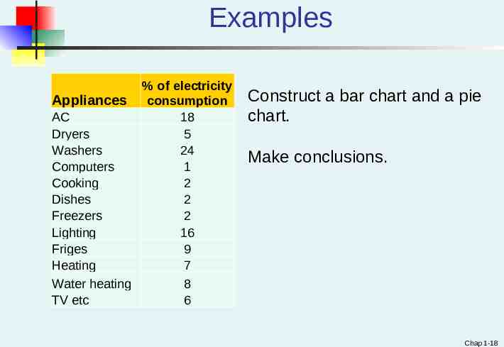
Examples % of electricity Appliances consumption AC 18 Dryers 5 Washers 24 Computers 1 Cooking 2 Dishes 2 Freezers 2 Lighting 16 Friges 9 Heating 7 Water heating 8 TV etc 6 Construct a bar chart and a pie chart. Make conclusions. Chap 1-18
Examples #2.39, p.58 “Cost of baseball games”. Dataset BBcost2011 (BBcost2015). Construct a histogram. #2.54, p.62 “Stock performance”. Construct a time series plot. Is there a pattern? Chap 1-19