Graphic Design What is Graphic Design? youtu.be/rUeiZ6c6EBw Visual


33 Slides9.99 MB
Graphic Design What is Graphic Design? https://youtu.be/rUeiZ6c6EBw Visual communication through the use of text, images, and symbols for a particular function. GRAPHIC: Visual, drawing, painting, engraving given clear and explicit detail Art Imagination, Expression DESIGN: To decide upon the look and function of something before it’s made Thinking, Problem Solving, Practicality
Graphic Design It’s not just Art! Graphic design is everywhere, touching everything we do, everything we see, everything we buy. We see it on billboards and in Bibles, on taxi receipts and on websites. It is personal and public. It has a function. What can you do with it? Interface design for web and apps Title sequences for films and TV shows! Street signs and your car’s dashboard Storyboard artist for movies or animations Cool packaging design! Video game interfaces, textiles, maps, etc. How do you start? Can you do it?
Graphic Design Main Elements of Graphic Design Type Line Shape Texture Color Space
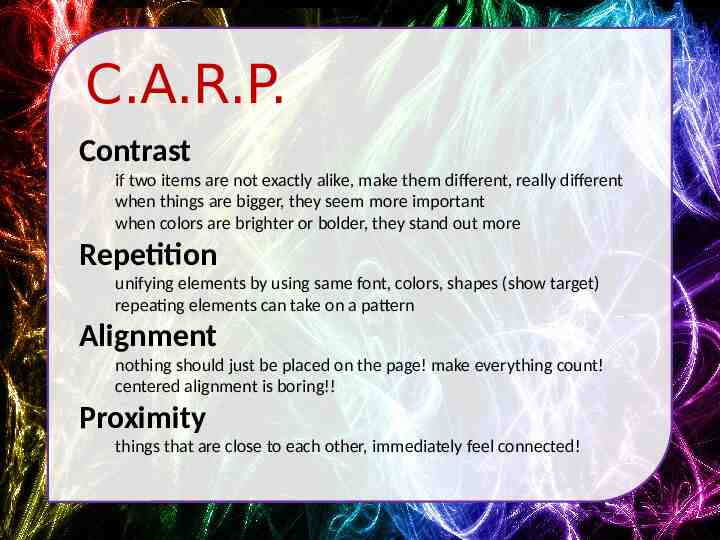
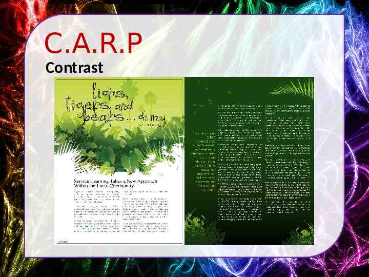
C.A.R.P. Contrast if two items are not exactly alike, make them different, really different when things are bigger, they seem more important when colors are brighter or bolder, they stand out more Repetition unifying elements by using same font, colors, shapes (show target) repeating elements can take on a pattern Alignment nothing should just be placed on the page! make everything count! centered alignment is boring!! Proximity things that are close to each other, immediately feel connected!
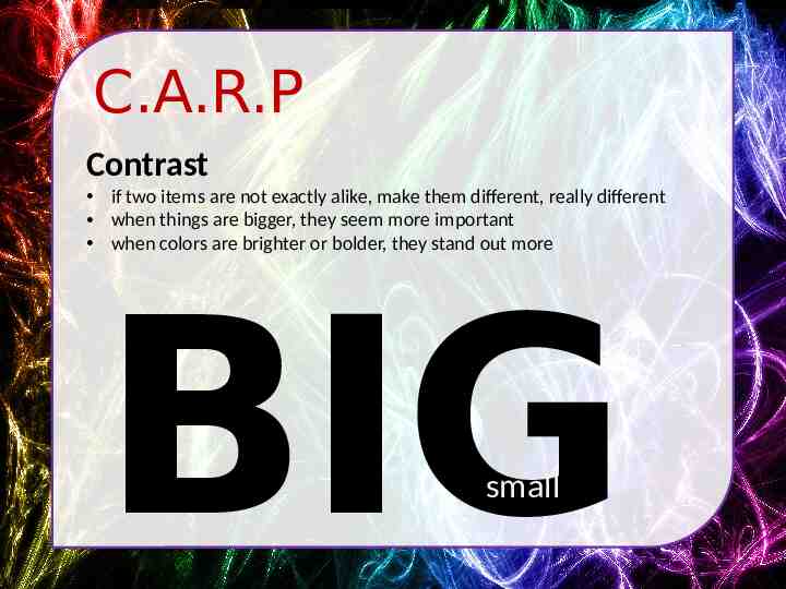
C.A.R.P Contrast if two items are not exactly alike, make them different, really different when things are bigger, they seem more important when colors are brighter or bolder, they stand out more BIG small
C.A.R.P Contrast small
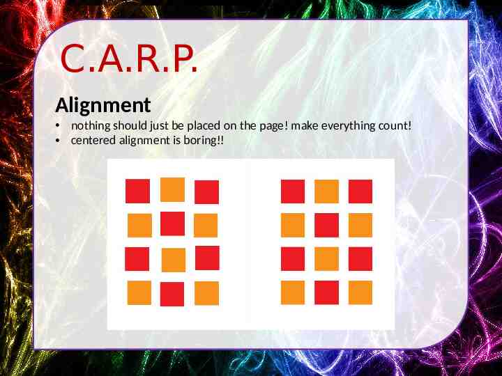
C.A.R.P. Alignment nothing should just be placed on the page! make everything count! centered alignment is boring!!
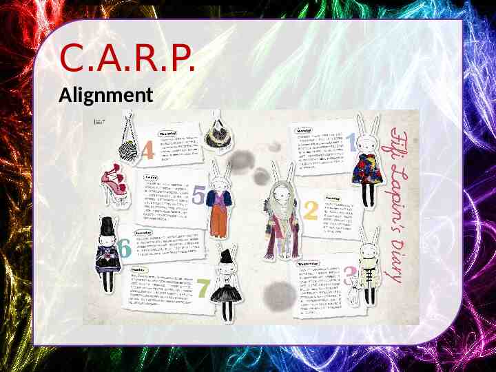
C.A.R.P. Alignment
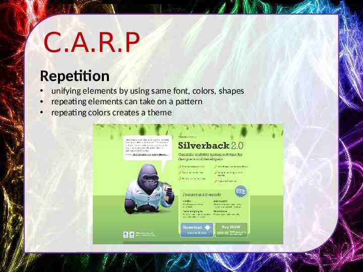
C.A.R.P Repetition unifying elements by using same font, colors, shapes repeating elements can take on a pattern repeating colors creates a theme
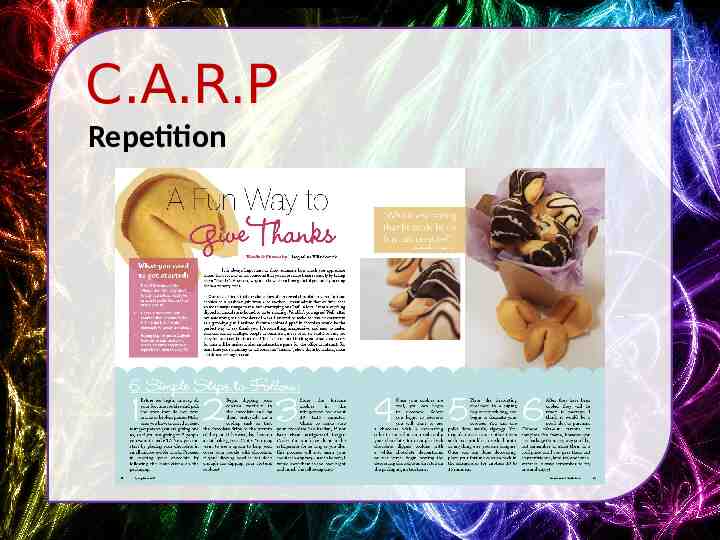
C.A.R.P Repetition
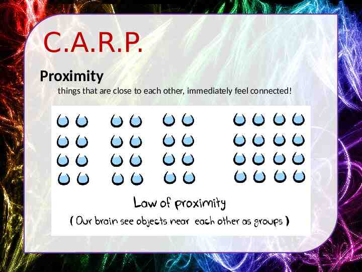
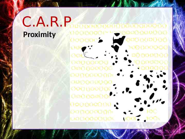
C.A.R.P. Proximity things that are close to each other, immediately feel connected!
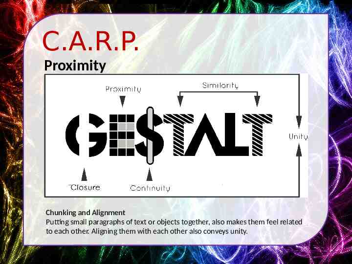
C.A.R.P. Proximity Chunking and Alignment Putting small paragraphs of text or objects together, also makes them feel related to each other. Aligning them with each other also conveys unity.
C.A.R.P. Proximity
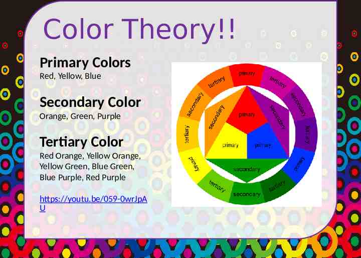
Color Theory!! Primary Colors Red, Yellow, Blue Secondary Color Orange, Green, Purple Tertiary Color Red Orange, Yellow Orange, Yellow Green, Blue Green, Blue Purple, Red Purple https://youtu.be/059-0wrJpA U
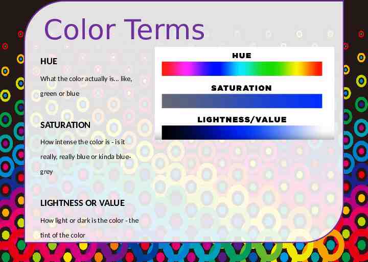
Color Terms HUE What the color actually is. like, green or blue SATURATION How intense the color is - is it really, really blue or kinda bluegrey LIGHTNESS OR VALUE How light or dark is the color - the tint of the color
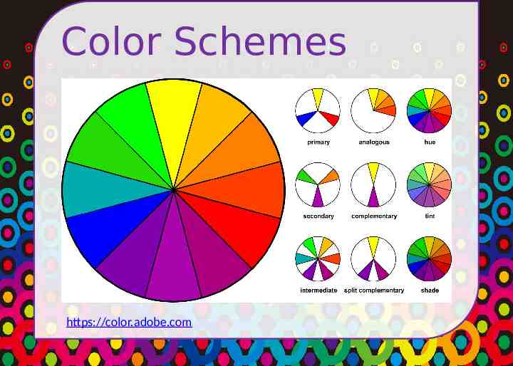
Color Schemes https://color.adobe.com
Typography An Introduction to Typography Comic Sans Font Conference Font Fight!!
Typography Type Face & Font The “type face” is the name of the family of fonts, like Arial. The font are the versions within that family, like BOLD or Italic or W i d e Serif / San Serif Serif type faces have curly-ques, like Times New Roman San Serif fonts are more angular, without curly ques, like Eurostile Kerning / Leading Kerning is the space between two letters Leading is the space between lines Tracking/letterspacing is applied to a group of letters http://type.method.ac/ Measurements Printed type is generally measured in Picas or Points, web type is generally measured in Pixels or Ems
Typography Good Practices Hierarchy This text is the sub headline This text is the content text. It’s smaller because it’s less important. The more important, the bigger it should be in relation to other text. CONTRAST Contrast is using different boldness, different colors, different fonts.
Typography Choose Wisely! EVEN YOUR TYPE FACE CREATES A MOOD Times New Roman – I’m easy to read on paper because of my serifs, but I’m harder to read on screen. I seem old and traditional. Helvetica or Arial – I’m a slick and sleek sans serif who’s easy to read on a computer screen. Everyone thinks I’m pretty cool. Comic Sans – Everyone thinks I’m a kid’s font, but I’m easier to read for people with dyslexia. Papyrus – Everyone knows that I’m trying too hard to be cool. Let me die.
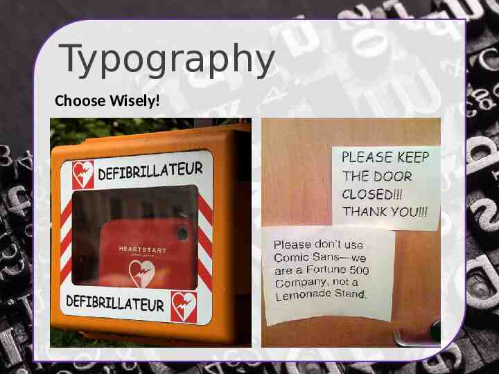
Typography Choose Wisely!
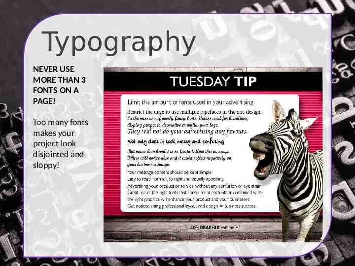
Typography NEVER USE MORE THAN 3 FONTS ON A PAGE! Too many fonts makes your project look disjointed and sloppy!
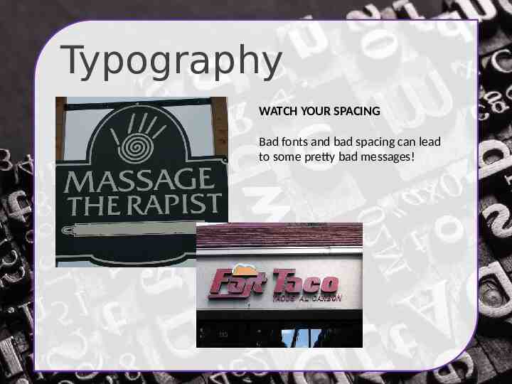
Typography WATCH YOUR SPACING Bad fonts and bad spacing can lead to some pretty bad messages!
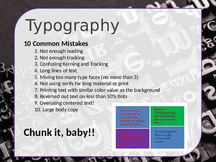
Typography 10 Common Mistakes 1. Not enough leading 2. Not enough tracking 3. Confusing Kerning and Tracking 4. Long lines of text 5. Mixing too many type faces (no more than 3) 6. Not using serifs for long material or print 7. Printing text with similar color value as the background 8. Reversed out text on less than 50% tints 9. Overusing centered text! 10. Large body copy Chunk it, baby!!
Photos & Images Web Graphics JPG vs. GIF vs. PNG vs. SVG JPG – photo quality with no transparency. Good for photography GIF – good to use for logos, graphics with colors, but not high quality photographs PNG – photo quality WITH transparency!! SVG – vector graphics! Can be resized .’cause MATH!
Photos & Images Web Photos & Graphics DPI – Dots per inch 300 dpi – print quality 72 dpi – screen quality Vector vs. Raster Photographs are raster, which is pixel information, which cannot be resized larger without losing quality. Logos can be vector, which is math based and can be resized with degradation!
Final Tips Plan out every detail of your site! Create intuitive navigation for your product. Organize your information in easy to understand lists BE CONSISTENT!! Don’t change your navigation throughout the product 3 Click Minimum – No user wants to go down the rabbit hole of links! Keep it user centered! Make your mom navigate the site to find things. Just because you can find it, doesn’t mean your user can! Make it responsive!! Over half of your views will be from devices!
Good, Bad, Ugly Good and Bad Web Design Elements Web Pages That Stink http://www.georgehutchins.com/ http://www.arngren.net/ http://www.gatesnfences.com/ http://www.dpgraph.com/ Web Pages That Don’t http://design-newz.com/ http://ismaelburciaga.com/ https://sikkema.be/ https://www.brandalmanac.com
Info Sources Usability.gov Usabilityfirst.com Adobe Color CC – color schemes for you! The Non-Designer’s Design & Type Books Conquering the Content