Graphic Design “The Computer as an Educational Tool: Productivity
21 Slides310.00 KB
Graphic Design “The Computer as an Educational Tool: Productivity and Problem Solving” Richard C. Forcier and Don E. Descy
Introduction Design principles Visual elements Basic lettering
Four Design Principles Balance Emphasis Simplicity Unity
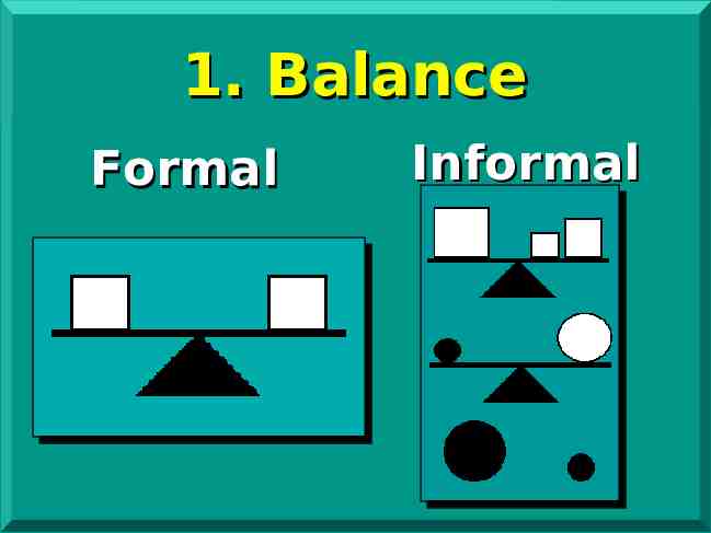
1. Balance Formal Informal
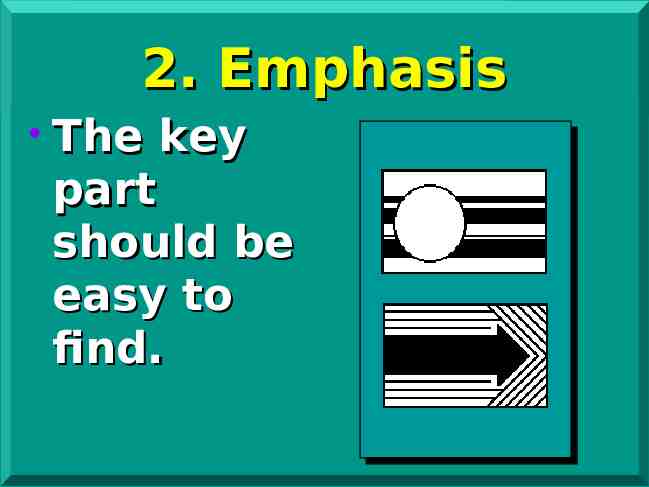
2. Emphasis The key part should be easy to find.
Emphasis (Continued) Arrows or other directing device Bright colors Contrasting colors Size of element Different shapes
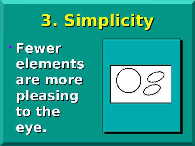
3. Simplicity Fewer elements are more pleasing to the eye.
Simplicity (Continued) Fewer elements better 15–20 words maximum Bold, simple drawings Easy lettering styles
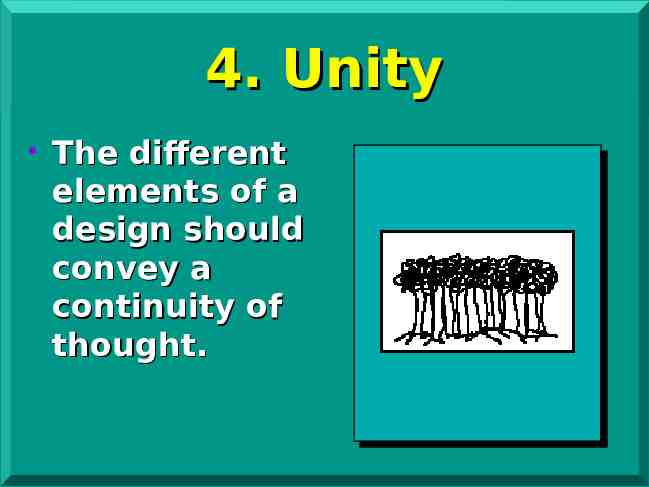
4. Unity The different elements of a design should convey a continuity of thought.
Visual Elements Lines Shapes Color and contrast Texture Space and size
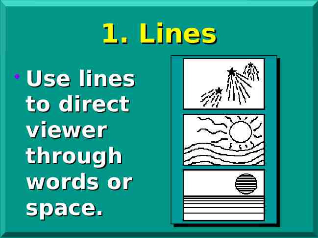
1. Lines Use lines to direct viewer through words or space.
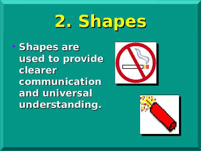
2. Shapes Shapes are used to provide clearer communication and universal understanding.
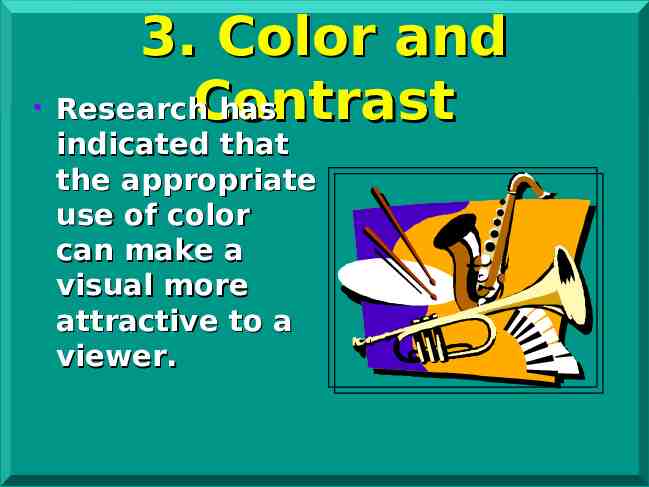
3. Color and Research has Contrast indicated that the appropriate use of color can make a visual more attractive to a viewer.
Color and Contrast (Continued) Use harmonious colors Gives separation Good for emphasis
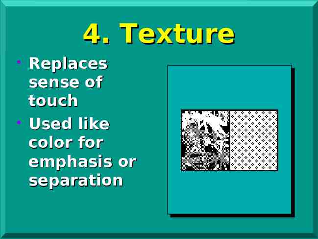
4. Texture Replaces sense of touch Used like color for emphasis or separation
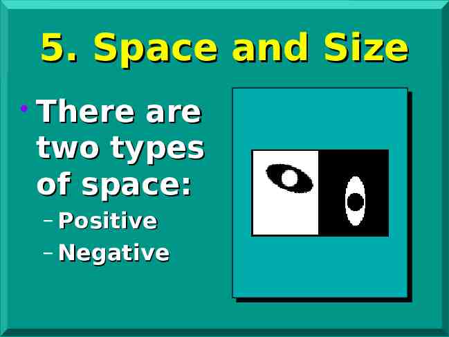
5. Space and Size There are two types of space: – Positive – Negative
Basic Lettering Guidelines Size Type style (font) Spacing
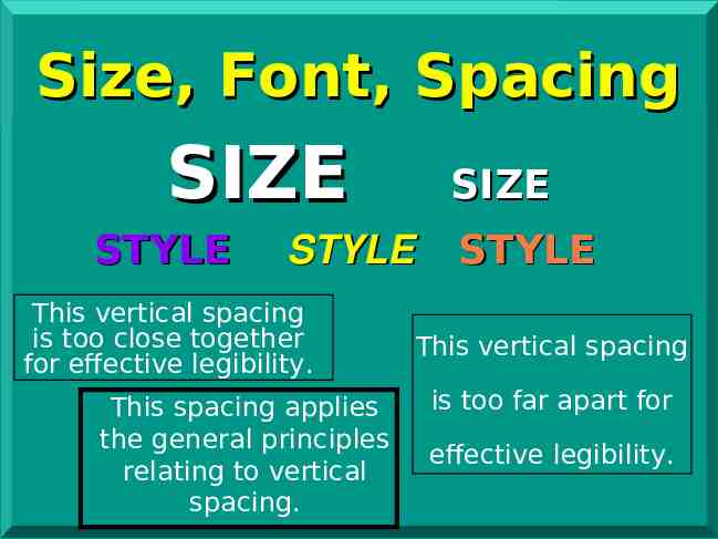
Size, Font, Spacing SIZE STYLE SIZE STYLE This vertical spacing is too close together for effective legibility. This spacing applies the general principles relating to vertical spacing. STYLE This vertical spacing is too far apart for effective legibility.
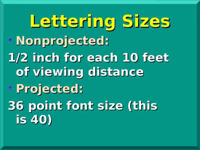
Lettering Sizes Nonprojected: 1/2 inch for each 10 feet of viewing distance Projected: 36 point font size (this is 40)
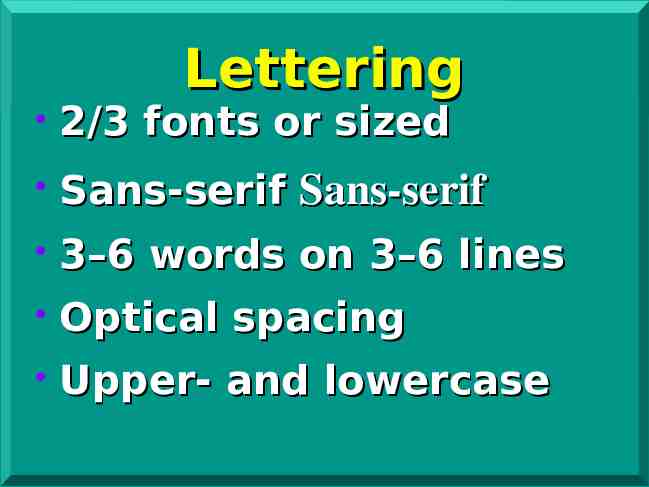
Lettering 2/3 fonts or sized Sans-serif Sans-serif 3–6 words on 3–6 lines Optical spacing Upper- and lowercase
Questions?