System Metrics to Assess KM Outcomes with Office 365


13 Slides1.00 MB
System Metrics to Assess KM Outcomes with Office 365 Updated: 5/22/2017
How to use this guide To truly assess whether your KM initiatives are successful, you need a combination of qualitative and quantitative measures – and not all of the measures (e.g. business metrics) can be captured from Office 365. But, with a combination of information you can get “out of the box” from Office 365 and some third-party tools, you can identify some valuable insights into your KM initiatives and their impact in the organization. The tables that follow are organized along three dimensions: Content Conversations People The information in this document was collected in September 2016 based on interviews with the product vendors listed. The list of third-party tools is not intended to be exhaustive. Microsoft has released a preview of a powerful set of metrics tools for Office 365 as part of the Power BI Content Pack for Office 365 (public preview beginning April 2017). For more information see: https://blogs.office.com/2017/05/22/announcing-the-public-preview-of-the-office-365-adoption-c ontent-pack-in-powerbi/ Be sure to take a look at session BRK2008 – Understand Your Users – what’s new in Office 365 usage reporting? from Microsoft Ignite 2016 where you can learn more about the new PowerBI Content Pack for Office 365 referenced in this document.
Overview of the tables Measure: The first column is an attempt to give the metric a name. Insight: The second column describes what you can learn from this metric and why it is important. For a Site/Group and For the Organization: These columns describe whether and how you can find this information “in the box” – as part of either the Site or Group Admin’s view of content or the Office 365 Administrator for your organization as a whole. Third-Party Tool: This column lists some third party tools that work with Office 365 that can help enhance what is available out of the box.
Metrics summary chart - Content Measure Insight For a Site/Group/Team For the Organization Third-party Tool? Most viewed documents Which Document Which Author (who contributed) Which Department To improve re-use and ensure predictable quality & effort, you need people need to contribute content – which requires performance management goals that recognize and reward collaborative behavior – and the ability to identify who is contributing and how that contribution is being used. View Site Contents to look for trending content. This will help identify popular documents. Select View Report for past 7 days. Site report shows Modified By (may not always be the author!) The new SharePoint activity report* shows a high level summary of the file activity within all of your SharePoint Online team sites. The perspective is by user and shows the number of files viewed or edited by user. This can help identify which users have been the most active, which is a good proxy for identifying “sharers,” but it doesn’t show the specific documents that have been shared/edited/synced the most. The Active Users report shows usage across all Office 365 services, which will allow you to identify insights into who may be sharing content from OneDrive but not necessarily sharing the content more broadly in a “public” location. The SharePoint site usage report shows the sites (and site owner) and can be sorted to see which sites are the most active, which can help identify activity by department. tyGraph for Office 365 CardioLog (Admin can filter and choose where they look at the data) Webtrends Infinity Analytics for SharePoint (Out of the box you can get which document has been viewed the most within a site collection only. Customization is required to configure to capture this at the farm/organization level. Customization is also required to identify the author of and department contributing a document.) Identifying who contributed highly “re-used” content also helps identify people whose knowledge is critical to the organization – and thus should be targeted for leading lunch and learn sessions, participating in video interviews, conducting “master classes,” etc. *There is more data coming soon, including a new Power BI content pack which will provide richer insights by enabling pivots between Office 365 usage data with user-level data, like region or department. This will be made available later in in the year along with new public APIs to access the usage data and integrated it into custom applications. However, it does not show specific documents or pages – just “top sites.”
Metrics summary chart – Content Measure Insight For a Site/Group/Team For the Organization Third-party Tool? My Documents with the Highest Reach Helping each individual understand the impact of their work, which provides incentives to continue to contribute and helps build the base of assets to improve quality. Starting 9/26/16 on iOS, each individual can see over time how many people have discovered and viewed their files that are copied from OneDrive to SharePoint. This will come to Android and Windows in future updates. Blog post with the most engagement (comments and likes) Author Topic In addition to the insights afforded above, the Subject or Topic covered by the blog post helps identify critical knowledge that you may want to promote in other ways. Top Queries (search) Identify key knowledge areas to promote or enhance. Popularity and Search Reports for each site collection Webtrends Infinity Analytics for SharePoint (for the site collection and for the organization) No Results Queries (by day and month) Use this report to identify emerging knowledge areas or topics where you need to create additional re-usable assets. Popularity and Search Reports for each site collection Webtrends Infinity Analytics for SharePoint (for the site collection and for the organization) Webtrends Infinity Analytics for SharePoint (but only for sites configured as “blog sites” so not really) CardioLog (maybe)
Metrics summary chart - Conversations Measure Insight For a Site/Group/Team For the Organization Yammer posts with the most likes/comments Contributor or “Best response” Topic To improve re-use and ensure predictable quality & effort, you need people need to contribute content – which requires performance management goals that recognize and reward collaborative behavior – and the ability to identify who is contributing and how that contribution is being used. In addition, the Subject or Topic covered by the blog post helps identify critical knowledge that you may want to promote in other ways. tyGraph for Yammer CardioLog (can do this natively by Contributor and can customize to find by Topic) Yammer posts with replies from members not @mentioned Identifies collaborative behavior not possible with traditional methods such as email tyGraph for Yammer CardioLog (with customization) Number of posts that are questions (by department, by individual) Demonstrates knowledge seeking behaviors – such as “did we ever do this before” tyGraph for Yammer (with customization) CardioLog (with customization) Number of sharing posts (by department, by Demonstrates knowledge sharing behaviors and re- The Yammer activity report shows users by Third-party Tool? tyGraph for Yammer CardioLog
Metrics summary chart – Conversations Measure Insight Number of questions answered (by department, by individual) Demonstrates knowledge sharing behaviors and reuse. Average response time to thread/message Proxy for reducing decision time. The faster the response time, the faster you can use that information to make decisions. It’s also a proxy for improving customer service – if a particular group has a committed rapid response SLA, it means that you can potentially answer questions while customers are on the phone, eliminating the need to call them back. And answers on the first call help create happy customers! For a Site/Group/Team For the Organization Third-party Tool? The Yammer activity report shows users by activity type - Read, Posted, Like – as well as an overall summary but it doesn’t tell you whether the post was a reply (more likely to be an answer). tyGraph for Yammer (with customization) CardioLog (with customization) tyGraph for Yammer (October 2016)
Metrics summary chart – Conversations, cont. Measure Insight Engagement by work team (usage metrics by team) Insight into issues with “time to talent.” For example, if you have one sales group that is high performing and another that is not, you may want to look and see whether the lower performing group has lower engagement in their Group. For a Site/Group/Team For the Organization Third-party Tool? The new Power BI Content Pack for Office 365 provides a wealth of information about usage and adoption – and supports the ability to filter answers by department. tyGraph for Yammer tyGraph for Office 365 CardioLog
Metrics summary chart - People Measure Insight Profile attributes completed/missing such as About me, Skills, Interests, etc. by person Key Influencers For a Site/Group/Team For the Organization Third-party Tool? Demonstrates knowledge sharing behaviors – willingness to provide insights and expertise (and enables expertise location) Possibly with custom code Hyperfish Directory Analyzer can look at any data in AD. As long as profile information is sync’d to AD, this tool provides the ability to not just monitor, but notify users about missing information. CardioLog (with customization) Identify people whose knowledge is critical to the organization – and thus should be targeted for leading lunch and learn sessions, participating in video interviews, conducting “master classes,” etc. The new SharePoint activity report shows a high level summary of the file activity within all of your SharePoint Online team sites. The perspective is by user and shows the number of files viewed or edited by user. This can help identify which users have been the most active, which is a good proxy for identifying influencers who contribute to documents. The Yammer activity reports show Posts by user. Users with a lot of posts are potentially influencers, but what might be a better indicator is which users have posts that have the most likes or “shares.” tyGraph for Yammer – tyGraph has an “influencer” score metric that looks at what people post (starting a thread, announcements, praise, likes) and what the impact of their posts are (replies, likes, mentions) to identify an influence metric for each Yammer user. tyGraph for Office 365 CardioLog (Influential Users report shows people with the most Followers in Yammer. Could be extended to include combining other metrics similar to tyGraph,) Webtrends Infinity Analytics for SharePoint (Only for content in SharePoint.
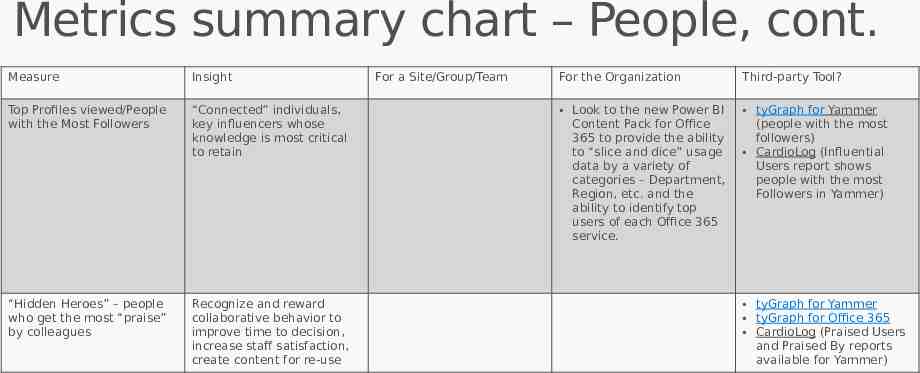
Metrics summary chart – People, cont. Measure Insight Top Profiles viewed/People with the Most Followers “Connected” individuals, key influencers whose knowledge is most critical to retain “Hidden Heroes” – people who get the most “praise” by colleagues Recognize and reward collaborative behavior to improve time to decision, increase staff satisfaction, create content for re-use For a Site/Group/Team For the Organization Third-party Tool? Look to the new Power BI Content Pack for Office 365 to provide the ability to “slice and dice” usage data by a variety of categories – Department, Region, etc. and the ability to identify top users of each Office 365 service. tyGraph for Yammer (people with the most followers) CardioLog (Influential Users report shows people with the most Followers in Yammer) tyGraph for Yammer tyGraph for Office 365 CardioLog (Praised Users and Praised By reports available for Yammer)
Screenshots from the new Power BI Content Pack for Office 365 Note that the Power BI Content Pack for Office 365 must be “turned on” by your Admin before the data is available. It is not enabled by default. The first load will take between 20-25 minutes. The default refresh on the data is once per day.
Screenshots from the new Power BI Content Pack for Office 365 (shared at Ignite 2016) Look at users who are posting a lot to Yammer, sharing a lot on SharePoint, etc. Filter by Department and Region This report can help identify key influencers – people who should be targeted to lead Brown Bags, mentor others, manage communities, etc.
Understanding the Office 365 Adoption dashboard Adoption report—Understand the trend of adoption of the various services within Office 365 for your organization. Look at the total numbers of users enabled to use a product through license assignment, the number of users active in a product tracked through an intentional use of the product, number of users returning month over month, number of first time users and the trend for the users that have been active in the service at least once. You can also understand what combination of Office 365 services are more popular amongst your users. Communication report—Understand how users use Office 365 to communicate. The dashboard includes a communication activities report that provides details about how the usage of different communication methods—such as email or IMs or messages posted in Yammer —has changed over time allowing you to understand how your users are adopting new ways of communication. Collaboration report—Gives you the ability to see how people in your organization use OneDrive and SharePoint to store documents and collaborate with each other and how this is changing. It enables you to understand how many users are active, and how many sites or OneDrives are actively being used by owners or others to store documents or collaborate. This gives you a good sense on the extent of collaboration going on amongst your users Storage utilization report—Helps you understand how your users are using the storage available to them in Office 365 Access from anywhere report—Helps you understand what clients and devices your users are using to connect to the various services with Office 365. Activation report—Helps you understand Office 365 ProPlus, Project and Visio activations. Understand the total number of activations across all users, number of users that have activated the products, number of devices they have activated them on and the type of device. You can see which are the top departments and regions (user location) that are using the various services in Office 365.