Creating Accessible Forms and Surveys in REDCap C.BATTISTON,
10 Slides848.10 KB
Creating Accessible Forms and Surveys in REDCap C.BATTISTON, WOMEN’S COLLEGE HOSPITAL [email protected]
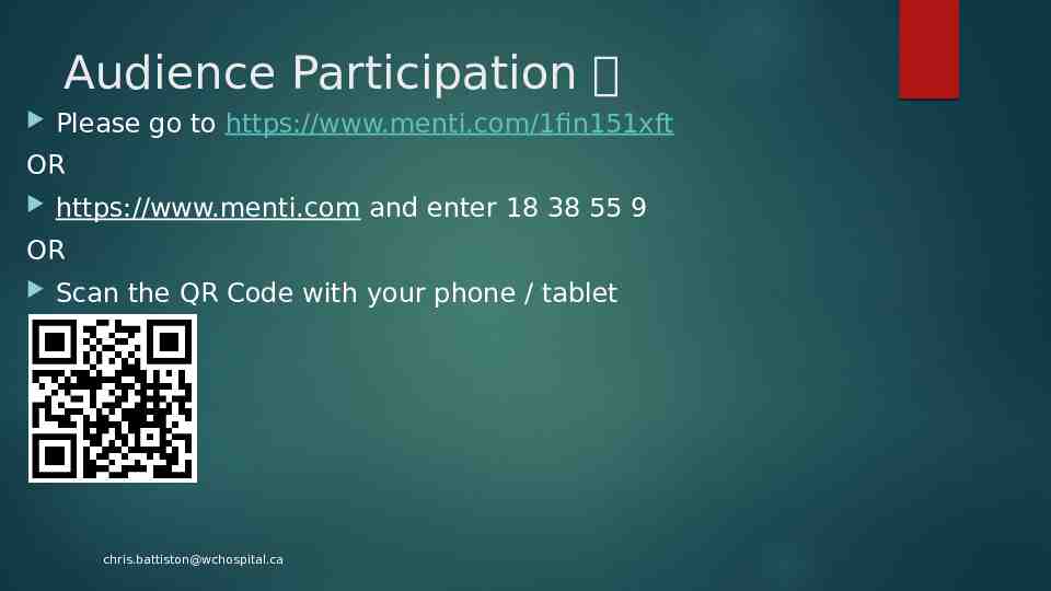
Audience Participation Please go to https://www.menti.com/1fin151xft OR https://www.menti.com and enter 18 38 55 9 OR Scan the QR Code with your phone / tablet [email protected]
What is accessibility mean to us? Accessibility is the design of products, devices, services, vehicles, or environments so as to be usable by people with disabilities (Wikipedia) For REDCap, we can do some pretty simple things to make our projects more accessible. We may do a lot of these as it makes the surveys / forms easier in general, but the key difference is doing them intentionally and to ensure as many participants as possible can fill in the questions. Offering paper copy for who have trouble reading screens or who don’t / can’t use Internet Proxy completion of the survey (family member, study coordinator, etc). Save and Return for longer surveys, and a Progress Bar and / or Page x of y Field notes with definitions and clarification if the question may be confusing for some Patient Experience Advisors or a DEIA representative review the survey before production The Text-To-Speech functionality in Survey Settings is OK but requires that the text be sent to Vanderbilt’s server, which may pose a problem for some privacy offices. Lag time of 30 seconds to the speech to be processed and returned Pronunciation – “A” is pronounced “AH” instead of “EH” which may confuse some people Submit and other buttons don’t get picked up by the reader [email protected]
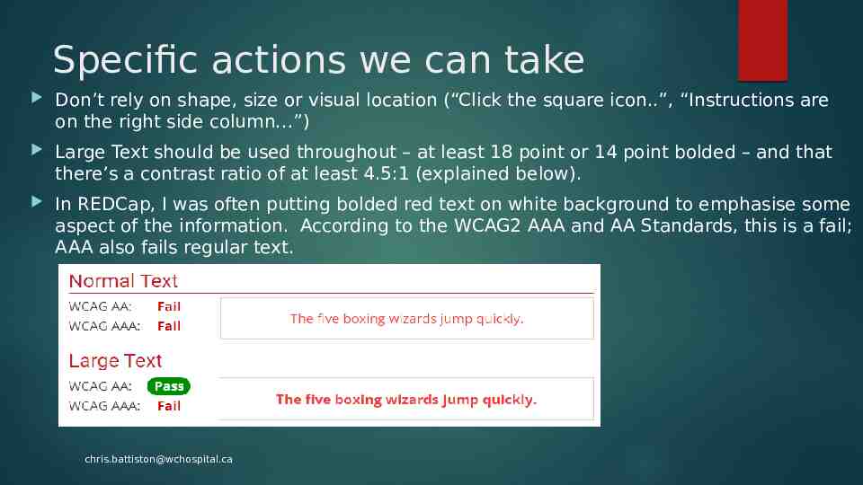
Specific actions we can take Don’t rely on shape, size or visual location (“Click the square icon.”, “Instructions are on the right side column ”) Large Text should be used throughout – at least 18 point or 14 point bolded – and that there’s a contrast ratio of at least 4.5:1 (explained below). In REDCap, I was often putting bolded red text on white background to emphasise some aspect of the information. According to the WCAG2 AAA and AA Standards, this is a fail; AAA also fails regular text. [email protected]
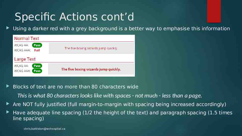
Specific Actions cont’d Using a darker red with a grey background is a better way to emphasise this information Blocks of text are no more than 80 characters wide This is what 80 characters looks like with spaces - not much - less than a page. Are NOT fully justified (full margin-to-margin with spacing being increased accordingly) Have adequate line spacing (1/2 the height of the text) and paragraph spacing (1.5 times line spacing) [email protected]
Images and other Media Alternative text provided for images etc.; if the image is static (a logo for example) then there’s an indication of this. Complex images have text-based descriptions. If you’re using audio or video as part of a survey, include a textbased transcript Images do not contain text that convey content OR when the information cannot be presented with text alone. [email protected]
Colour Colour is not used as the sole method of conveying content or distinguishing visual elements (red ineligible, green eligible for example). Colour alone is not used to distinguish links from surrounding text unless the contrast ratio between the link and surrounding text is at least 3:1 and an additional distinction (e.g. underline) is provided when the link is hovered / receives focus Text and images have a minimum contrast ratio of 4.5:1 [email protected]
Browser No loss of content or functionality occurs and horizontal scrolling is avoided when content is presented and usable using zoom, and should be tested by setting the browser window to 1280 pixels wide and then zooming the page content to 400% (content that requires horizontal scrolling, such as data tables, complex images etc. are exempt) If an authentication session expires, the user can re-authenticate and continue the activity without losing any data from the current page - Users must be warned of any timeout that could result in data loss, unless the data is preserved for longer than 20 hours of user inactivity [email protected]
Keyboard / Mouse When additional information is presented on hover or keyboard focus, the newly revealed content can be dismissed (generally via the ESC key) without moving the pointer / keyboard focus, unless the content presents an input error or does not obscure or interfere with other page content The pointer can be moved to the new content without the content disappearing All page functionality is available through the keyboard, unless the functionality cannot be accomplished in any known way using a keyboard (e.g., free-hand drawings) The user can navigate to and from all navigable page elements using only a keyboard Visually apparent which page element has the current keyboard focus (as you tab through the page, you can see where you are) [email protected]
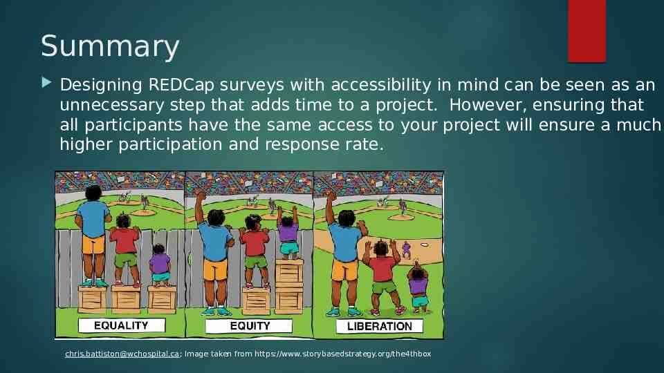
Summary Designing REDCap surveys with accessibility in mind can be seen as an unnecessary step that adds time to a project. However, ensuring that all participants have the same access to your project will ensure a much higher participation and response rate. [email protected]; Image taken from https://www.storybasedstrategy.org/the4thbox