Visualizing and Using Routine Reproductive, Maternal, Neonatal,

12 Slides6.46 MB
Visualizing and Using Routine Reproductive, Maternal, Neonatal, and Child Health Data at Health Facilities How to Design and Use a Customizable Health Facility Wall Chart
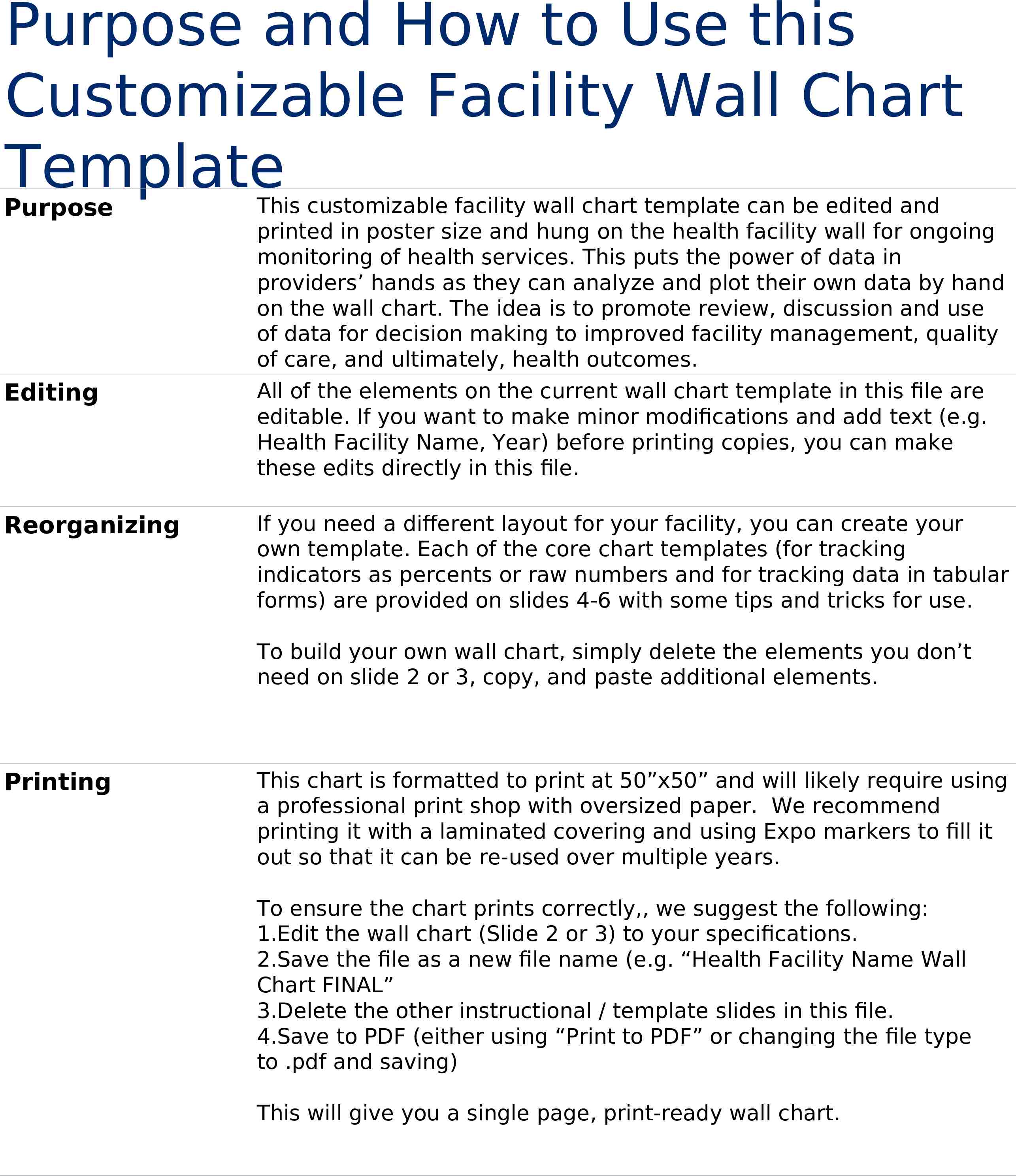
Purpose and How to Use this Customizable Facility Wall Chart Template Purpose Editing Reorganizing This customizable facility wall chart template can be edited and printed in poster size and hung on the health facility wall for ongoing monitoring of health services. This puts the power of data in providers’ hands as they can analyze and plot their own data by hand on the wall chart. The idea is to promote review, discussion and use of data for decision making to improved facility management, quality of care, and ultimately, health outcomes. All of the elements on the current wall chart template in this file are editable. If you want to make minor modifications and add text (e.g. Health Facility Name, Year) before printing copies, you can make these edits directly in this file. If you need a different layout for your facility, you can create your own template. Each of the core chart templates (for tracking indicators as percents or raw numbers and for tracking data in tabular forms) are provided on slides 4-6 with some tips and tricks for use. To build your own wall chart, simply delete the elements you don’t need on slide 2 or 3, copy, and paste additional elements. Printing This chart is formatted to print at 50”x50” and will likely require using a professional print shop with oversized paper. We recommend printing it with a laminated covering and using Expo markers to fill it out so that it can be re-used over multiple years. To ensure the chart prints correctly,, we suggest the following: 1.Edit the wall chart (Slide 2 or 3) to your specifications. 2.Save the file as a new file name (e.g. “Health Facility Name Wall Chart FINAL” 3.Delete the other instructional / template slides in this file. 4.Save to PDF (either using “Print to PDF” or changing the file type to .pdf and saving) This will give you a single page, print-ready wall chart.
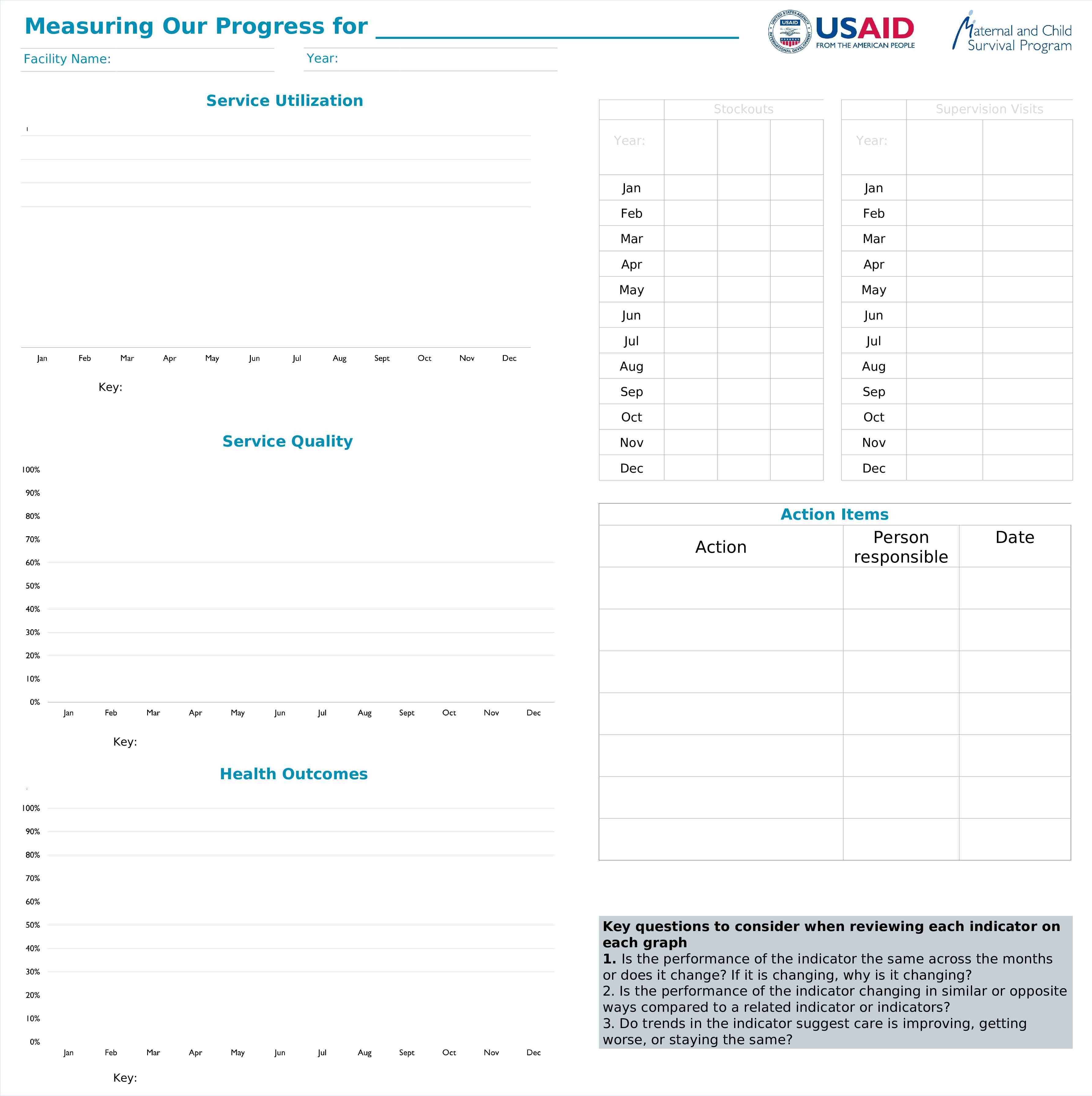
Measuring Our Progress for Year: Facility Name: Service Utilization Key: Service Quality Stockouts Supervision Visits Year: Year: Jan Jan Feb Feb Mar Mar Apr Apr May May Jun Jun Jul Jul Aug Aug Sep Sep Oct Oct Nov Nov Dec Dec Action Items Action Person responsible Date Key: Health Outcomes Key questions to consider when reviewing each indicator on each graph 1. Is the performance of the indicator the same across the months or does it change? If it is changing, why is it changing? 2. Is the performance of the indicator changing in similar or opposite ways compared to a related indicator or indicators? 3. Do trends in the indicator suggest care is improving, getting worse, or staying the same? Key:
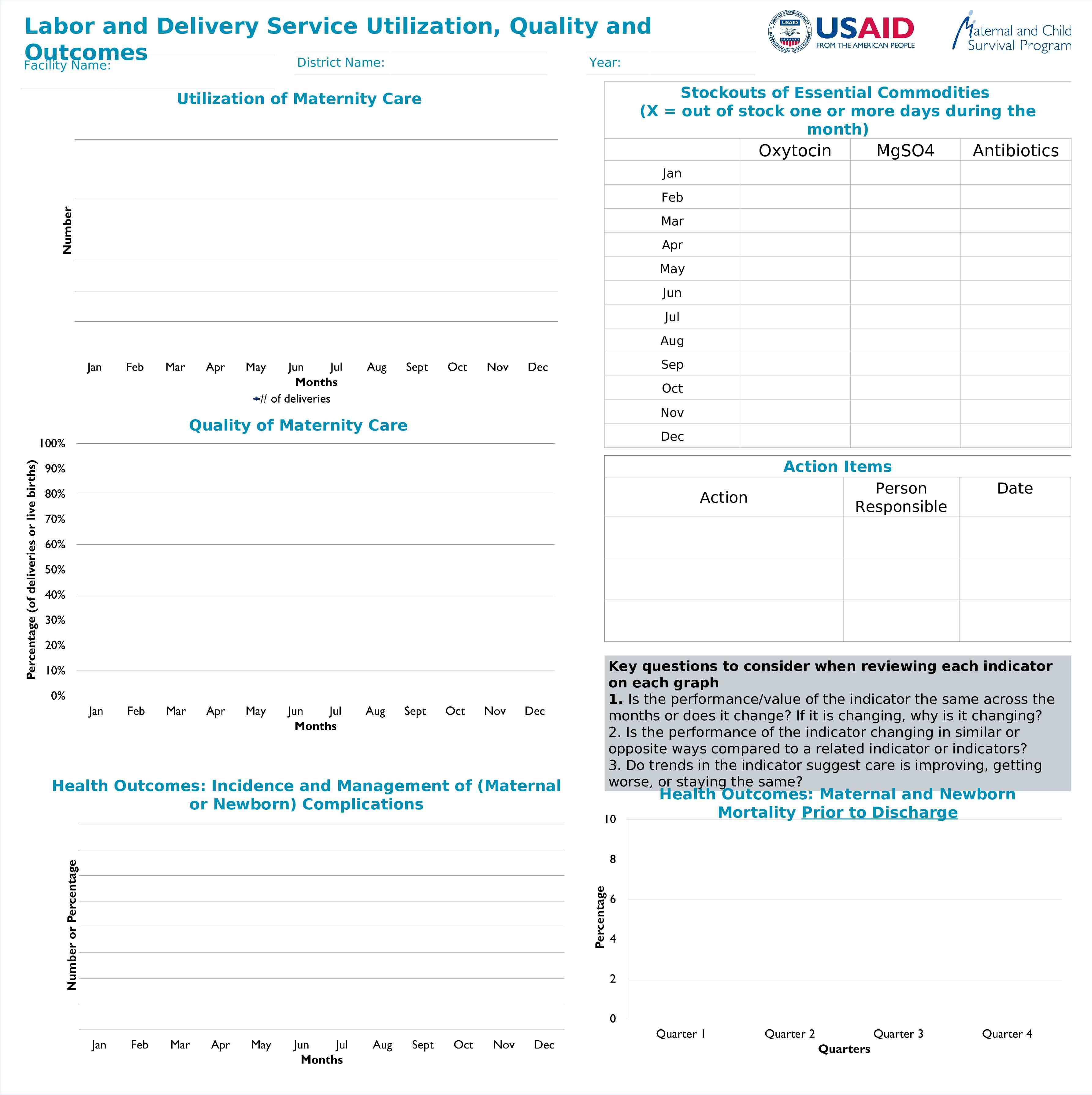
Labor and Delivery Service Utilization, Quality and Outcomes District Name: Year: Facility Name: Utilization of Maternity Care Stockouts of Essential Commodities (X out of stock one or more days during the month) Oxytocin MgSO4 Antibiotics Jan Feb Mar Apr May Jun Jul Aug Sep Oct Quality of Maternity Care Nov Dec Action Health Outcomes: Incidence and Management of (Maternal or Newborn) Complications Action Items Person Responsible Date Key questions to consider when reviewing each indicator on each graph 1. Is the performance/value of the indicator the same across the months or does it change? If it is changing, why is it changing? 2. Is the performance of the indicator changing in similar or opposite ways compared to a related indicator or indicators? 3. Do trends in the indicator suggest care is improving, getting worse, or staying the same? Health Outcomes: Maternal and Newborn Mortality Prior to Discharge
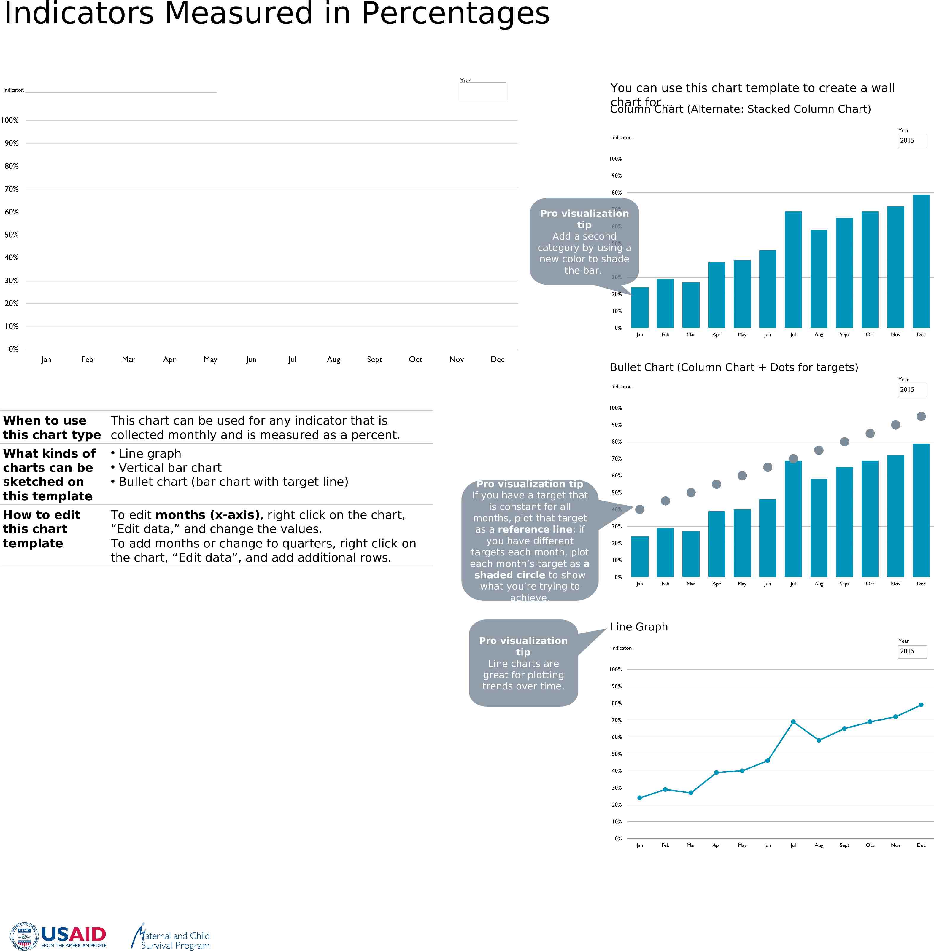
Indicators Measured in Percentages You can use this chart template to create a wall chart for Column Chart (Alternate: Stacked Column Chart) Pro visualization tip Add a second category by using a new color to shade the bar. Bullet Chart (Column Chart Dots for targets) When to use This chart can be used for any indicator that is this chart type collected monthly and is measured as a percent. What kinds of charts can be sketched on this template Line graph Vertical bar chart Bullet chart (bar chart with target line) How to edit this chart template To edit months (x-axis), right click on the chart, “Edit data,” and change the values. To add months or change to quarters, right click on the chart, “Edit data”, and add additional rows. Pro visualization tip If you have a target that is constant for all months, plot that target as a reference line; if you have different targets each month, plot each month’s target as a shaded circle to show what you’re trying to achieve. Line Graph Pro visualization tip Line charts are great for plotting trends over time.
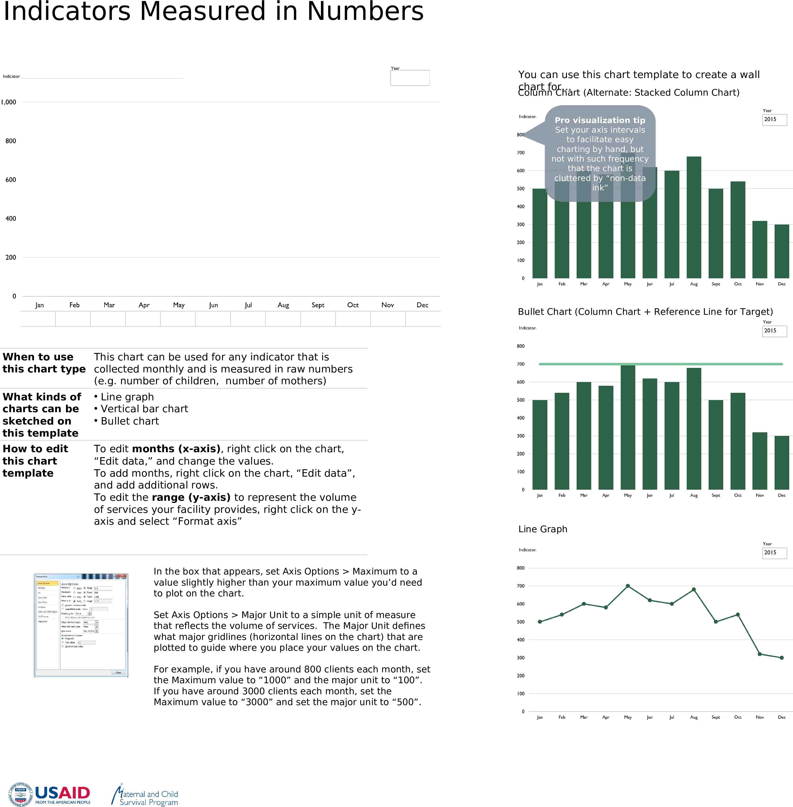
Indicators Measured in Numbers You can use this chart template to create a wall chart for Column Chart (Alternate: Stacked Column Chart) Pro visualization tip Set your axis intervals to facilitate easy charting by hand, but not with such frequency that the chart is cluttered by “non-data ink” Bullet Chart (Column Chart Reference Line for Target) When to use This chart can be used for any indicator that is this chart type collected monthly and is measured in raw numbers (e.g. number of children, number of mothers) What kinds of charts can be sketched on this template Line graph Vertical bar chart Bullet chart How to edit this chart template To edit months (x-axis), right click on the chart, “Edit data,” and change the values. To add months, right click on the chart, “Edit data”, and add additional rows. To edit the range (y-axis) to represent the volume of services your facility provides, right click on the yaxis and select “Format axis” In the box that appears, set Axis Options Maximum to a value slightly higher than your maximum value you’d need to plot on the chart. Set Axis Options Major Unit to a simple unit of measure that reflects the volume of services. The Major Unit defines what major gridlines (horizontal lines on the chart) that are plotted to guide where you place your values on the chart. For example, if you have around 800 clients each month, set the Maximum value to “1000” and the major unit to “100”. If you have around 3000 clients each month, set the Maximum value to “3000” and set the major unit to “500”. Line Graph
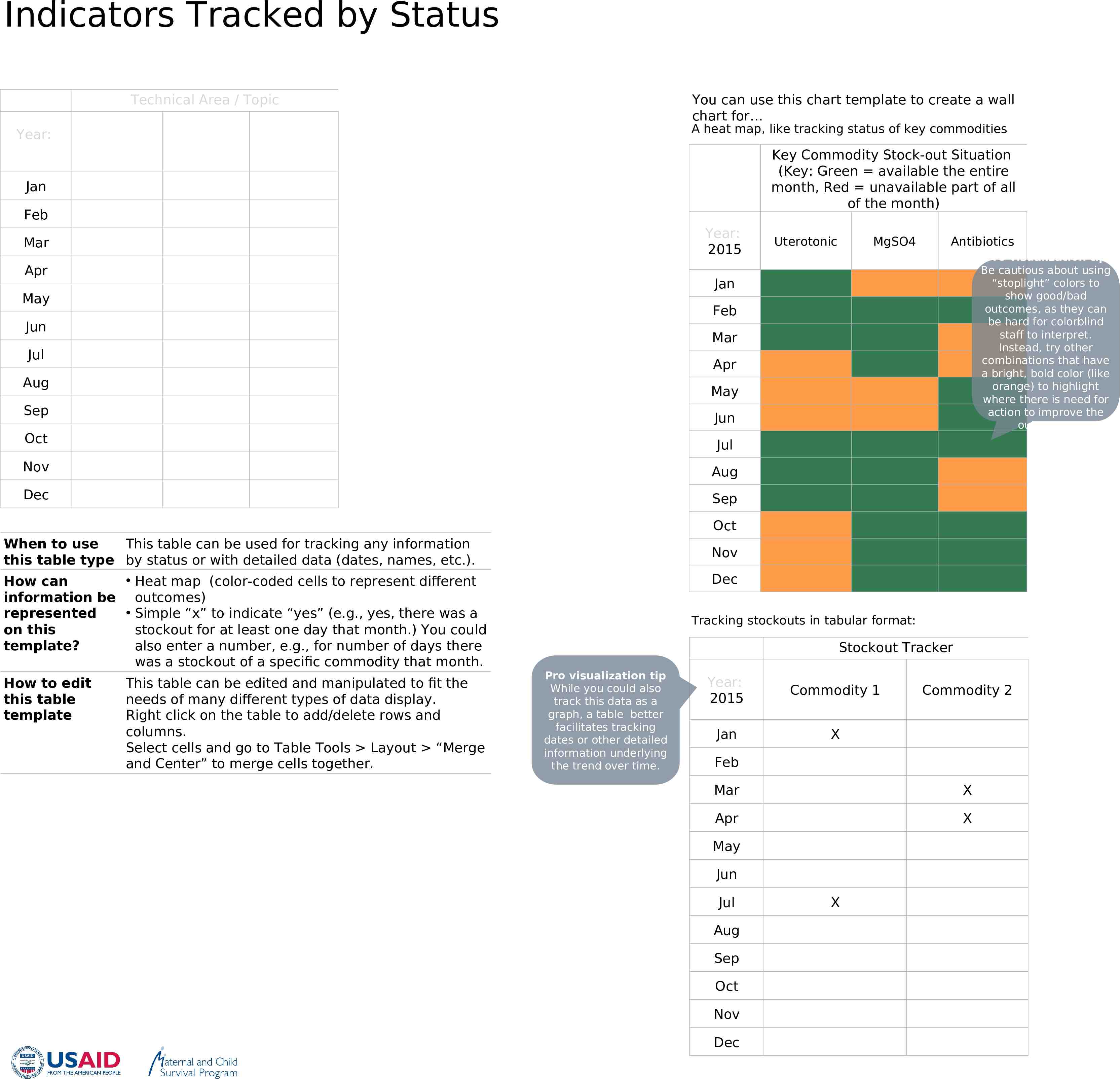
Indicators Tracked by Status Technical Area / Topic You can use this chart template to create a wall chart for A heat map, like tracking status of key commodities Year: Key Commodity Stock-out Situation (Key: Green available the entire month, Red unavailable part of all of the month) Jan Feb Year: 2015 Mar Apr Uterotonic MgSO4 Antibiotics Pro visualization tip Be cautious about using “stoplight” colors to show good/bad outcomes, as they can be hard for colorblind staff to interpret. Instead, try other combinations that have a bright, bold color (like orange) to highlight where there is need for action to improve the outcomes. Jan May Feb Jun Mar Jul Apr Aug May Sep Jun Oct Jul Nov Aug Dec Sep Oct When to use This table can be used for tracking any information this table type by status or with detailed data (dates, names, etc.). Heat map (color-coded cells to represent different How can information be outcomes) Simple “x” to indicate “yes” (e.g., yes, there was a represented on this stockout for at least one day that month.) You could template? also enter a number, e.g., for number of days there was a stockout of a specific commodity that month. How to edit this table template This table can be edited and manipulated to fit the needs of many different types of data display. Right click on the table to add/delete rows and columns. Select cells and go to Table Tools Layout “Merge and Center” to merge cells together. Nov Dec Tracking stockouts in tabular format: Stockout Tracker Pro visualization tip While you could also track this data as a graph, a table better facilitates tracking dates or other detailed information underlying the trend over time. Year: 2015 Commodity 1 Jan X Commodity 2 Feb Mar X Apr X May Jun Jul Aug Sep Oct Nov Dec X
SAMPLE COMPLETED WALL CHARTS
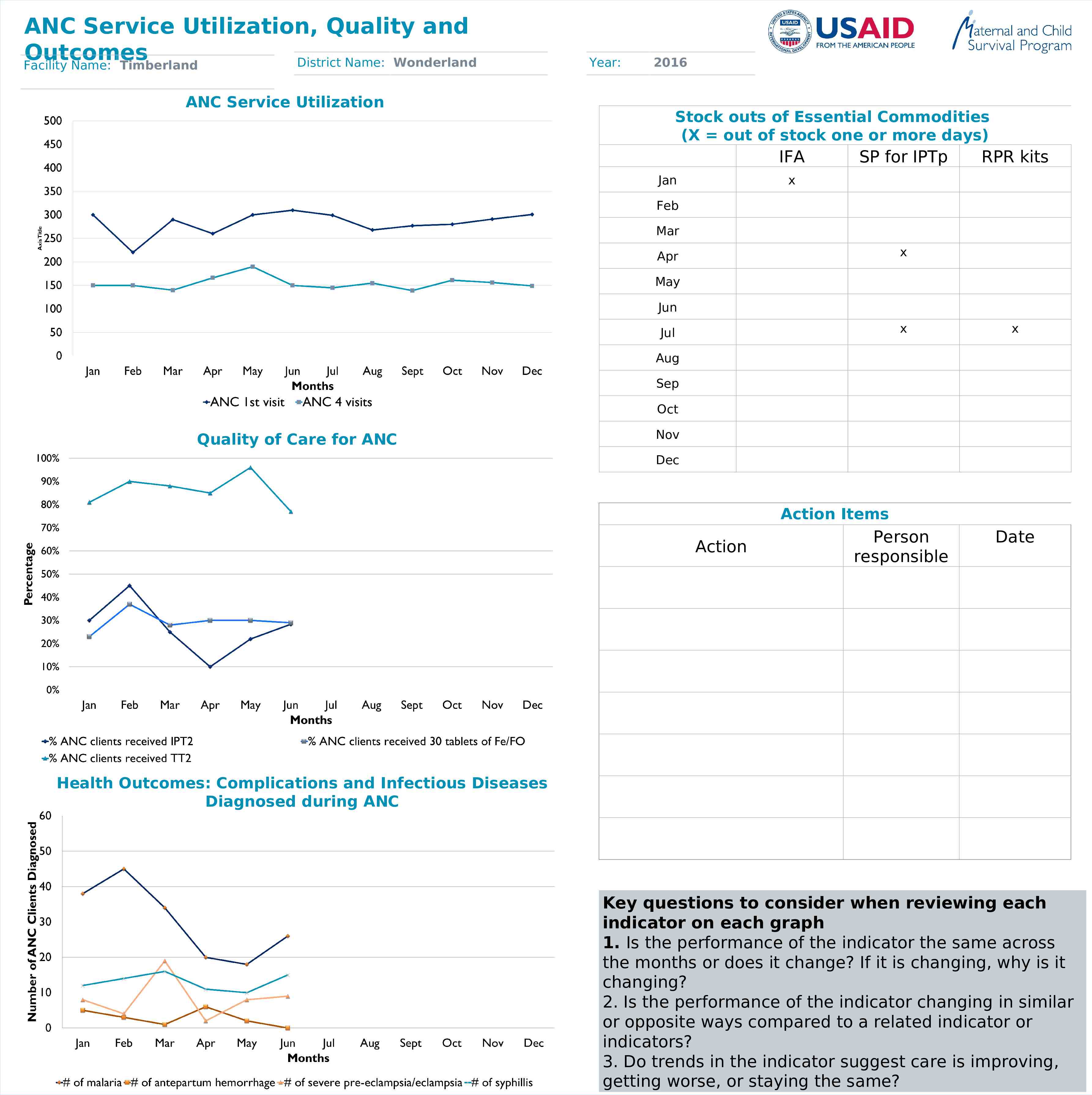
ANC Service Utilization, Quality and Outcomes District Name: Wonderland Facility Name: Timberland Year: 2016 ANC Service Utilization Stock outs of Essential Commodities (X out of stock one or more days) IFA Jan SP for IPTp RPR kits x Feb Mar x Apr May Jun x x Person responsible Date Jul Aug Sep Oct Quality of Care for ANC Nov Dec Action Items Action Health Outcomes: Complications and Infectious Diseases Diagnosed during ANC Key questions to consider when reviewing each indicator on each graph 1. Is the performance of the indicator the same across the months or does it change? If it is changing, why is it changing? 2. Is the performance of the indicator changing in similar or opposite ways compared to a related indicator or indicators? 3. Do trends in the indicator suggest care is improving, getting worse, or staying the same?
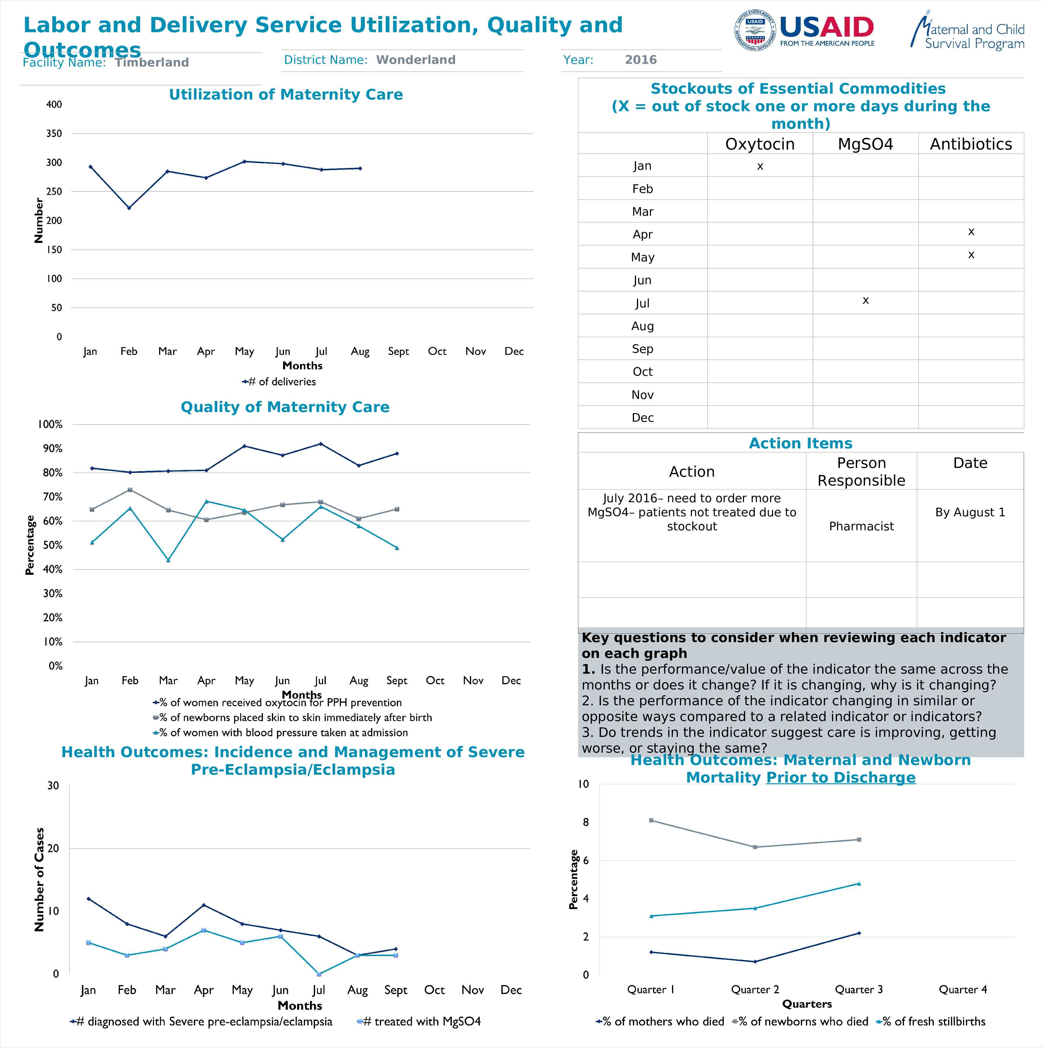
Labor and Delivery Service Utilization, Quality and Outcomes District Name: Wonderland Year: 2016 Facility Name: Timberland Utilization of Maternity Care Stockouts of Essential Commodities (X out of stock one or more days during the month) Oxytocin Jan MgSO4 Antibiotics x Feb Mar Apr x May x Jun x Jul Aug Sep Oct Quality of Maternity Care Nov Dec Action Action Items Person Responsible July 2016– need to order more MgSO4– patients not treated due to stockout Health Outcomes: Incidence and Management of Severe Pre-Eclampsia/Eclampsia Date By August 1 Pharmacist Key questions to consider when reviewing each indicator on each graph 1. Is the performance/value of the indicator the same across the months or does it change? If it is changing, why is it changing? 2. Is the performance of the indicator changing in similar or opposite ways compared to a related indicator or indicators? 3. Do trends in the indicator suggest care is improving, getting worse, or staying the same? Health Outcomes: Maternal and Newborn Mortality Prior to Discharge
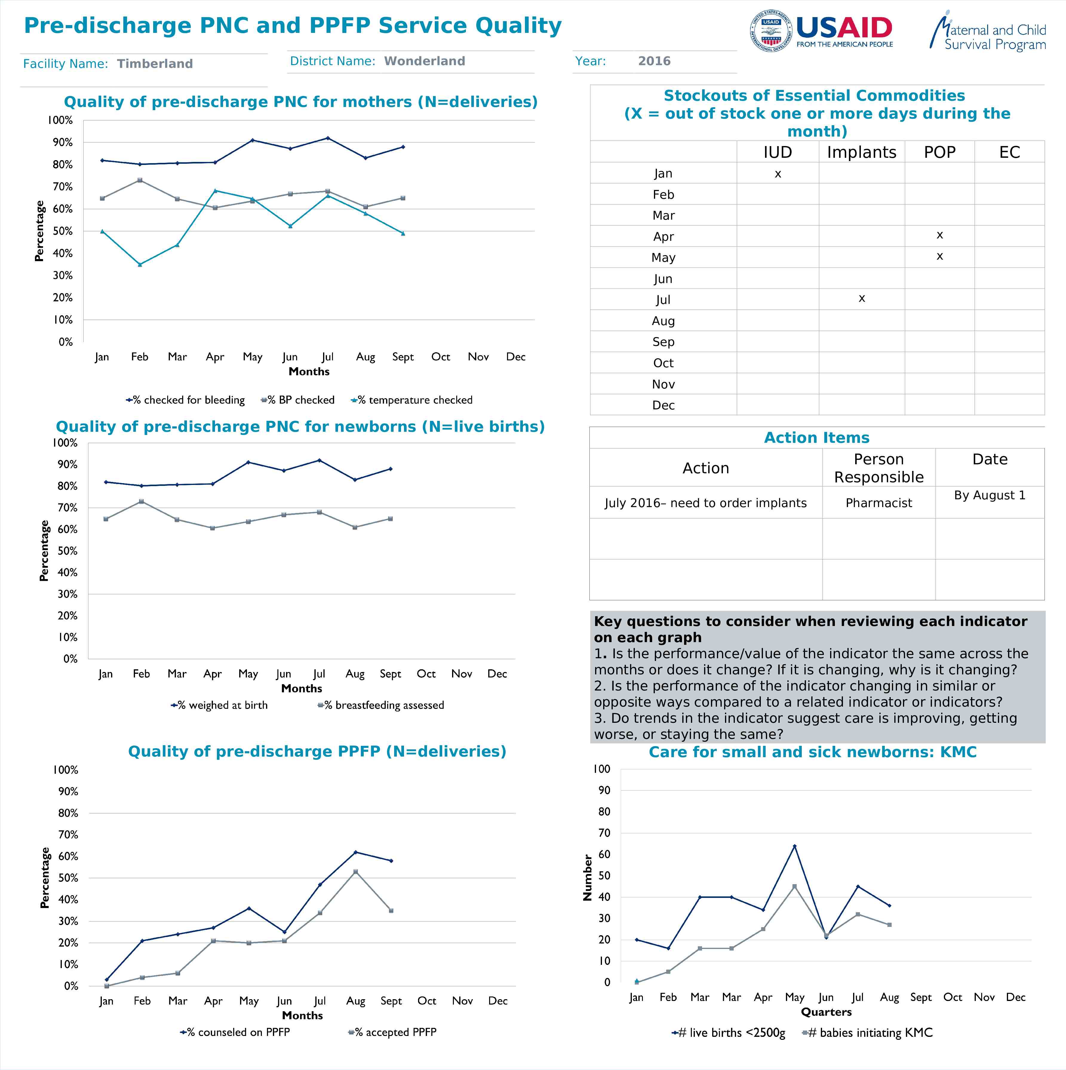
Pre-discharge PNC and PPFP Service Quality Facility Name: Timberland District Name: Wonderland Quality of pre-discharge PNC for mothers (N deliveries) Year: 2016 Stockouts of Essential Commodities (X out of stock one or more days during the month) IUD Jan Implants POP EC x Feb Mar Apr x May x Jun x Jul Aug Sep Oct Nov Dec Quality of pre-discharge PNC for newborns (N live births) Action Action Items Person Responsible July 2016– need to order implants Pharmacist Date By August 1 Key questions to consider when reviewing each indicator on each graph 1. Is the performance/value of the indicator the same across the months or does it change? If it is changing, why is it changing? 2. Is the performance of the indicator changing in similar or opposite ways compared to a related indicator or indicators? 3. Do trends in the indicator suggest care is improving, getting worse, or staying the same? Quality of pre-discharge PPFP (N deliveries) Care for small and sick newborns: KMC
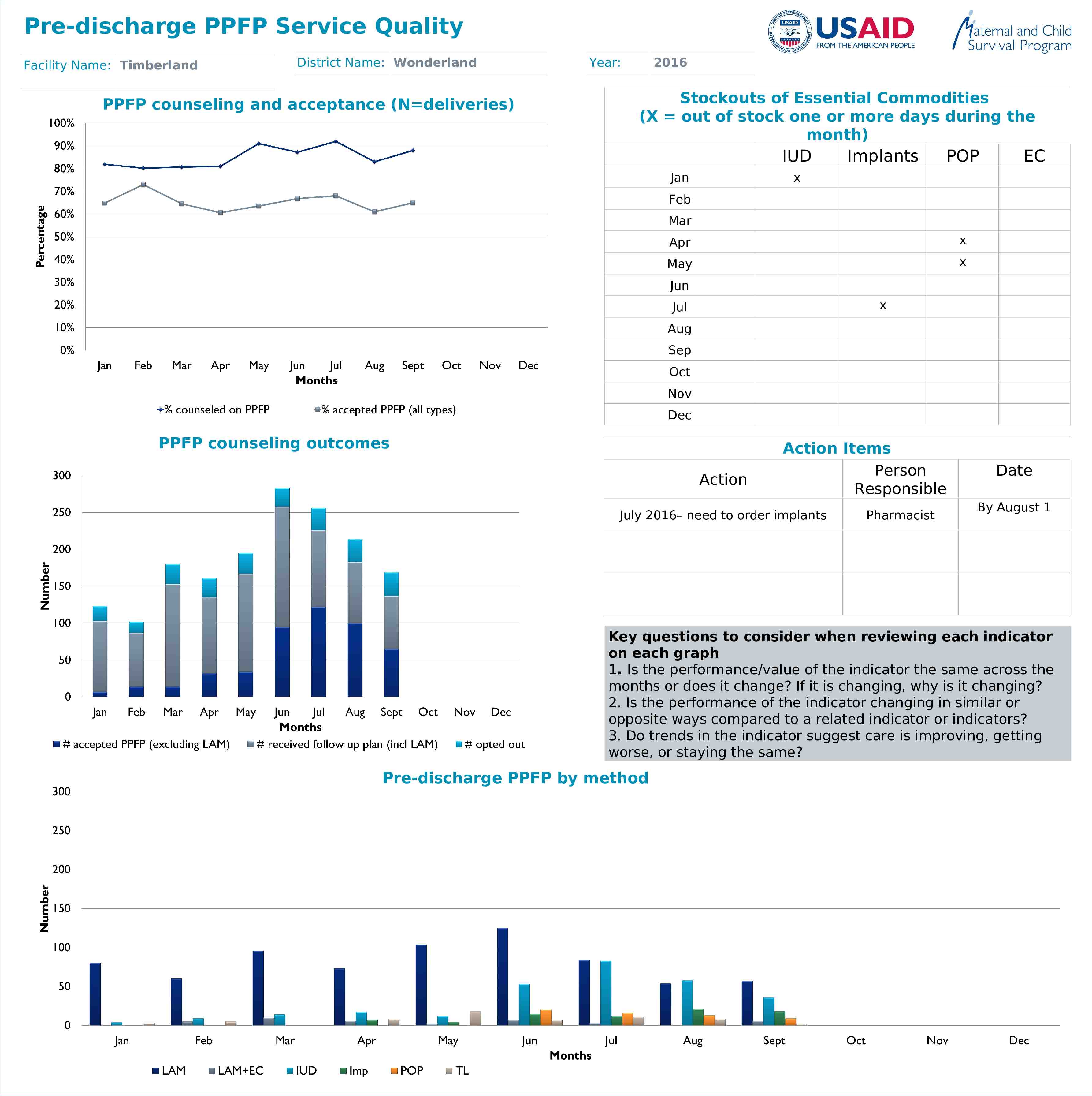
Pre-discharge PPFP Service Quality Facility Name: Timberland District Name: Wonderland PPFP counseling and acceptance (N deliveries) Year: 2016 Stockouts of Essential Commodities (X out of stock one or more days during the month) IUD Jan Implants POP EC x Feb Mar Apr x May x Jun x Jul Aug Sep Oct Nov Dec PPFP counseling outcomes Action Action Items Person Responsible July 2016– need to order implants Pharmacist Date By August 1 Key questions to consider when reviewing each indicator on each graph 1. Is the performance/value of the indicator the same across the months or does it change? If it is changing, why is it changing? 2. Is the performance of the indicator changing in similar or opposite ways compared to a related indicator or indicators? 3. Do trends in the indicator suggest care is improving, getting worse, or staying the same? Pre-discharge PPFP by method