Strategy and tactics for graphic multiples in Stata Nicholas J.


74 Slides1.02 MB
Strategy and tactics for graphic multiples in Stata Nicholas J. Cox Department of Geography Durham University, UK 1
Comparison Many useful graphs compare two or more sets of values, and so can be thought as of multiples. Often there can be a fine line between richly detailed graphics and busy, unintelligible graphics that lead nowhere. In this presentation I survey strategy and tactics for developing good graphic multiples in Stata. 2
Strategies: what to do superimpose (on top) or juxtapose (alongside)? plot different versions or reductions of the data transform scales for easier comparison linear reference patterns backdrops of context 3
Tactics: details of what to do over() and by() options and graph combine kill the key or lose the legend if you can annotations and self-explanatory markers 4
Datasets visited James Short’s collation from the transit of Venus Florence Nightingale’s data on deaths in the Crimean War deaths from the Titanic sinking Grunfeld panel data admissions to Berkeley hostility in response to insult or apology fluctuations in Arctic sea ice 5
Original programs discussed catplot (SSC) devnplot (SSC) qplot (Stata Journal) sparkline (SSC) spineplot (SJ) stripplot (SSC) tabplot (SSC) 6
Categorical comparisons 7
Berkeley admissions data A classic dataset covers admissions to six graduate majors by gender at UC Berkeley. At first sight, females were discriminated against. But there is an underlying interaction: major by major, females generally do well, yet their acceptance rates are worse on more popular majors. This is an example of an amalgamation paradox named for E.H. Simpson (1922–) but known to K. Pearson (1857–1936) and G.U. Yule (1871– 1951). 8
Berkeley data references The original reference was Bickel, P.J., E.A. Hammel and J.W. O’Connell. 1975. Sex bias in graduate admissions: Data from Berkeley. Science 187: 398–404. The Berkeley data were discussed as an example for Stata in Cox, N.J. 2008. Spineplots and their kin. Stata Journal 8: 105–121. 9
A simple problem? The structure of the data is already well known. The challenge is how best to present it. There are three categorical variables major (anonymously A, B, C, D, E, F) gender (male, female) decision (accept, reject) so the data are just 24 frequencies. 10
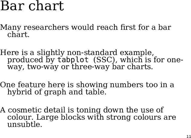
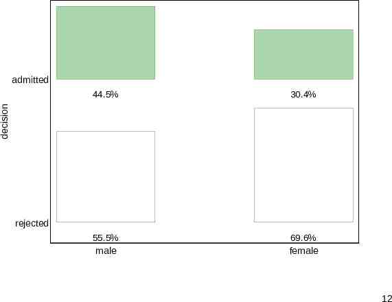
Bar chart Many researchers would reach first for a bar chart. Here is a slightly non-standard example, produced by tabplot (SSC), which is for oneway, two-way or three-way bar charts. One feature here is showing numbers too in a hybrid of graph and table. A cosmetic detail is toning down the use of colour. Large blocks with strong colours are unsubtle. 11
admitted 30.4% 55.5% male 69.6% female decision 44.5% rejected 12
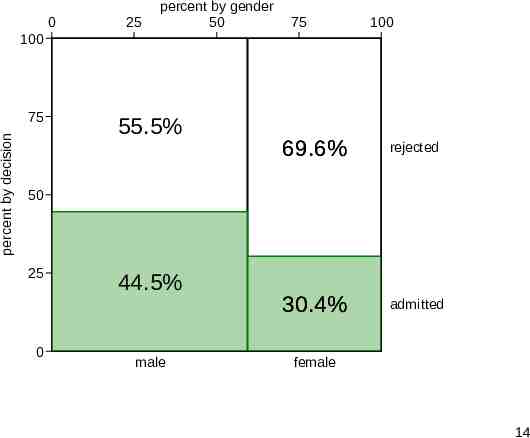
Mosaic plot or spineplot The previous bar chart omitted the frequencies. We can show them using a mosaic plot or spineplot. The proportions of both variables are shown, giving marginal and conditional distributions. Areas of tiles are proportional to raw frequencies. Departures from independence are easily seen. The program here is spineplot. 13
0 25 percent by gender 50 75 100 100 percent by decision 75 55.5% 69.6% rejected 30.4% admitted 50 25 0 44.5% male female 14
Drilling down The bar chart and spineplot do a fair job of showing the gross breakdown with four percents. (Two are redundant.) Predictably, both would be rejected as trivial by many journal reviewers, but both could be useful for presentations. But clearly we need to drill down to see the patterns for different majors. 15
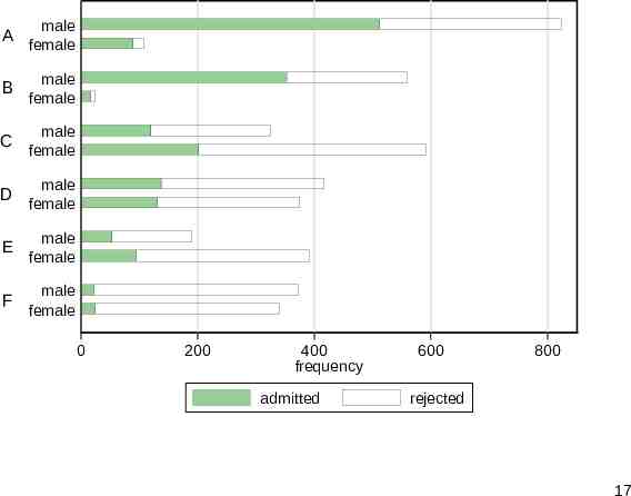
More detailed bar chart Stacking bars is a standard strategy, but the result is immediately much more complicated. Showing all the detail does not always help. Focusing more sharply on the response of interest is a way forward. In general there is no need for alphabetical order. Here majors A to F are already ordered by admission rate. 16
A male female B male female C male female D male female E male female F male female 0 200 400 frequency admitted 600 800 rejected 17
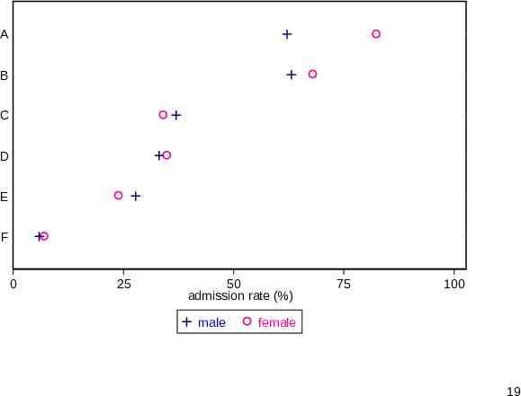
Dot chart Dot charts as advocated by W.S. Cleveland remain under-used by comparison with bar charts. In Stata that usually means graph dot. By using marker position alone, rather than bar length, they are less busy and thus ease more detailed comparison. Here it is easier to identify that female admission rates are higher for four majors and lower for the other two. 18
A B C D E F 0 25 50 admission rate (%) male 75 100 female 19
Details for dot charts Open symbols (e.g. not ) tolerate overlap much better than closed symbols. can even be combined with whenever nearly equal values are possible. Legends (keys) are at best a necessary evil. Self-explanatory or at least memorable symbolisation is to be prized wherever it is possible. Using blue for males and pink for females is a simple example. 20
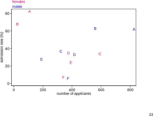
A scatter plot? Many statistically-minded people find the idea of bar charts trivial, but their practice not very helpful. Where is the scatter plot, they cry? Plotting admission rate against number of applicants re-introduces a crucial aspect, size of major. This allows identification of positive correlation for males and negative correlation for females, hence the paradox. This is currently my favourite plot for these data. 21
females males A 80 admission rate (%) B B 60 40 C D D E A C E 20 F F 0 0 200 400 number of applicants 600 800 22
Previously In an earlier version of this plot I had admissions versus applications, both raw frequencies. Reference lines here are lines through the origin such as y x and y 0.5x for 100% and 50% admission rates. But it is simpler to plot admission rates. Then the reference lines are horizontal. 23
Slogans: the banal in search of the profound Focus as far as possible on the response or outcome, the variable you most want to explain. Linear reference patterns are good and horizontal patterns better. Omit what is unimportant and keep what is important. Even for a very simple problem, it is rare that a single graph meets all needs. 24
Continuous comparisons 25
Hostility change Results of an experiment reported by Atkinson, C. and J. Polivy. 1976. Effects of delay, attack, and retaliation on state depression and hostility. Journal of Abnormal Psychology 85: 570–576. Male and female subjects were made to wait and then either were insulted or received an apology. Half were given a chance to retaliate by negatively evaluating the experimenter. Hostility was measured before and after the experiment. 26
Variables in hostility study Response: Change in hostility, a difference of scores and so approximately continuous Predictors all binary: Treatment: insult, apology Gender: male, female Retaliation allowed: yes, no 27
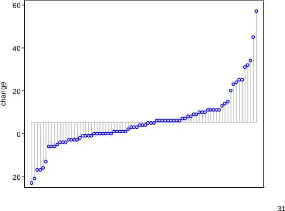
ANOVA-type problems: What to plot? Change in hostility is adequately modelled by a simple linear model, using analysis of variance. What to plot for similar analyses is key here. Box plots (with medians etc.) are surprisingly common even when comparison of means is the central question. Plotting means with standard errors or confidence intervals is also common, but what about the detail omitted? 28
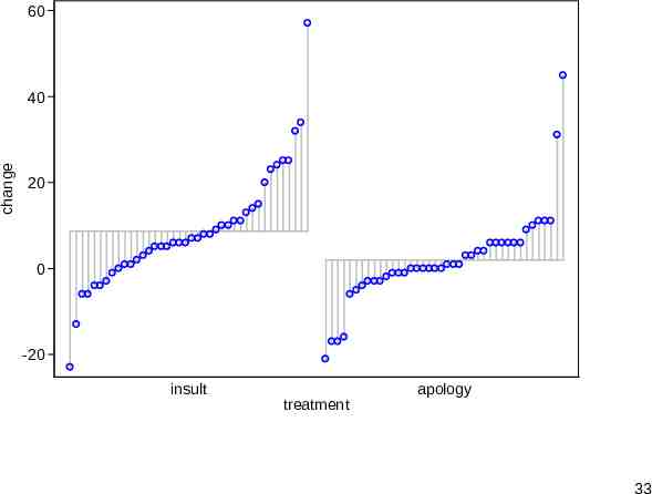
devnplot (SSC) devnplot (SSC) is named for its emphasis on plotting deviations. Deviations are measured from any level you care to specify, but deviations from means are the default. “devplot” was too ugly and “deviationplot” too long. Quantile enthusiasts will see it as a way to plot ordered quantiles side by side. Compare quantile or qplot (SJ). 29
devnplot syntax The syntax resembles standard modelling syntax, response named first and any predictors following. With one variable named we get in essence a quantile plot for that variable, a plot of the ordered values versus an implicit cumulative probability scale. The scaffolding emphasising that each value can be represented by a deviation from a level might seem redundant, but bear with me. 30
60 change 40 20 0 -20 31
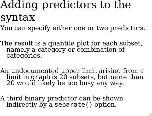
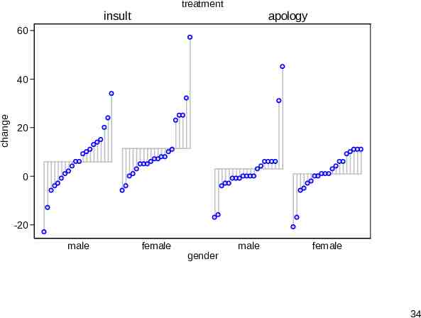
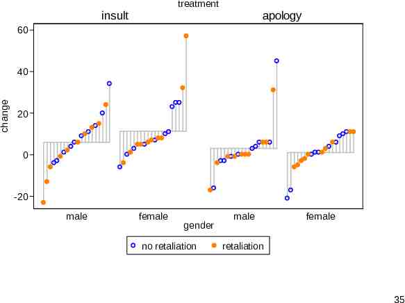
Adding predictors to the syntax You can specify either one or two predictors. The result is a quantile plot for each subset, namely a category or combination of categories. An undocumented upper limit arising from a limit in graph is 20 subsets, but more than 20 would likely be too busy any way. A third binary predictor can be shown indirectly by a separate() option. 32
60 change 40 20 0 -20 insult treatment apology 33
treatment insult apology 60 change 40 20 0 -20 male female gender male female 34
treatment insult apology 60 change 40 20 0 -20 male female gender no retaliation male female retaliation 35
devnplot virtues The display serves well in showing variation within subsets as well as variation between. Interactions can be seen. The scaffolding (in subtle gray) helps to tie the values of a group together visually. The separate() option is best used to highlight a few unusual or interesting cases. 36
Waterfall plots Similar plots have been called waterfall plots, especially in clinical oncology. But watch out: waterfall plots (or charts) have at least two quite different meanings elsewhere, in business and physical science contexts. Sometimes the jungle of plot names is just a confounded nuisance. 37
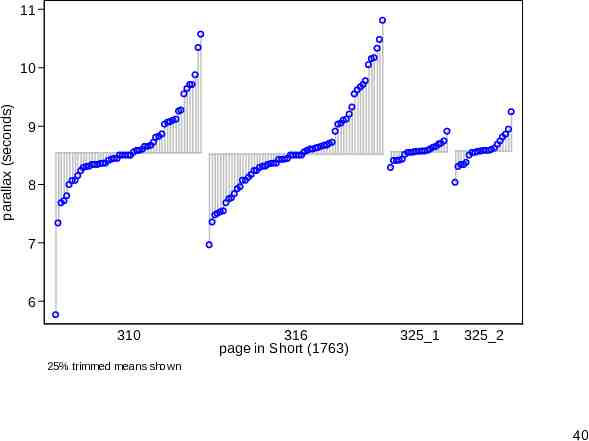
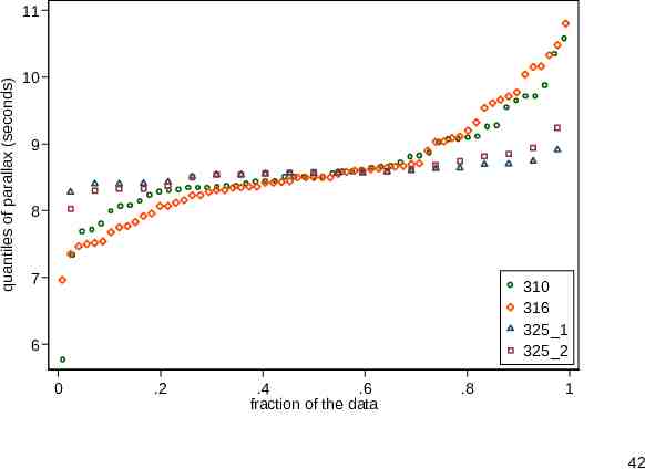
James Short and the transit of Venus (1763) Short collated and corrected observations made by various astronomers during the transit of Venus in 1761. The parallax here is the angle subtended by the earth’s radius, as if viewed and measured from the surface of the sun. The data will be published and discussed in Stata Journal 13(3). 38
Deviation plot A deviation plot adjusts to the differing sample sizes. Here deviations are relative to 25% trimmed means (otherwise known as midmeans or interquartile means). Boxplot fans can think that they average values within the box. The context here of careful precise measurement does not rule out the occasional mild or even strong outlier. 39
11 parallax (seconds) 10 9 8 7 6 310 316 page in Short (1763) 325 1 325 2 25% trimmed means shown 40
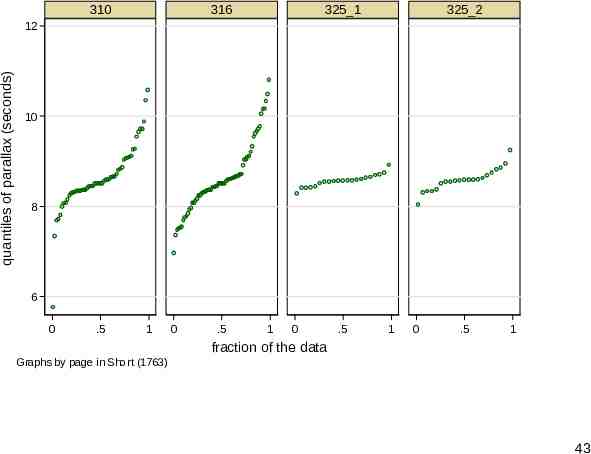
Quantile plots Deviation plots (waterfall plots, if you prefer) are in essence quantile plots. qplot from SJ can superimpose through its over() option or juxtapose through its by() option. How well does that compare? 41
quantiles of parallax (seconds) 11 10 9 8 7 310 316 325 1 325 2 6 0 .2 .4 .6 fraction of the data .8 1 42
310 316 325 1 325 2 quantiles of parallax (seconds) 12 10 8 6 0 .5 1 0 .5 1 0 .5 1 0 .5 1 fraction of the data Graphs by page in Short (1763) 43
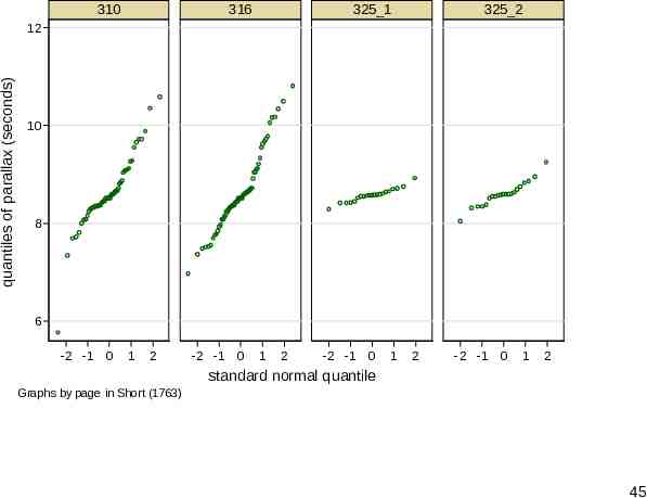
devnplot or qplot? I prefer devnplot here, although qplot has useful options too, including flexibility over axis scales. For example, if we plot against standard normal quantiles, normal (Gaussian) distributions will follow straight lines. 44
310 316 325 1 325 2 quantiles of parallax (seconds) 12 10 8 6 -2 -1 0 1 2 -2 -1 0 1 2 -2 -1 0 1 2 -2 -1 0 1 2 standard normal quantile Graphs by page in Short (1763) 45
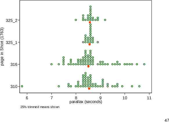
Strip plot An alternative display is a strip plot or dot plot. (Many other names exist.) Here it takes on the flavour of a histogram but with markers or point symbols for each value. Some binning allows stacking. stripplot from SSC offers an alternative to official Stata’s dotplot. 46
page in Short (1763) 325 2 325 1 316 310 6 7 8 9 parallax (seconds) 10 11 25% trimmed means shown 47
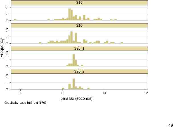
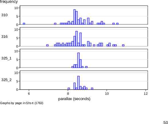
Histograms or box plots? Many statistical people would start almost automatically with histograms or box plots for such data. How do they compare? You can judge for yourself. A specific problem with histograms is keeping the amount of scaffolding down. It is easy to lose valuable real estate in axis and title information. 48
0 5 10 310 0 0 5 10 325 1 5 10 325 2 0 Frequency 5 10 316 6 8 10 12 parallax (seconds) Graphs by page in Short (1763) 49
frequency 10 310 5 0 10 316 5 0 10 325 1 5 0 10 325 2 5 0 6 8 10 12 parallax (seconds) Graphs by page in Short (1763) 50
How did we do that? The main trick here is moving the subtitles to the left. It only works here because they are so short, but accept good fortune, however it comes. The incantation is subtitle(, ring(1) pos(9) nobox nobexpand) 51
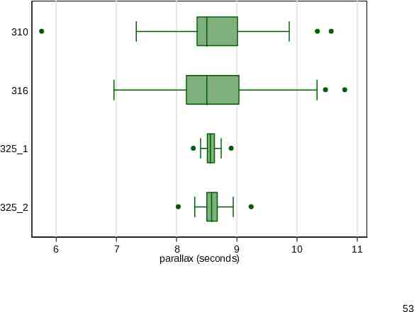
Box plots Box plots do work fairly well, but they just leave out too much detail for my taste. If the details are accessible, you can decide for yourself whether they are trivial. 52
310 316 325 1 325 2 6 7 8 9 parallax (seconds) 10 11 53
Timed comparisons 54
Time series Comparisons of time series are an especially rich, and especially challenging, area of statistical graphics. The widespread term spaghetti plot hints immediately at the difficulties. As always, we want to combine a grasp of general patterns with access to individual details. 55
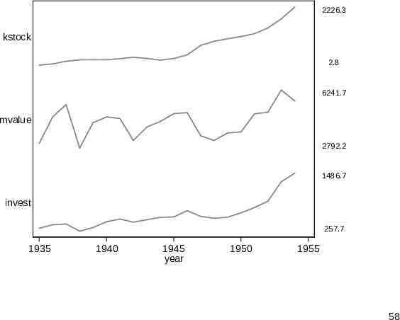
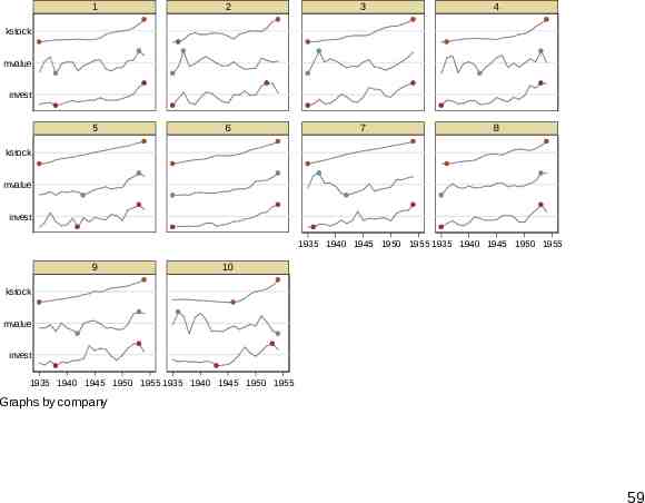
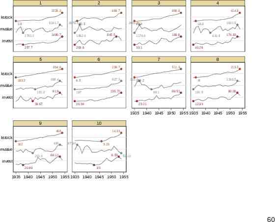
sparkline The Grunfeld data (webuse grunfeld) are a classic dataset in panel-based economics. Ten companies were monitored for 1935–54. This can be an example for sparkline (SSC). The name sparkline was suggested by Edward Tufte for intense text-like graphics. Time series are the most obvious example. 56
Vertical and horizontal By default sparkline stacks small graphs vertically. If several graphs are combined, it is typical to cut down on axis labels and rely on differences in shape to convey information. Horizontal stacking is also supported, which can be useful for archaeological or environmental problems focused on variations with depth or height. 57
2226.3 kstock 2.8 6241.7 mvalue 2792.2 1486.7 invest 257.7 1935 1940 1945 year 1950 1955 58
1 2 3 4 5 6 7 8 kstock mvalue invest kstock mvalue invest 1935 1940 1945 1950 1955 1935 1940 1945 1950 1955 9 10 kstock mvalue invest 1935 1940 1945 1950 1955 1935 1940 1945 1950 1955 Graphs by company 59
1 2 3 2226.3 669.7 4 888.9 414.9 kstock 6241.7 2.8 2676.3 50.5 2803.3 97.8 1001.5 10.2 mvalue 1486.7 2792.2 645.5 1362.4 189.6 1170.6 410.9 174.93 invest 257.7 209.9 5 33.1 6 40.29 7 804.9 238.7 8 511.3 213.5 kstock 183.2 398.4 6.5 927.3 91.9 197 135.72 210.1 100.2 .8 1193.5 191.5 90.08 mvalue 151.2 98.1 89.51 invest 39.67 20.36 23.21 12.93 1935 1940 1945 1950 1955 1935 1940 1945 1950 1955 9 10 468 14.33 kstock 496 162 87.94 3.23 mvalue 213.3 66.11 6.53 58.12 invest 20.89 .93 1935 1940 1945 1950 1955 1935 1940 1945 1950 1955 60
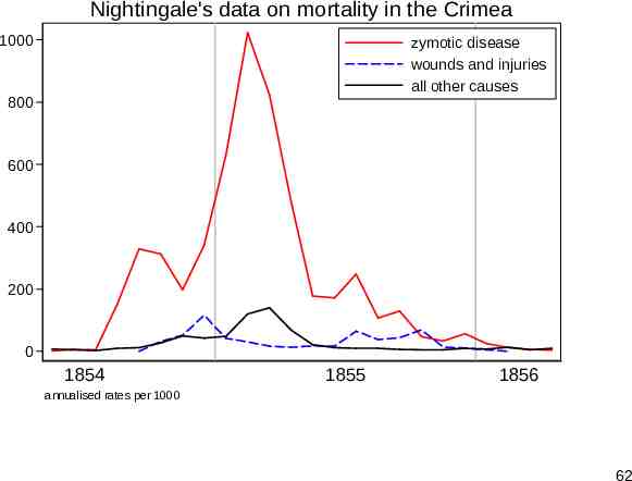
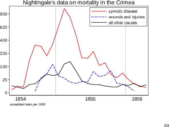
Nightingale’s data Florence Nightingale (1820-1910) is well remembered for her nursing in the Crimean war and less so as a pioneer in data analysis. Her most celebrated dataset is often reproduced using her polar diagram, but is easier to think about as time series. Zymotic (loosely, infectious) disease mortality dominates other kinds, so much so that a square root scale helps comparison. (A logarithmic scale over-transforms here.) 61
Nightingale's data on mortality in the Crimea 1000 zymotic disease wounds and injuries all other causes 800 600 400 200 0 1854 1855 1856 annualised rates per 1000 62
Nightingale's data on mortality in the Crimea zymotic disease wounds and injuries all other causes 900 625 400 225 100 25 0 1854 1855 1856 annualised rates per 1000 63
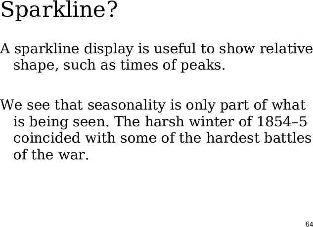
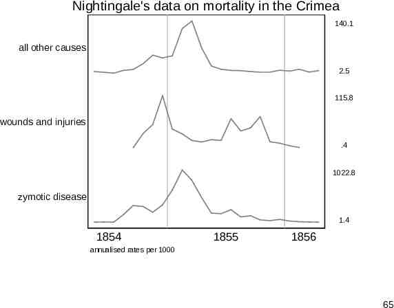
Sparkline? A sparkline display is useful to show relative shape, such as times of peaks. We see that seasonality is only part of what is being seen. The harsh winter of 1854–5 coincided with some of the hardest battles of the war. 64
Nightingale's data on mortality in the Crimea 140.1 all other causes 2.5 115.8 wounds and injuries .4 1022.8 zymotic disease 1.4 1854 1855 1856 annualised rates per 1000 65
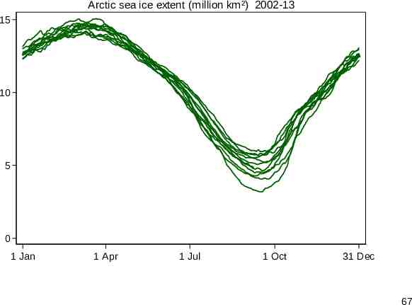
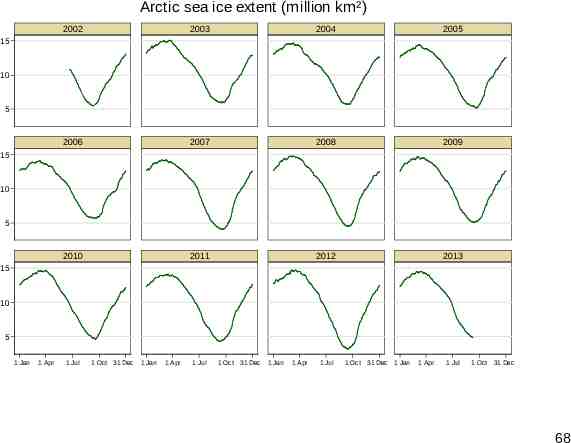
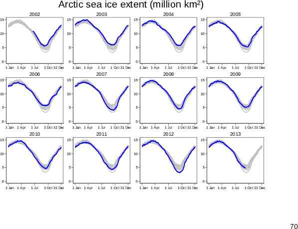
Arctic sea ice Another time series example concerns seasonal variation in Arctic sea ice for 2002-13, just 12 annual series. The usual spaghetti plot shows the similarity of series well, but makes comparing them difficult. Although some people try using a key or legend, that rarely works well beyond a very few series. Separating out the series runs into the opposite problem. 66
Arctic sea ice extent (million km²) 2002-13 15 10 5 0 1 Jan 1 Apr 1 Jul 1 Oct 31 Dec 67
Arctic sea ice extent (million km²) 2002 2003 2004 2005 2006 2007 2008 2009 2010 2011 2012 2013 15 10 5 15 10 5 15 10 5 1 Jan 1 Apr 1 Jul 1 Oct 31 Dec 1 Jan 1 Apr 1 Jul 1 Oct 31 Dec 1 Jan 1 Apr 1 Jul 1 Oct 31 Dec 1 Jan 1 Apr 1 Jul 1 Oct 31 Dec 68
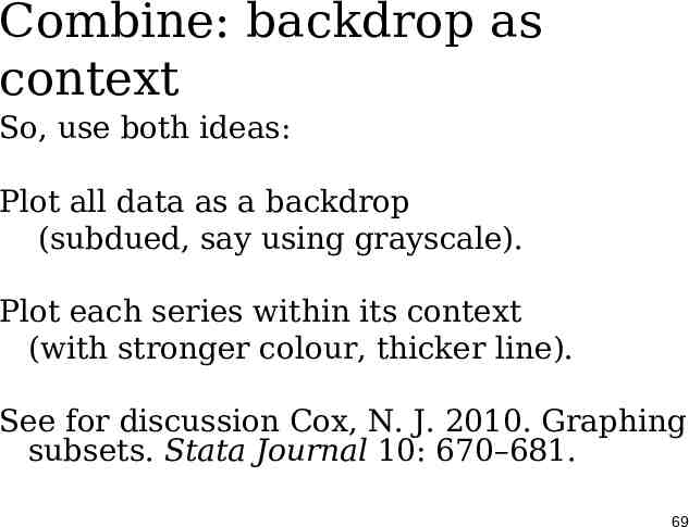
Combine: backdrop as context So, use both ideas: Plot all data as a backdrop (subdued, say using grayscale). Plot each series within its context (with stronger colour, thicker line). See for discussion Cox, N. J. 2010. Graphing subsets. Stata Journal 10: 670–681. 69
Arctic sea ice extent (million km²) 2002 2003 2004 2005 15 15 15 15 10 10 10 10 5 5 5 5 0 0 1 Jan 1 Apr 1 Jul 1 Oct 31 Dec 0 1 Jan 1 Apr 2006 1 Jul 1 Oct 31 Dec 0 1 Jan 1 Apr 2007 1 Jul 1 Oct 31 Dec 1 Jan 1 Apr 2008 15 15 15 10 10 10 10 5 5 5 5 0 0 0 0 1 Jul 1 Oct 31 Dec 1 Jan 1 Apr 2010 1 Jul 1 Oct 31 Dec 1 Jan 1 Apr 2011 1 Jul 1 Oct 31 Dec 1 Jan 1 Apr 2012 15 15 15 10 10 10 10 5 5 5 5 0 1 Jan 1 Apr 1 Jul 1 Oct 31 Dec 0 1 Jan 1 Apr 1 Jul 1 Oct 31 Dec 1 Jul 1 Oct 31 Dec 2013 15 0 1 Oct 31 Dec 2009 15 1 Jan 1 Apr 1 Jul 0 1 Jan 1 Apr 1 Jul 1 Oct 31 Dec 1 Jan 1 Apr 1 Jul 1 Oct 31 Dec 70
Cross-fertilisation 71
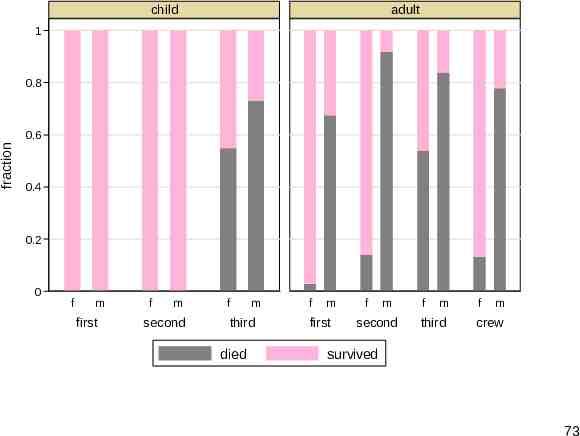
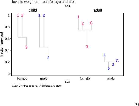
Titanic data The Titanic sank in 1912. Statistically, we want to explain fraction survived in terms of age, sex and class of those on board. A standard graph is a stacked or divided bar graph, but it lacks punch. The command used was catplot (SSC). So, we end with something rather different, produced with devnplot. 72
child adult 1 0.8 fraction 0.6 0.4 0.2 0 f m first f m second f m third died f m first f m second f m third f m crew survived 73
level is weighted mean for age and sex age child 1 1 2 1 2 1 C 2 0.8 fraction survived adult 0.6 0.4 3 3 1 3 0.2 3 C 2 0 female male sex female male 1,2,3,C first, second, third class and crew 74